
Thank you! Your submission has been received!
Oops! Something went wrong while submitting the form.
Get SaaSFrame Pro
Monthly
$18
Quarterly
$48
Yearly
$180
Upgrade to access this feature
Browse all screens & flows
Filter and search screens & flows
Access Figma files
Access mobile versions
Bookmark screens & flows
Join now
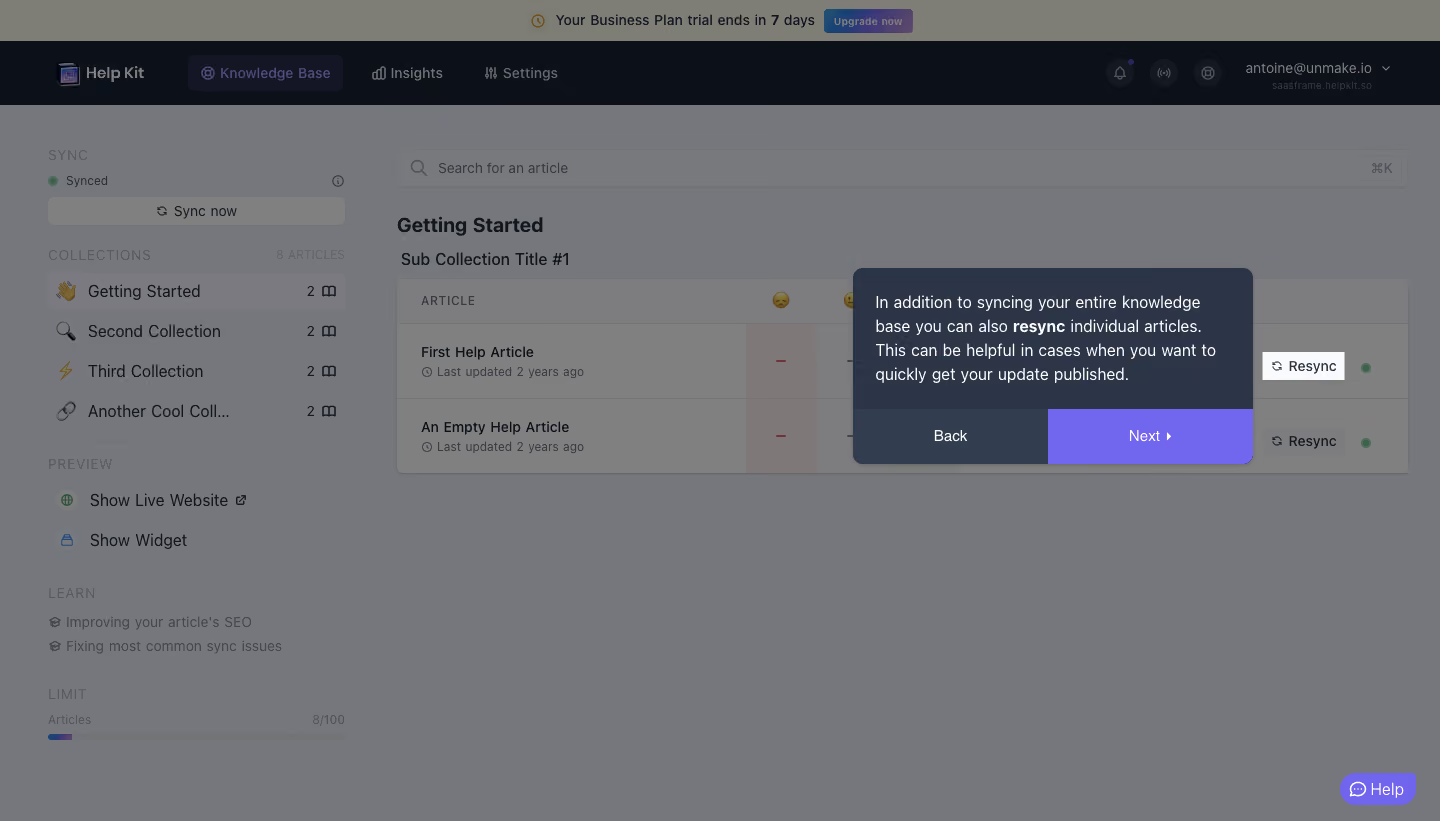
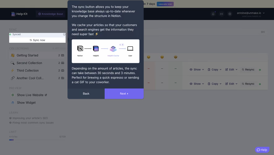
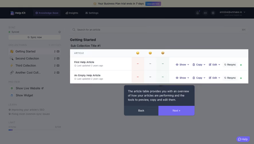
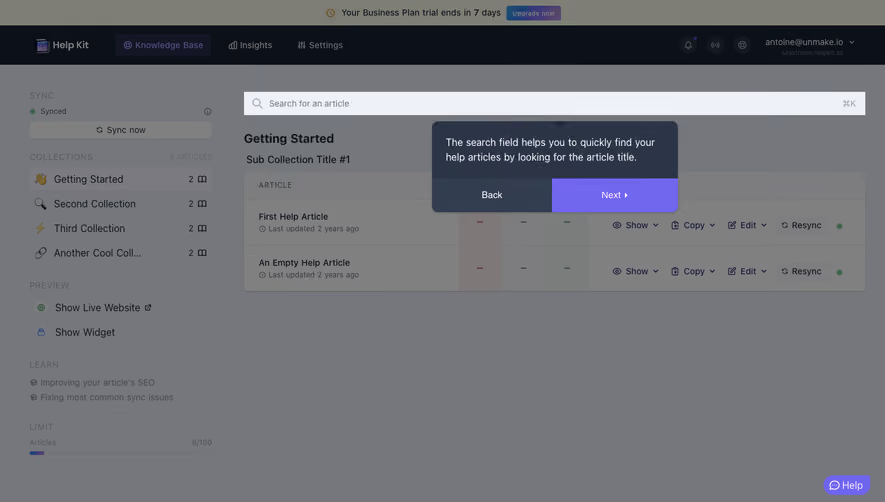
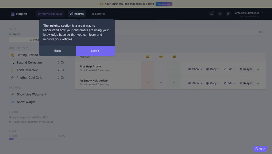
Help Kit Product Tour

Help Kit
Turn Notion into a Help or Doc site
Designed by
No items found.

Bookmark
Bookmark

Design with AI
Thank you! Your submission has been received!
Oops! Something went wrong while submitting the form.
# Design from Reference: Help Kit Product Tour
Create an original, high-fidelity visual design inspired by the reference. Prioritize composition, typography, colors, spacing, and component styling over technical implementation.
## Reference
- **Product:** Help Kit
- **Category:** Product Tour
- **Screenshot:** https://cdn.prod.website-files.com/5e9dc792e1210c5325f7ebbc/6acbbb57151c40fa40745eb6_6acb71c0994832179b59116c_cms-357c297124be27f488e5f2fe.webp
Analyze the screenshot first. If inaccessible, request it rather than guessing.
## Content
{{content.instructions}}
{{content.data}}
Preserve essential messaging and factual accuracy. Adapt structure and copy length for visual balance; never invent product claims.
## Visual Design
### Overall aesthetic
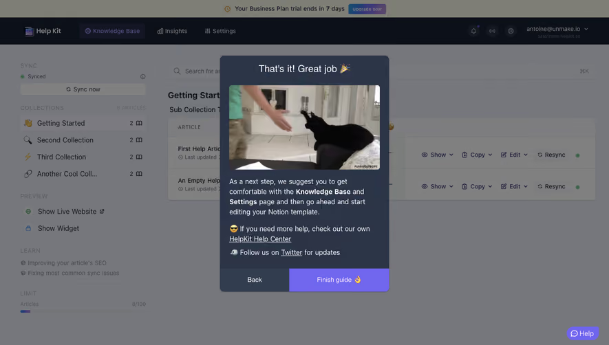
- **Character:** A product-tour overlay dims a knowledge-base dashboard while a dark navy instruction popover and bright violet Next action guide attention to an individual Resync control.
- **Tone:** The underlying interface is practical and list-based; the tour adds a clear instructional layer without replacing the application context.
- **Observed scale:** The source measures 1440 × 821 pixels. Sizes below refer to approximate image pixels; CSS estimates assume an unverified 1× capture.
### Page composition
- **Top layers:** A pale trial-status strip sits above a dark product navigation bar containing Help Kit branding, Knowledge Base, Insights, Settings, and account utilities.
- **Left sidebar:** Sync status and Sync now appear above collection links, preview actions, learning links, and an article-limit indicator.
- **Main workspace:** A wide search field sits above a collection heading and a two-row article table.
- **Tour popover:** A dark rounded panel approximately 400 × 196 pixels overlays the table’s right-center area.
- **Popover footer:** Back and Next occupy equal-width segments beneath the explanatory copy; Next is violet.
- **Target highlight:** One white Resync control remains bright beside the popover while most of the application is dimmed.
- **Support:** A small violet Help pill sits near the lower-right corner.
### Information hierarchy
- **Instruction priority:** The popover’s white paragraph is the primary reading content.
- **Target connection:** The bright Resync button visually ties the explanation to an individual article action.
- **Navigation:** Back is secondary; the filled violet Next segment is the main tour continuation.
- **Underlying context:** Collection and article labels remain visible enough to explain where the target sits.
- **State scope:** The screenshot explains resyncing but does not show a resync operation, progress, or success result.
- **Privacy:** Captured account identifiers and site details are contextual data and should not be reused in demonstrations.
### Typography
- **Typeface appearance:** A neutral sans-serif is used throughout. Exact family is unverified.
- **Tour paragraph:** Approximately 16–17 pixels, regular, with 24-pixel line-height. One phrase is bold for emphasis.
- **Tour controls:** Around 14–15 pixels, centered in broad footer segments.
- **Workspace headings:** Approximately 20 pixels, semibold; article titles and sidebar links around 14–16 pixels.
- **Metadata:** Updated timestamps, group labels, counts, and quota text are smaller and muted.
- **Alignment:** Popover copy is left aligned; button labels are centered.
### Colors & surfaces
- **Measured dimmed canvas:** #75777C dominates the overlaid workspace, with nearby #77797D and #7D7D7E variations.
- **Measured dark navigation:** #0C1018 appears in the dark application bar.
- **Measured popover:** #2C3447 supplies the navy instruction-panel family.
- **Measured violet:** #7167EF appears in the strong tour-action family.
- **Other dimmed tones:** #808080 and #7E7E75 occur across pale surfaces under the scrim.
- **Contrast:** White popover text and the bright target button stand above the muted background.
- **Depth:** The popover has small rounded corners and a soft shadow; the table remains a flat outlined surface beneath the scrim.
### Components
- **Trial strip:** A small clock symbol, trial-end message, and Upgrade now control form a centered upper band.
- **Product tabs:** Knowledge Base is visibly selected in the dark header.
- **Sync module:** A green status dot, status label, information symbol, and wide Sync now button occupy the sidebar’s top.
- **Collection list:** Four rows combine emoji-like icons, labels, and article counts; the first is selected.
- **Article table:** Two article rows include title/timestamp, reaction-like columns, Resync actions, and green status dots.
- **Tour panel:** A dark content area contains a four-line explanation of individual-article resyncing.
- **Tour footer:** Back uses muted navy; Next uses violet and a small right chevron.
- **Highlighted target:** A white rectangular Resync button with a refresh symbol is isolated beside the instruction panel.
- **Help launcher:** A violet pill combines a message symbol and Help label.
- **Unshown states:** Earlier/later tour steps, open articles, resync progress, errors, and completed tour are not visible.
### Visual rhythm
- **Layer focus:** The scrim suppresses dense navigation/table content while leaving the tour and target easy to locate.
- **Compact instruction:** Paragraph and two-button footer form a self-contained module.
- **Underlying alignment:** Search, heading, and table share a stable main-column left edge.
- **Sidebar grouping:** Sync, collections, preview, learning, and limit sections use clear vertical separation.
- **Accent repetition:** Violet connects selected navigation, tour continuation, and support without dominating the whole workspace.
### Responsive
- **Evidence limit:** Only a desktop tour step is captured. Mobile positioning and target-tracking behavior are unverified.
- **Recommended tour placement:** Reposition the popover within viewport bounds and preserve a clear relationship to the highlighted target.
- **Recommended narrow layout:** Collapse the sidebar and allow table content to adapt without hiding the resync action.
- **Recommended controls:** Keep Back/Next large enough for touch and provide keyboard navigation, focus management, and an accessible exit.
- **Recommended semantics:** Announce the tour step and target purpose without requiring users to interpret dimming alone.
### Adaptation guidance
- **Preserve contextual teaching:** Explain one action while highlighting its actual location in the interface.
- **Do not imply execution:** Showing a resync target is distinct from starting or completing a resync.
- **Define tour behavior:** Specify progression, dismissal, persistence, and handling when the target is unavailable.
- **Use accessible layers:** Manage focus and ensure background controls cannot be activated unintentionally during guided steps.
- **Use safe data:** Replace account, site, article, and trial details with approved examples.
- **Build from measured tokens:** Dark navy popover, violet continuation, white target highlight, and neutral scrim provide the core tour treatment.
Use this context to reproduce the reference's visual language: layout, typography, colors, spacing, borders, radii, and distinctive elements. The screenshot takes priority if descriptions conflict.
## Direction
{{preferences.fidelityInstructions}}
## Output
{{output.instructions}}
Deliver a polished, cohesive design with precise alignment, hierarchy, and spacing. Produce the requested visual artifact, not just a description. If unsupported, explain the limitation.


Category
Patterns



Added on
February 27, 2023


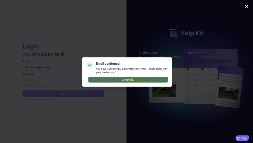


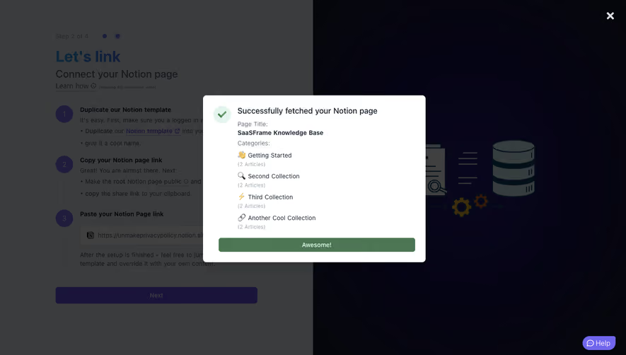
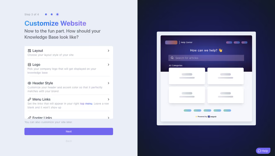




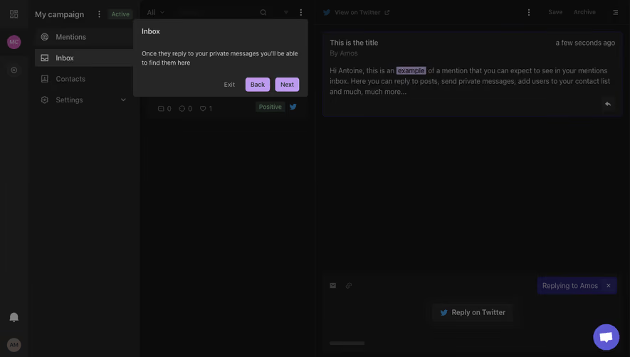
Similar screens




Upgrade to SaaSFrame Pro now to see similar examples.
Monthly
$18 /month
Billed $18 monthly
Browse all screens & flows
Filter and search screens & flows
Search text in screenshots
Access Figma files
Access mobile versions
Join now
Quarterly
$16 /month
Billed $48 quarterly
Browse all screens & flows
Filter and search screens & flows
Search text in screenshots
Access Figma files
Access mobile versions
Join now
Yearly
$15 /month
Billed $180 yearly
Browse all screens & flows
Filter and search screens & flows
Search text in screenshots
Access Figma files
Access mobile versions
Join now