Overall Style and Aesthetic
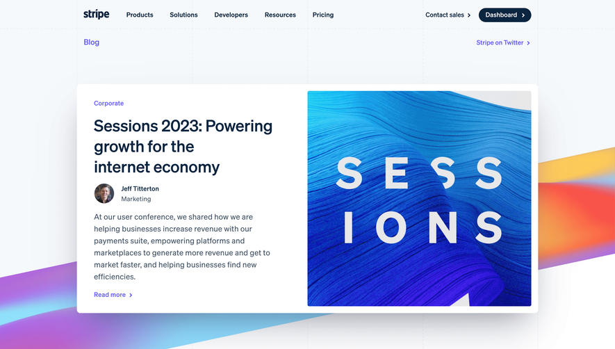
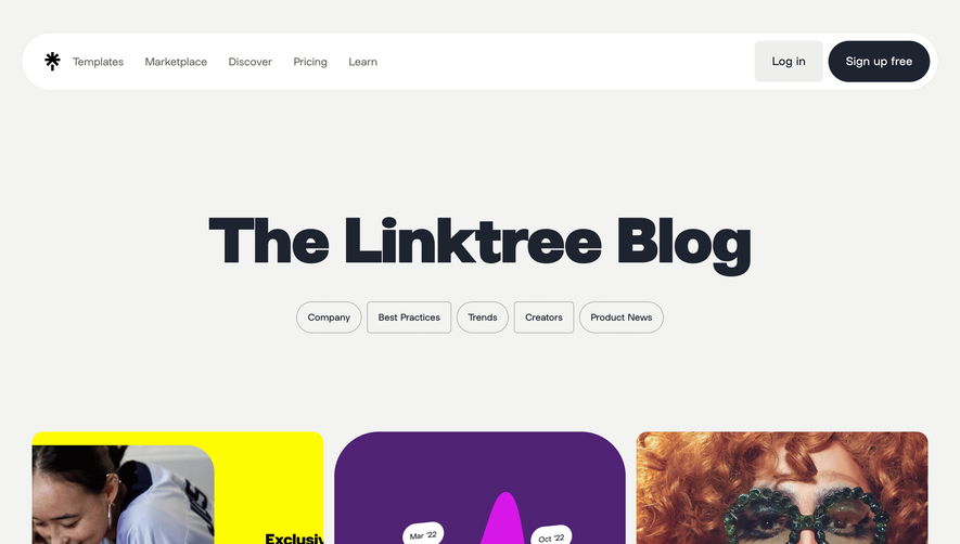
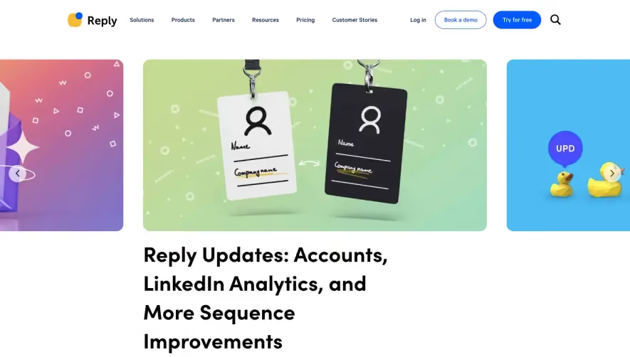
The Deel Blog page exemplifies a modern, professional aesthetic with a subtle touch of playfulness. Its clean, spacious layout highlights minimalism, while refined UI accents—such as rounded containers and soft drop shadows—promote a sense of trust and approachability. The visual language is sophisticated but never cold, ensuring it feels both cutting-edge and accessible. Layout and Structure
A sticky navigation bar with drop-downs and a clear search feature encourages seamless exploration. The central hero area is understated, providing immediate filtering options for categories and timely, trending posts. Each blog article snippet is arranged in a responsive grid with excellent whitespace, allowing users to scan content without feeling overwhelmed. The footer—robust and multipurpose—provides navigational links, social media icons, and legal information, balancing utility and style. Visual Elements
Subtle illustrations, custom icons, and thoughtfully chosen author images inject personality into each post, while restrained animations drive engagement without distraction. Article thumbnails feature diverse, clean imagery, enhancing the overall reading experience and breaking up text-heavy areas. Color Palette and Typography
A sophisticated blend of deep navy blue, crisp white, and energetic teal dominate the palette, delivering vibrancy and clarity. Accents of warm coral elevate featured content, drawing the eye without overwhelming. Typefaces are modern sans-serifs with clear hierarchy—headlines are bold and sizable, while summaries use softer weights for balance and effortless skimming. User Experience Patterns & Unique Design Choices
Persistent CTAs guide readers to subscribe or explore resources, while quick-filters and endless scroll foster content discovery. Microinteractions—like hover states and expanding cards—signal interactivity. The flexible card-based structure, combined with the editor’s picks highlight, showcases a thoughtful take on content hierarchy. The tone is trustworthy, energetic, and innovative, offering users a frictionless and visually inspiring experience.