Generate a new design based on this screen using your own content.
Thank you! Your submission has been received!
Oops! Something went wrong while submitting the form.
# Design from Reference: Atlas Welcome Screen
Create an original, high-fidelity visual design inspired by the reference. Prioritize composition, typography, colors, spacing, and component styling over technical implementation.
## Reference
- **Product:** Atlas
- **Category:** Welcome Screen
- **Screenshot:** https://cdn.prod.website-files.com/5e9dc792e1210c5325f7ebbc/6685c81146e4792b4c787af6_1HzN-BoaM46K_KArqSLpfLU1cjlNAQT_X5HnvqOiRDc.webp
Analyze the screenshot first. If inaccessible, request it rather than guessing.
## Content
{{content.instructions}}
{{content.data}}
Preserve essential messaging and factual accuracy. Adapt structure and copy length for visual balance; never invent product claims.
## Visual Design
Use this context to reproduce the reference's visual language: layout, typography, colors, spacing, borders, radii, and distinctive elements. The screenshot takes priority if descriptions conflict.
## Direction
{{preferences.fidelityInstructions}}
## Output
{{output.instructions}}
Deliver a polished, cohesive design with precise alignment, hierarchy, and spacing. Produce the requested visual artifact, not just a description. If unsupported, explain the limitation.
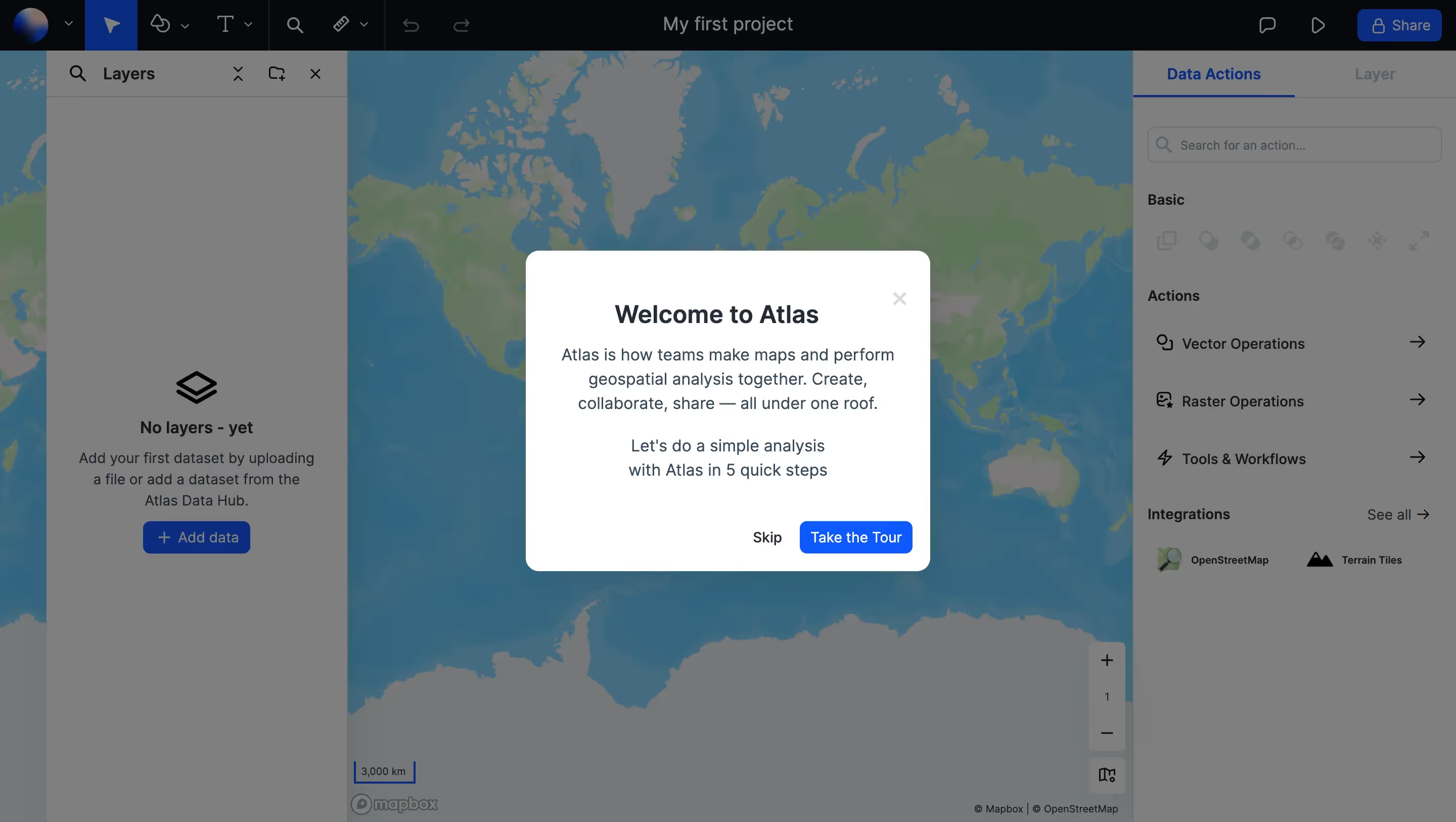
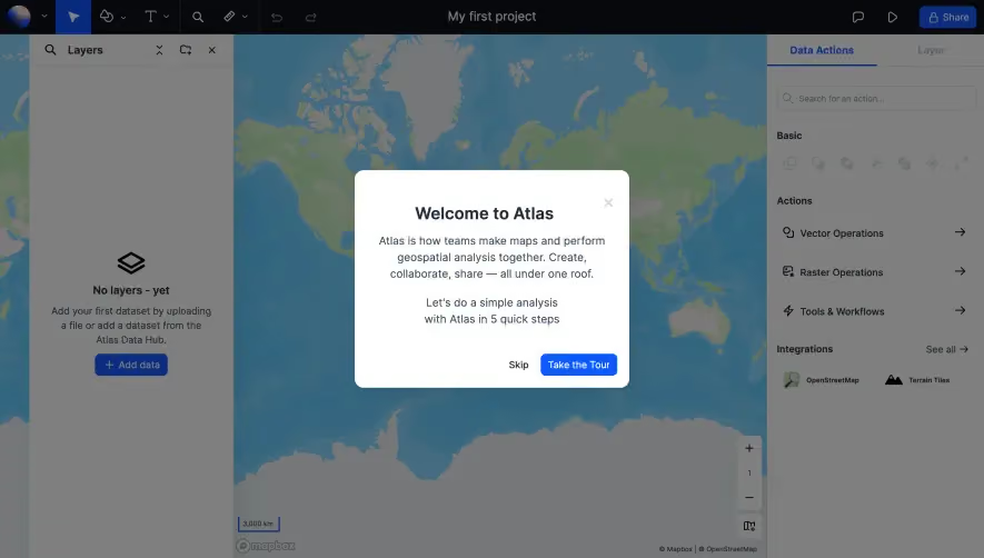
That centered welcome dialog is doing all the heavy lifting here. Clean white card, generous padding, and a dead-simple CTA hierarchy. "Skip" in plain text, "Take the Tour" in a bold blue button. No confusion about what they want you to do. The copy is tight too. Five quick steps. That's a promise that respects your time.
A Workspace That Doesn't Overwhelm
Behind the modal you can already see the full app layout and it feels approachable. Left panel for layers, right panel for data actions, map in the center. The dark top toolbar with minimal icons keeps things functional without clutter. Mapbox-powered base map with muted earth tones lets your actual data be the star later. The "No layers - yet" empty state with that diamond icon is a small touch but it tells you exactly where to start.
What Makes It Stand Out
The right sidebar organizing Vector Operations, Raster Operations, and Tools & Workflows into expandable rows is super scannable. Typography is consistent and restrained throughout. Nothing fights for attention. It just works.