Overall Style and Aesthetic
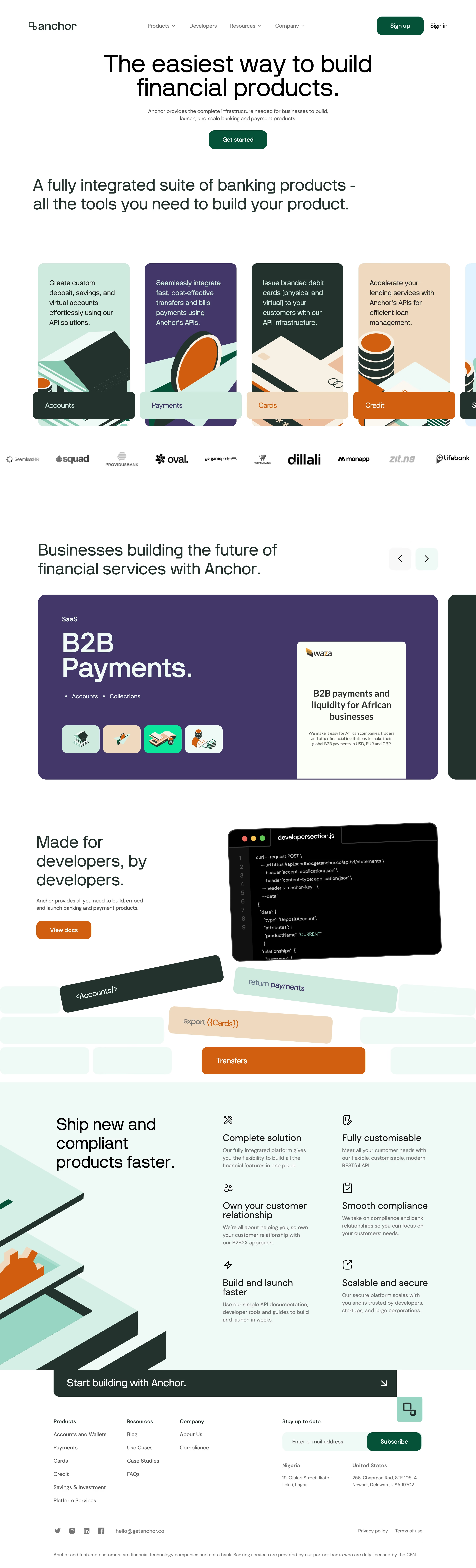
Anchor’s homepage embodies a sleek, modern, and tech-forward aesthetic tailored for today’s SaaS audience. Crisp lines, generous white space, and subtle gradients produce a balanced and calming interface. The vibe delivers quiet confidence—neither overly flashy nor stark—positioning Anchor as both innovative and approachable. Layout and Structure
The layout is structured with clarity and intent. A bold hero section introduces the product’s value proposition with prominent CTAs. Following this, the features section cleanly breaks down core functionalities, using grids for easy visual scanning. User testimonials highlight social proof, while a concise pricing area simplifies comparison. The footer consolidates navigation, social links, and legal information effectively. Visual Elements
Illustrations featuring abstract, geometric designs punctuate key sections, lending a sense of sophistication and dynamism. Micro-animations, such as subtle pulse effects on CTA buttons, enliven the page without distraction. Lightweight, friendly iconography guides attention to essential content, and hero imagery is used sparingly to keep focus where it matters. Color Palette and Typography
A cool, modern palette mixes navy, blue, and soft purples—evoking calm and reliability throughout. Clean sans-serif typography (notably, the use of Inter or a similar web font) establishes a clear visual hierarchy, with deliberate weight and size contrasts for headings, subheadings, and body copy. User Experience Patterns
Navigation is streamlined with a fixed top bar for swift access. CTAs are graphically distinctive, well-positioned, and encourage engagement. Scroll interactions are refined; transitions are smooth and content stacks naturally on mobile and desktop. Forms are concise and accessible, supporting rapid onboarding. Unique or Notable Design Choices
The home page’s modular laddering of sections provides a logical, story-driven experience—each scroll reveals additional context in digestible pieces. The judicious use of modern gradients and lively, yet professional, illustration sets Anchor apart, infusing utility with character. The site’s tone radiates credibility and forward-thinking energy, catering perfectly to its SaaS audience.