
Thank you! Your submission has been received!
Oops! Something went wrong while submitting the form.
Get SaaSFrame Pro
Monthly
$18
Quarterly
$48
Yearly
$180
Upgrade to access this feature
Browse all screens & flows
Filter and search screens & flows
Access Figma files
Access mobile versions
Bookmark screens & flows
Join now
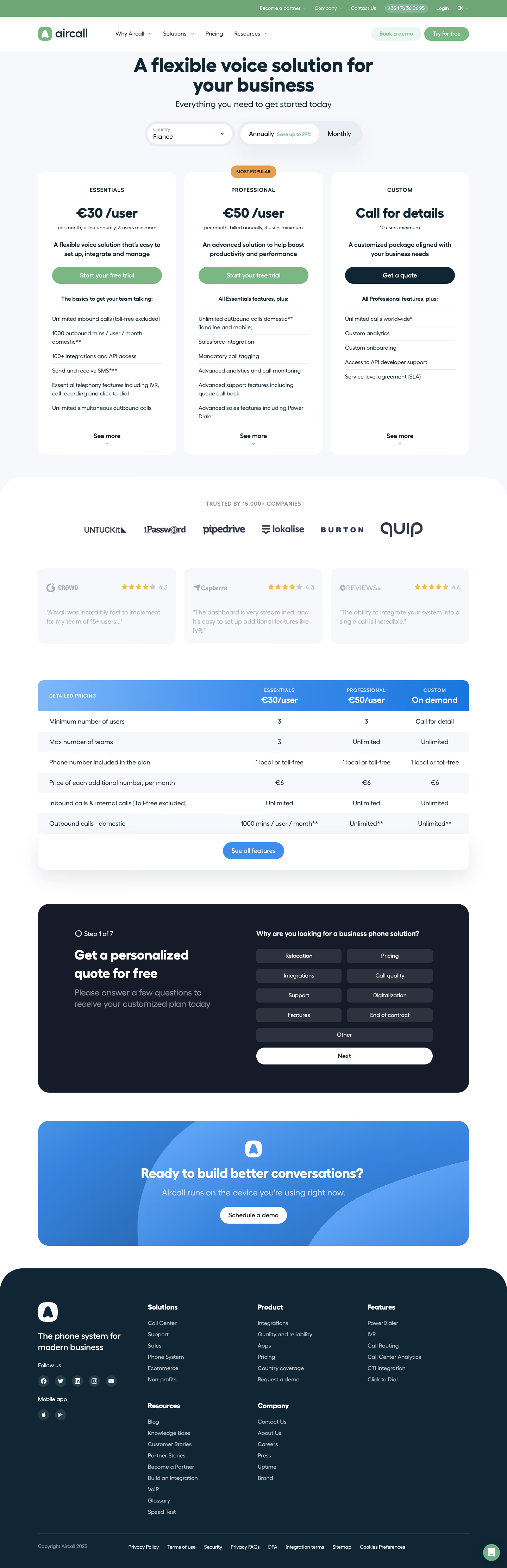

Aircall Pricing Page

Aircall
Cloud Phone System
Designed by
No items found.

Bookmark
Bookmark

Design with AI
Thank you! Your submission has been received!
Oops! Something went wrong while submitting the form.
# Design from Reference: Aircall Pricing Page
Create an original, high-fidelity visual design inspired by the reference. Prioritize composition, typography, colors, spacing, and component styling over technical implementation.
## Reference
- **Product:** Aircall
- **Category:** Pricing Page
- **Screenshot:** https://cdn.prod.website-files.com/5e9dc792e1210c5325f7ebbc/6acb72c0018523cfee2da32e_6acb704db7be405e66e8e66f_cms-b42084b017e4d8d04e9daa28.webp
Analyze the screenshot first. If inaccessible, request it rather than guessing.
## Content
{{content.instructions}}
{{content.data}}
Preserve essential messaging and factual accuracy. Adapt structure and copy length for visual balance; never invent product claims.
## Visual Design
### Overall aesthetic
- **Character:** A rounded business-pricing page uses dark navy headings, soft gray-blue backgrounds, green trial actions, blue comparison/CTA bands and generous white space.
- **Evidence:** The image measures 1440 × 4453 pixels. All four readable portions were inspected; CSS sizes assume an unverified 1× capture density.
### Page composition
- **Header:** A slim green utility bar sits above a white brand/navigation row.
- **Pricing hero:** A centered heading/subtitle precedes country and billing controls, then three tall plan cards.
- **Trust/comparison:** Customer logos and three review panels lead into a four-column detailed-pricing table.
- **Quote flow:** A dark rounded block presents Step 1 of 7, explanatory copy and a grid of selectable reasons with Next.
- **Closing:** A blue demo banner precedes a large dark footer containing brand, five link groups, social/store icons and legal links.
### Information hierarchy
- **Offer:** Large heading leads into Essentials, Professional and Custom cards, with the middle plan carrying an orange Most Popular badge.
- **Plan details:** Price, billing/minimum note, short positioning statement and action precede feature lists.
- **Comparison:** A blue header repeats the plans/prices above alternating pale rows.
- **Conversion:** The quote questionnaire and final demo banner provide two later routes after the pricing information.
### Typography
- **Hero:** Approximately 56–58 pixels bold, with tight leading; subtitle about 24 pixels.
- **Prices:** Around 38–40 pixels extra-bold; plan labels are uppercase around 16 pixels with increased tracking.
- **Body/features:** Roughly 16 pixels with 24-pixel leading. Section/CTA headings are around 36–40 pixels bold.
- **Identity:** Rounded geometric sans-serif forms are visible; exact family is unverified.
### Colors & surfaces
- **Measured palette:** ICC-to-sRGB sampling identifies #FFFFFF as cards/canvas, #F7F8FC as pale backgrounds and #112634 as deep navy.
- **Measured dark layers:** #151B28 defines the quote-flow region and #2D323E its option buttons.
- **Measured green:** #6EA678 occurs in the green brand/action family.
- **Accent roles:** Orange highlights the popular badge and review stars; blue gradients distinguish detailed pricing and the closing banner.
- **Depth:** Broad corner radii and soft shadows give pricing/table regions a gentle raised appearance.
### Components
- **Selectors:** Country dropdown and annual/monthly segmented control use thick pale surrounds and rounded pill geometry.
- **Plan cards:** Three approximately 392-pixel-wide panels have large 24-pixel radii, 40-pixel side padding and broad rounded actions.
- **Feature lists:** Fine rules divide rows; See more with a small green chevron sits at each card bottom.
- **Reviews:** Three pale rounded cards pair rating-brand marks/stars with short muted excerpts.
- **Comparison:** A rounded table has a blue-gradient header, broad feature column and three aligned plan columns, ending with See all features.
- **Quote questionnaire:** A two-column dark panel pairs progress/title with nine reason options and a full-width white Next pill.
- **Footer:** A large rounded-top navy region organizes brand/social/store controls left and link groups right.
### Visual rhythm
- **Shared bounds:** Pricing, reviews, comparison and CTA blocks use a centered roughly 1220-pixel content width.
- **Card cadence:** Equal card widths and roughly 24-pixel gutters support comparison; rows have generous vertical leading.
- **Section spacing:** Large white gaps distinguish trust, table, questionnaire and final demo.
- **Shape continuity:** Pills and broad rounded panels repeat from selectors through footer.
### Responsive
- **Observed scope:** One desktop France/annual pricing state and first quote step are shown.
- **Recommended layout:** Stack plan cards, wrap billing controls and provide a usable narrow-screen comparison rather than shrinking all columns.
- **Recommended questionnaire:** Stack explanation and options, preserve clear selected state and expose progress accessibly.
- **Recommended footer:** Collapse link groups and retain readable legal/social targets.
### Adaptation guidance
- **Pricing sequence:** Present plan selection, trust evidence, detailed differences and tailored-quote support in that order.
- **Content accuracy:** Verify country-specific prices, minimums and billing terms before reuse.
- **Visual system:** Reuse navy type, green purchase actions, blue comparison bands and generous rounded geometry.
- **Implementation:** Confirm font/density and define selector, expansion, questionnaire and focus states beyond the single captured view.
Use this context to reproduce the reference's visual language: layout, typography, colors, spacing, borders, radii, and distinctive elements. The screenshot takes priority if descriptions conflict.
## Direction
{{preferences.fidelityInstructions}}
## Output
{{output.instructions}}
Deliver a polished, cohesive design with precise alignment, hierarchy, and spacing. Produce the requested visual artifact, not just a description. If unsupported, explain the limitation.


Category
Patterns
No items found.


Added on
March 7, 2023
Similar screens



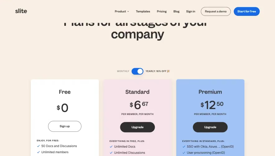

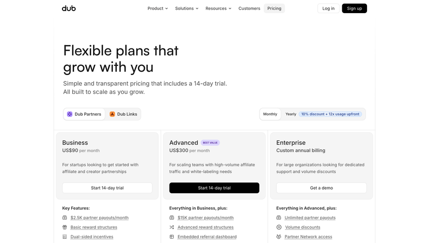

Upgrade to SaaSFrame Pro now to see similar examples.
Monthly
$18 /month
Billed $18 monthly
Browse all screens & flows
Filter and search screens & flows
Search text in screenshots
Access Figma files
Access mobile versions
Join now
Quarterly
$16 /month
Billed $48 quarterly
Browse all screens & flows
Filter and search screens & flows
Search text in screenshots
Access Figma files
Access mobile versions
Join now
Yearly
$15 /month
Billed $180 yearly
Browse all screens & flows
Filter and search screens & flows
Search text in screenshots
Access Figma files
Access mobile versions
Join now