Overall Style and Aesthetic
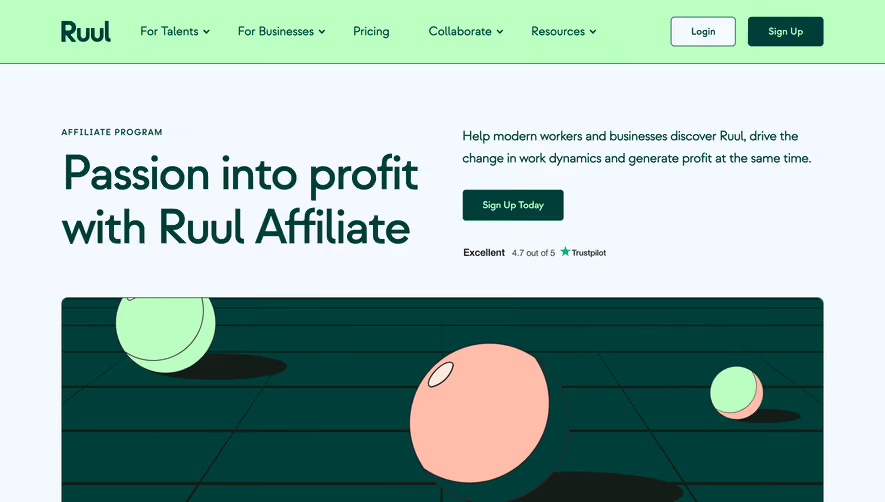
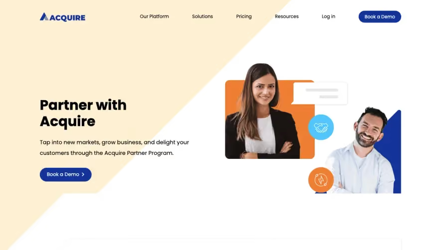
Winden’s Partner Program page embodies a crisp, contemporary SaaS aesthetic, toeing the line between minimalist and inviting professionalism. White space abounds, giving each element ample room to breathe, while soft, modern gradients and purposeful accent colors create a sense of sophistication without overwhelming. The visual language feels progressive yet approachable—ideal for fostering trust with potential partners. Layout and Structure
The page follows a clear and digestible layout. The hero section features impactful typography and a concise value proposition, paired with engaging vector artwork. As you scroll, sections cascade naturally: benefits presented in modular cards, a visually distinct application CTA, and succinct FAQs. The structure avoids clutter, guiding the visitor through short, focused blocks of content. Visual Elements
Illustrations are a standout: abstract yet friendly, blending geometric shapes with brand colors to keep the experience on-brand and visually dynamic. Iconography is streamlined and meaningful, supporting scannability. No superfluous photography or video ensures nothing distracts from the intended action. Color Palette and Typography
A base of calming whites and soft grays is accented by rich teals and muted purples, giving the page freshness and memorability. Bold, modern sans-serif headings create hierarchy, while lightweight body fonts ensure legibility and openness. User Experience Patterns & Notable Choices
Navigation is efficient—persistent header, judicious CTAs, and a frictionless application form. Gently animated transitions add polish without excess. The partner-focused messaging, accentuated by trust signals and concise copy, positions Winden as credible and partner-centric. Overall, the tone radiates warmth, reliability, and modernity, making it a prime example for SaaS UX inspiration.