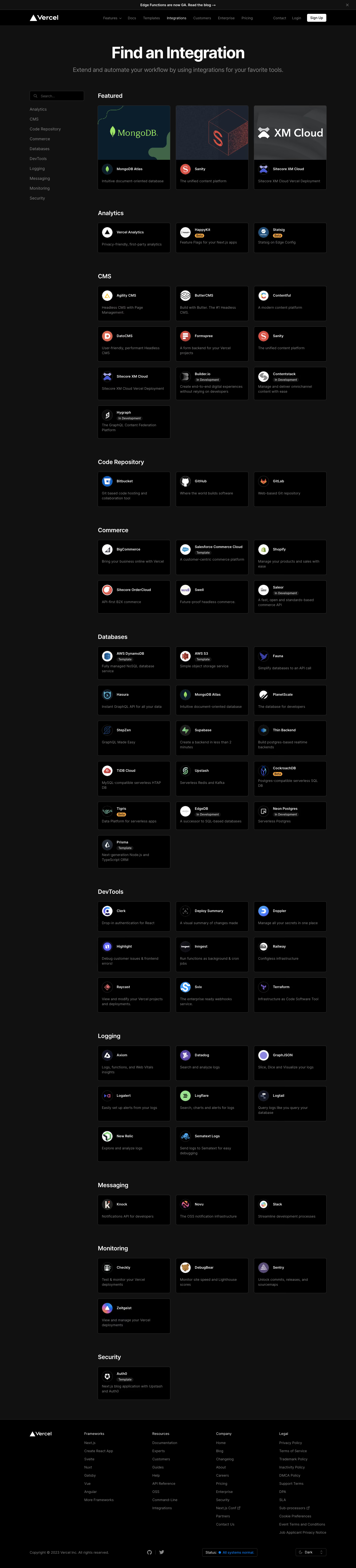
Generate a new design based on this screen using your own content.
Thank you! Your submission has been received!
Oops! Something went wrong while submitting the form.
# Design from Reference: Vercel Integrations Page
Create an original, high-fidelity visual design inspired by the reference. Prioritize composition, typography, colors, spacing, and component styling over technical implementation.
## Reference
- **Product:** Vercel
- **Category:** Integrations Library
- **Screenshot:** https://cdn.prod.website-files.com/5e9dc792e1210c5325f7ebbc/6acbbebc39e7f22db40287fa_6acbbdfb405d8e0fbc39467b_cms-4e64db8923cfc8bb2f8c1ba3.webp
Analyze the screenshot first. If inaccessible, request it rather than guessing.
## Content
{{content.instructions}}
{{content.data}}
Preserve essential messaging and factual accuracy. Adapt structure and copy length for visual balance; never invent product claims.
## Visual Design
Use this context to reproduce the reference's visual language: layout, typography, colors, spacing, borders, radii, and distinctive elements. The screenshot takes priority if descriptions conflict.
## Direction
{{preferences.fidelityInstructions}}
## Output
{{output.instructions}}
Deliver a polished, cohesive design with precise alignment, hierarchy, and spacing. Produce the requested visual artifact, not just a description. If unsupported, explain the limitation.
``` Vercel’s Integrations page embodies a distinctly minimalist, modern design, exuding a sense of effortless sophistication and professional polish. The visual language is clean, with generous white space, allowing content and interactive elements to breathe. Subtle accents create a UI that feels both focused and inviting—instantly establishing a tone of reliability and forward-thinking innovation. ```html
Layout and Structure
``` The structure is intuitive and scannable, beginning with a concise hero section introducing integrations and a universal search field, inviting users to explore the ecosystem. Below, integrations are categorized with sticky navigation tabs, enabling seamless browsing without overwhelming the user. Each integration is presented in a flexible, grid-based card layout, making dense information feel approachable and organized. The sticky call-to-action enhances persistent discoverability. ```html
Visual Elements
``` Visual flourishes are understated but impactful: sharp vector icons for each partner integration, subtle hover animations on cards, and crisp logos that feel at home on both light and dark backgrounds. No excessive photography or illustration—the interface directs attention to value, not distraction. Animation is used sparingly and purposefully to signify interactivity. ```html
Color Palette and Typography
``` The dominant palette leans heavily on monochromatic whites and greys, offset with bold black and the occasional accent blue to draw focus toward CTAs and active tabs. Typography is decisive—using modern sans-serif fonts (like Geist) with clear hierarchy: large headers, readable body text, and weight contrasts that improve scannability and visual balance. ```html
User Experience Patterns & Unique Touches
``` Navigation is frictionless, anchored by a sticky sub-nav and instantaneous search/filtering that responds as you type. CTAs are clear without being intrusive. Notable is the lack of clutter: every element serves a purpose, resulting in a user experience that feels both simplified and powerful. This fosters trust, encourages exploration, and inspires confidence—making Vercel’s Integration Marketplace an exemplary reference for SaaS design excellence.