
Thank you! Your submission has been received!
Oops! Something went wrong while submitting the form.
Get SaaSFrame Pro
Monthly
$18
Quarterly
$48
Yearly
$180
Upgrade to access this feature
Browse all screens & flows
Filter and search screens & flows
Access Figma files
Access mobile versions
Bookmark screens & flows
Join now
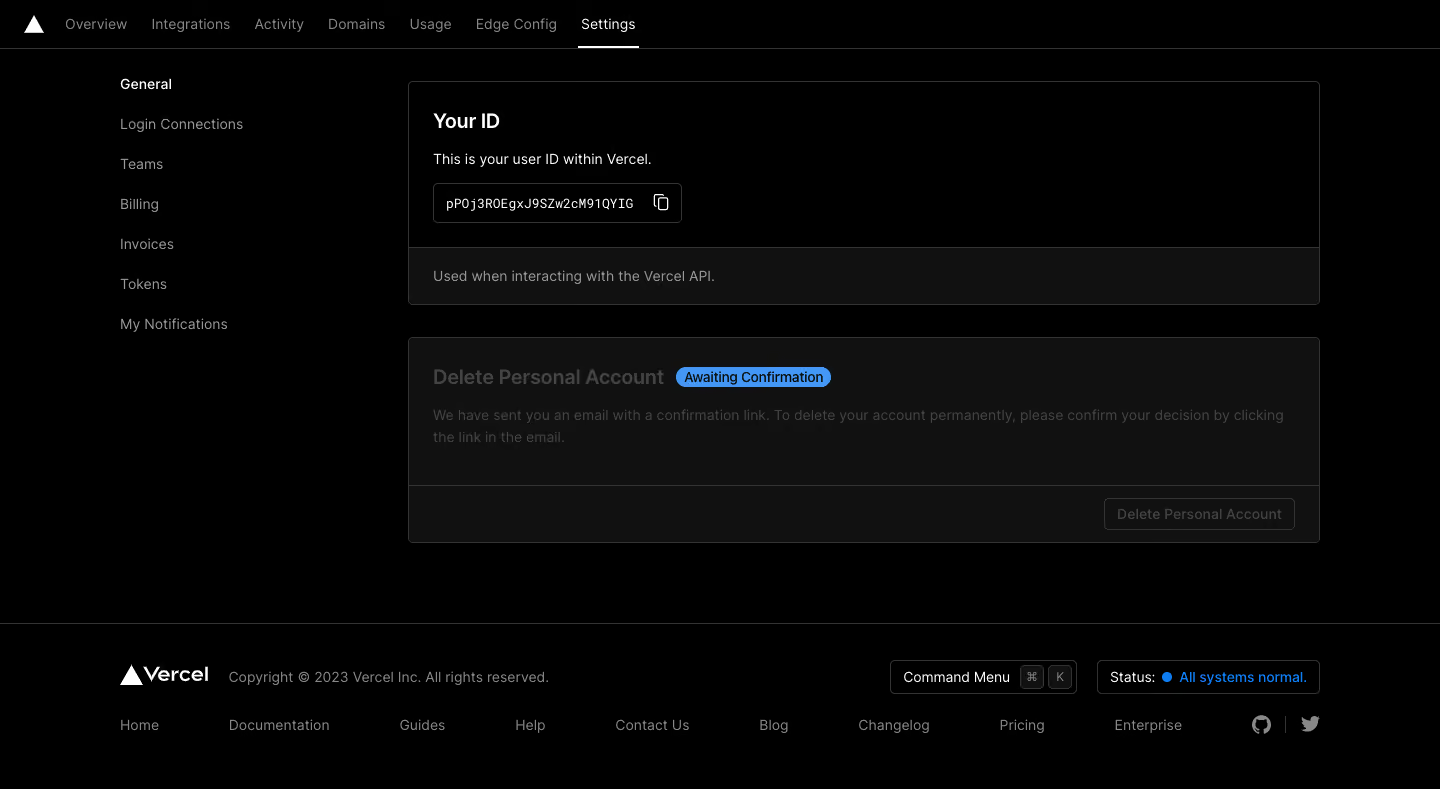
Vercel Delete Account

Vercel
Build Fast and Reliable Sites
Designed by
No items found.

Bookmark
Bookmark

Design with AI
Thank you! Your submission has been received!
Oops! Something went wrong while submitting the form.
# Design from Reference: Vercel Delete Account
Create an original, high-fidelity visual design inspired by the reference. Prioritize composition, typography, colors, spacing, and component styling over technical implementation.
## Reference
- **Product:** Vercel
- **Category:** Delete
- **Screenshot:** https://cdn.prod.website-files.com/5e9dc792e1210c5325f7ebbc/6acc0d39ea6cae5cb6f1c264_6acc08488ffc8e09d2b19b25_cms-63ba97b0b61c2a7f8a8c85ad-v3.webp
Analyze the screenshot first. If inaccessible, request it rather than guessing.
## Content
{{content.instructions}}
{{content.data}}
Preserve essential messaging and factual accuracy. Adapt structure and copy length for visual balance; never invent product claims.
## Visual Design
### Overall aesthetic
- **Style:** Minimal dark account-settings page with black canvas, thin gray outlines and sparse white typography.
- **Character:** The interface is utilitarian and subdued, with a blue confirmation-status pill supplying the main color accent.
- **Capture:** The screenshot measures 1440 × 789 image pixels. CSS estimates assume approximately 1:1 capture scale; browser scale and exact font identity are unverified.
### Page composition
- **Top navigation:** A 48-pixel-high horizontal bar contains the triangular brand mark and product areas; Settings is selected with a white underline.
- **Settings sidebar:** A narrow link list begins around x120, with General selected and other account categories stacked beneath.
- **Main column:** An approximately 912-pixel-wide region starts around x408 and contains two bordered panels.
- **Identity panel:** A title, short explanation and copyable identifier sit above a dark footer strip describing API use.
- **Deletion panel:** A dimmed account-deletion section contains a title, confirmation-status badge, explanatory copy and a disabled-looking action in its lower strip.
- **Footer:** A full-width rule separates branding/copyright, command and status controls, a horizontal link row and social icons.
### Information hierarchy
- **Current location:** Settings is selected in the top bar and General is brighter in the left navigation.
- **Identity information:** The user-ID title and explanation are the brightest main-panel content, followed by the code-style value and copy icon.
- **Deletion state:** A blue Awaiting Confirmation pill sits beside the dimmed deletion heading.
- **Confirmation message:** Muted copy explains that an email confirmation step remains; the action below appears disabled.
- **Footer utilities:** Command-menu and system-status controls are more visibly bounded than the surrounding plain links.
- **State scope:** The capture shows an awaiting-confirmation state, not a completed deletion or an active confirmation dialog.
### Typography
- **Family:** A clean UI sans-serif is visible; exact identity is unverified.
- **Panel titles:** Approximately 20-pixel CSS size, semibold, with around 28-pixel line height.
- **Body and navigation:** Approximately 14 pixels with 22-pixel line height.
- **Identifier:** A small monospace-style treatment, approximately 13 pixels, visually distinguishes the account value.
- **Status badge:** Approximately 14 pixels with compact line height.
- **Footer:** Approximately 14 pixels, with muted copyright/navigation text and a stronger white wordmark.
### Colors & surfaces
- **Measured canvas:** Black #000000 dominates the page.
- **Measured panel strips:** Very dark gray #111111 supports the identity footer and deletion panel.
- **Measured boundaries:** Gray #333333 outlines panels and controls; #444444 occurs in subdued text/control pixels.
- **Measured confirmation accent:** Blue #4398F7 fills the status pill.
- **Measured text:** White #FFFFFF supports active content; gray #888888 appears among secondary text pixels.
- **Depth:** There are no visible shadows or gradients; boundaries and small surface shifts create structure.
### Components
- **Selected tab:** Settings uses a thin white underline approximately 60 pixels wide.
- **Settings links:** Plain text rows recur at roughly 40-pixel vertical intervals, with the active item brighter.
- **Identity card:** Approximately 912 × 224 pixels, with 4-pixel corners and 24-pixel padding.
- **Copyable identifier:** A compact outlined box contains a monospace value and copy icon. The literal account value is not a design token.
- **Card footer strip:** A thin divider separates the identity explanation from a dark 58-pixel-high contextual strip.
- **Deletion card:** Approximately 912 × 206 pixels; its dimmed content and bottom-right outlined button visually indicate an unavailable repeat action.
- **Status pill:** A short blue rounded badge sits inline with the deletion heading.
- **Footer controls:** The command-menu button includes two small keyboard-key badges; a separate outlined status control combines label, colored dot and status text.
- **Social icons:** Small muted repository/social marks sit at the far right of the footer.
- **Interaction scope:** Copy, menu and account controls are visible affordances only; no action outcome beyond the displayed status is evidenced.
### Visual rhythm
- **Main alignment:** Both panels share a left/right edge and a 32-pixel vertical gap.
- **Internal spacing:** Titles, descriptions and controls follow a compact 16–20-pixel rhythm inside 24-pixel insets.
- **Sidebar separation:** A broad horizontal gap separates the left settings list from the content panels.
- **Whitespace:** Open black space beneath the panels separates account controls from the footer.
- **Footer cadence:** Branding and utility controls share one row, with navigation/social details on a lower row.
### Responsive
- **Recommendation — settings navigation:** Collapse or horizontally adapt the left category list on narrow screens.
- **Recommendation — panels:** Make the main column fluid and let title/status combinations wrap without overlap.
- **Recommendation — identifier:** Preserve copy access while truncating or scrolling long values safely.
- **Recommendation — footer:** Wrap links and utility controls into several rows.
- **Recommendation — status:** Keep awaiting-confirmation text explicit rather than relying on dimming alone. No mobile layout is shown.
### Adaptation guidance
- **Preserve state clarity:** Show the pending email confirmation distinctly from a completed destructive action.
- **Reuse dark settings tokens:** Keep black canvas, fine gray borders, 24-pixel insets and restrained corner rounding.
- **Separate information from action:** Maintain independent identity and deletion modules with their own contextual footer strips.
- **Keep identifiers secondary:** Use a monospace value with a clear copy affordance without elevating it above the panel purpose.
- **Define disabled semantics:** Pair the dimmed deletion presentation with appropriate disabled control behavior and accessible status messaging.
- **Implement unseen transitions separately:** Confirmation-email handling, cancellation and final deletion feedback are outside the captured state.
Use this context to reproduce the reference's visual language: layout, typography, colors, spacing, borders, radii, and distinctive elements. The screenshot takes priority if descriptions conflict.
## Direction
{{preferences.fidelityInstructions}}
## Output
{{output.instructions}}
Deliver a polished, cohesive design with precise alignment, hierarchy, and spacing. Produce the requested visual artifact, not just a description. If unsupported, explain the limitation.


Category
Patterns
No items found.
Tech Stack




Added on
February 5, 2023
Found in 1 flow


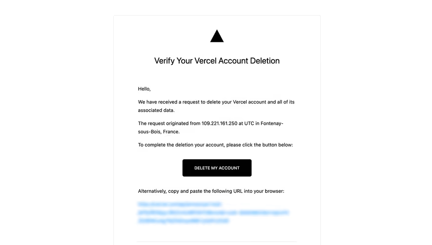

Similar screens





Upgrade to SaaSFrame Pro now to see similar examples.
Monthly
$18 /month
Billed $18 monthly
Browse all screens & flows
Filter and search screens & flows
Search text in screenshots
Access Figma files
Access mobile versions
Join now
Quarterly
$16 /month
Billed $48 quarterly
Browse all screens & flows
Filter and search screens & flows
Search text in screenshots
Access Figma files
Access mobile versions
Join now
Yearly
$15 /month
Billed $180 yearly
Browse all screens & flows
Filter and search screens & flows
Search text in screenshots
Access Figma files
Access mobile versions
Join now