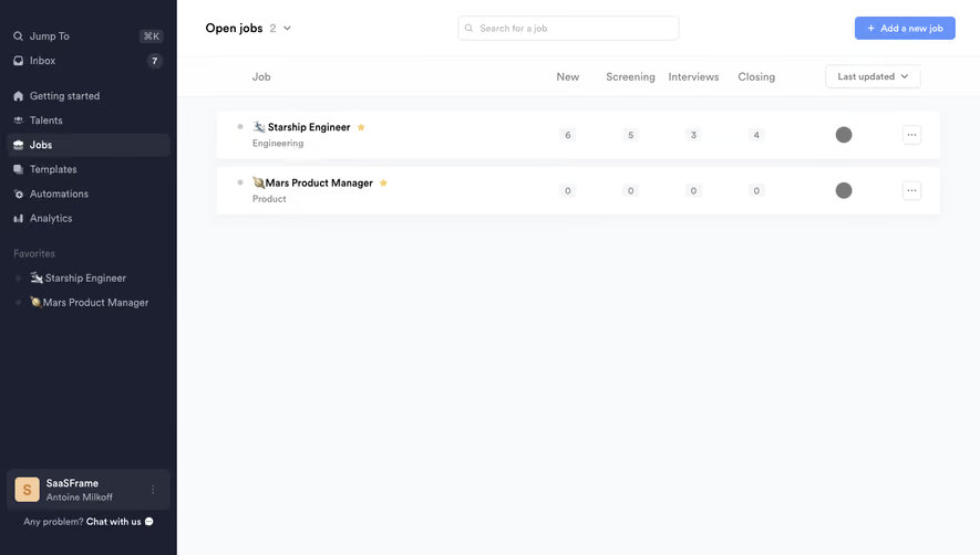
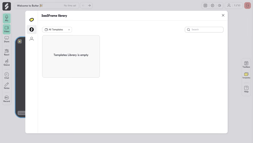
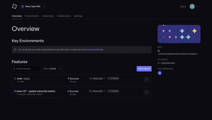
Generate a new design based on this screen using your own content.
Thank you! Your submission has been received!
Oops! Something went wrong while submitting the form.
# Design from Reference: Pitch Dashboard
Create an original, high-fidelity visual design inspired by the reference. Prioritize composition, typography, colors, spacing, and component styling over technical implementation.
## Reference
- **Product:** Pitch
- **Category:** Dashboard
- **Screenshot:** https://cdn.prod.website-files.com/5e9dc792e1210c5325f7ebbc/6acad46a886583e9d96b6f60_6acad31dc2028efdec719560_cms-321e72d9d62788e201abf7a0.webp
Analyze the screenshot first. If inaccessible, request it rather than guessing.
## Content
{{content.instructions}}
{{content.data}}
Preserve essential messaging and factual accuracy. Adapt structure and copy length for visual balance; never invent product claims.
## Visual Design
Use this context to reproduce the reference's visual language: layout, typography, colors, spacing, borders, radii, and distinctive elements. The screenshot takes priority if descriptions conflict.
## Direction
{{preferences.fidelityInstructions}}
## Output
{{output.instructions}}
Deliver a polished, cohesive design with precise alignment, hierarchy, and spacing. Produce the requested visual artifact, not just a description. If unsupported, explain the limitation.
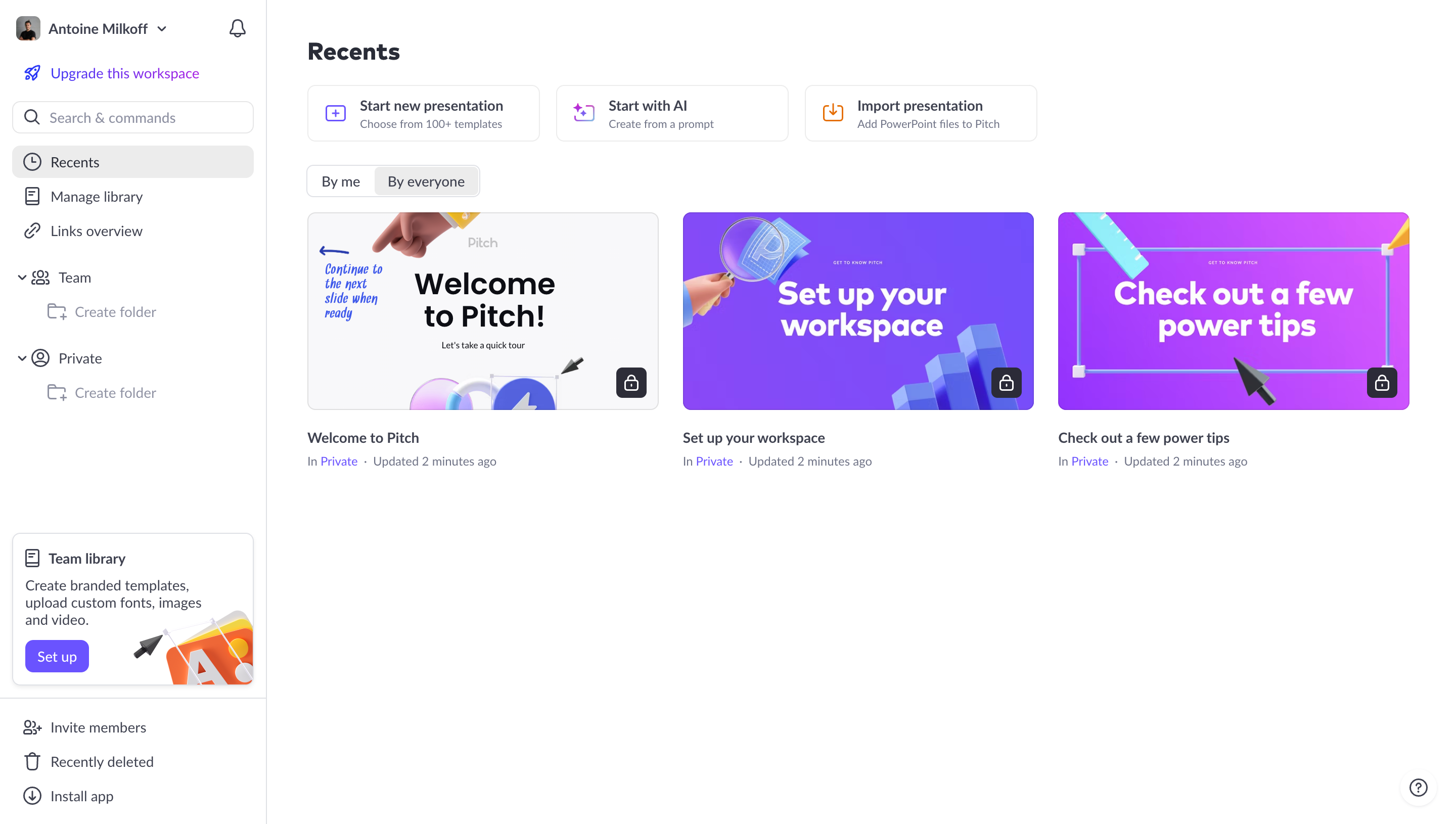
First thing you notice is the vibrant purple and blue presentation thumbnails. They pop hard against the clean white background. Pitch nails the balance between playful and professional here. The 3D illustrated elements on the cards add personality without feeling childish.
Layout That Does the Thinking for You
Three clear CTAs up top. Start new, use AI, or import. No decision paralysis. Below that, the recent presentations sit in a simple grid with just enough metadata. The left sidebar keeps navigation tight with a clear hierarchy between Team and Private spaces. Smart use of whitespace everywhere.
Little Details That Land
The lock icons on presentation cards are subtle but useful. Typography is clean and consistent, nothing competing for attention. That bottom-left "Team library" promotion card is well placed but not pushy. The warm gradient illustration there contrasts with the purple cards above, giving the page visual variety. Even the "By me / By everyone" toggle feels thoughtfully minimal. This is a dashboard that respects your time and attention from the first glance.