Overall Style and Aesthetic
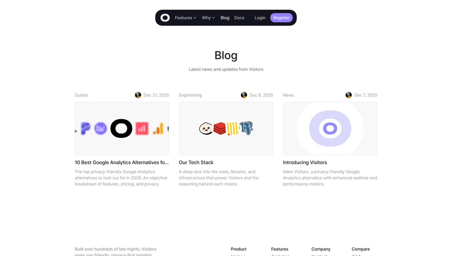
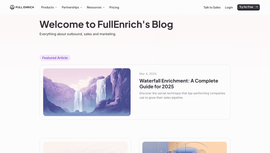
Mixpanel’s blog page embodies a sleek, modern SaaS aesthetic, balancing professionalism with approachability. The visual tone is confident yet welcoming, harnessing generous white space and sharp UI elements to keep content uncluttered, transparent, and inviting—perfect for knowledge-sharing in the tech SaaS space. Layout and Structure
The page uses a clean grid-based layout, with an above-the-fold hero banner elegantly introducing featured content. Articles are presented in well-defined cards, organized by categories for easy scanning. There’s a subtle but effective sticky header for frictionless navigation, and the footer is streamlined, containing essential links without distraction, aiding seamless exploration. Visual Elements
Quality editorial photography and custom illustrations break up the text, injecting the page with energy and visual clarity. Article cards often incorporate author avatars, lending authenticity. Microinteractions—like gentle hover states and animated card transitions—keep engagement high without overwhelming users. Color Palette and Typography
Mixpanel’s signature violet and teal accent colors give the site a vibrant, memorable identity, contrasted against a crisp white background. Bold headlines, paired with a readable sans-serif body font, establish a clear hierarchy, while muted greys subtly delineate content sections. User Experience Patterns
Navigation is intuitive, with thoughtful categorization and persistent access to search. Consistent, clearly-labeled CTAs drive users to key actions or deeper content. Responsive design ensures mobile-friendliness, and subtle scroll-triggered animations maintain visual interest without interrupting flow. Unique or Notable Design Choices
Mixpanel stands out for its editorial-first approach, letting insightful content shine while leveraging a sophisticated yet approachable visual language. Its blend of professionalism and personality sets a fresh, inspiring benchmark for SaaS blog design.