Generate a new design based on this screen using your own content.
Thank you! Your submission has been received!
Oops! Something went wrong while submitting the form.
# Design from Reference: GoFundMe Dashboard
Create an original, high-fidelity visual design inspired by the reference. Prioritize composition, typography, colors, spacing, and component styling over technical implementation.
## Reference
- **Product:** GoFundMe
- **Category:** Dashboard
- **Screenshot:** https://cdn.prod.website-files.com/5e9dc792e1210c5325f7ebbc/6acad5245a5fdf4c30310f02_6acad44b1025e911ae516fd3_cms-7422c6cc1eca1e320df52e30.webp
Analyze the screenshot first. If inaccessible, request it rather than guessing.
## Content
{{content.instructions}}
{{content.data}}
Preserve essential messaging and factual accuracy. Adapt structure and copy length for visual balance; never invent product claims.
## Visual Design
Use this context to reproduce the reference's visual language: layout, typography, colors, spacing, borders, radii, and distinctive elements. The screenshot takes priority if descriptions conflict.
## Direction
{{preferences.fidelityInstructions}}
## Output
{{output.instructions}}
Deliver a polished, cohesive design with precise alignment, hierarchy, and spacing. Produce the requested visual artifact, not just a description. If unsupported, explain the limitation.
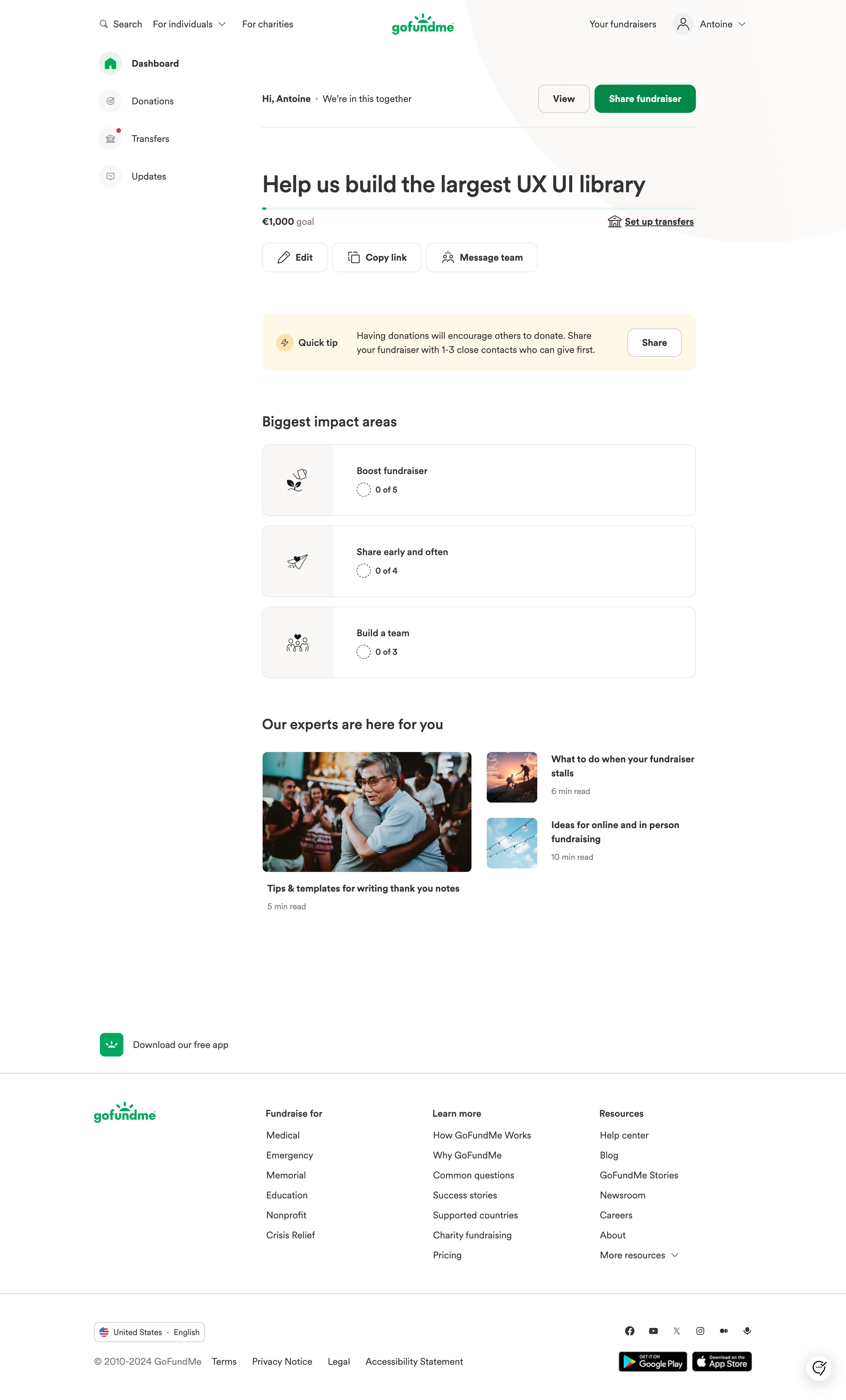
GoFundMe's fundraiser dashboard nails the "what do I do next" problem. The progress bar sitting right under the campaign title is nearly empty, which makes the action-oriented sections below feel urgent without being pushy. Smart move.
Clean Hierarchy, Zero Confusion
The left sidebar keeps it dead simple. Four items: Dashboard, Donations, Transfers, Updates. That's it. No mega-menus, no nested nonsense. The main content area uses a clear vertical flow. You get your campaign status, then a quick tip card with a soft green background, then the "Biggest impact areas" checklist. Each section builds on the last, nudging you toward sharing and growing your fundraiser.
The Details That Work
Typography is restrained. Bold headings, regular weight body text, lots of breathing room. The green accent on the CTA button and progress bar ties back to GoFundMe's brand without overwhelming anything. The expert articles section at the bottom with real photography adds warmth to what could feel like a sterile dashboard. Those "0 of 5" progress indicators are quietly motivating. They make you want to fill them up.