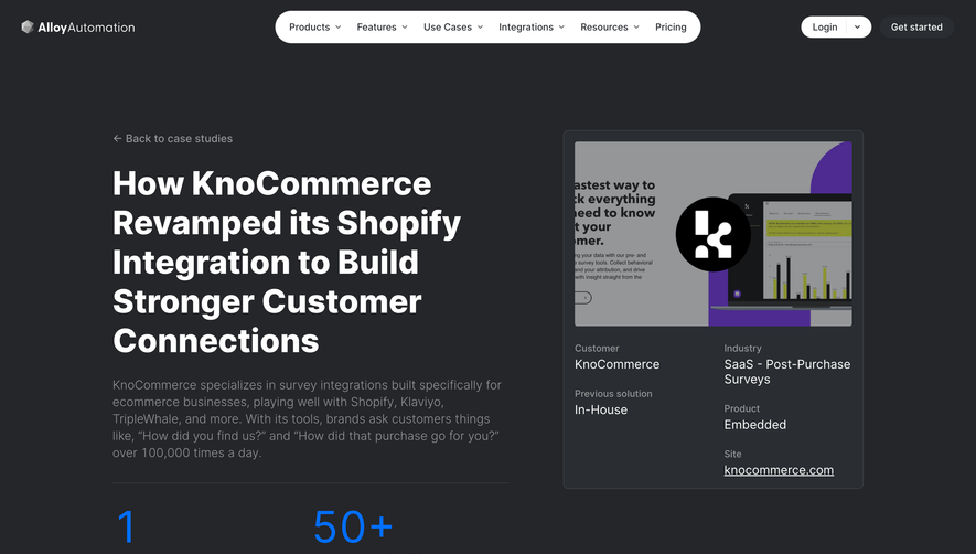
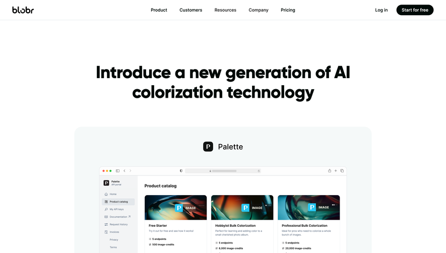
Generate a new design based on this screen using your own content.
Thank you! Your submission has been received!
Oops! Something went wrong while submitting the form.
# Design from Reference: Contractbook Customer Stories
Create an original, high-fidelity visual design inspired by the reference. Prioritize composition, typography, colors, spacing, and component styling over technical implementation.
## Reference
- **Product:** Contractbook
- **Category:** Customer Stories
- **Screenshot:** https://cdn.prod.website-files.com/5e9dc792e1210c5325f7ebbc/62ec9c85c60a5c68fc68a5cb_1659624983843-screenshot-device-572daa2a1f50b0d703e5a20a70d3d0ab-1659605045312.webp
Analyze the screenshot first. If inaccessible, request it rather than guessing.
## Content
{{content.instructions}}
{{content.data}}
Preserve essential messaging and factual accuracy. Adapt structure and copy length for visual balance; never invent product claims.
## Visual Design
Use this context to reproduce the reference's visual language: layout, typography, colors, spacing, borders, radii, and distinctive elements. The screenshot takes priority if descriptions conflict.
## Direction
{{preferences.fidelityInstructions}}
## Output
{{output.instructions}}
Deliver a polished, cohesive design with precise alignment, hierarchy, and spacing. Produce the requested visual artifact, not just a description. If unsupported, explain the limitation.
The Contractbook customer story page for TSH Collab epitomizes modern SaaS minimalism. The design is crisp and breathable, relying on ample white space and uncluttered layouts to convey professionalism and approachability. Subtle color highlights and contemporary lines foster a trustworthy yet energetic vibe—perfectly balancing reliability with an innovative edge.
Layout and Structure
The page flows intuitively, starting with a compelling hero section: bold headline, concise subheader, and a prominent CTA. Below, a carefully segmented journey spotlights TSH Collab’s success, using a two-column layout to interplay text and visuals. Client testimonials and outcome metrics are interspersed, while the footer neatly organizes navigation and essential links without visual heaviness.
Visual Elements
Photography takes center stage, with authentic images of team members enhancing credibility and narrative. Custom linear illustrations reinforce branding and add visual variety, while discrete geometric motifs and clean icons underscore key information. There’s a focus on human touches—team portraits, real workspaces—anchoring the SaaS product in genuine experience.
Color Palette and Typography
A refined palette combines Contractbook’s deep blues and vibrant accents with neutral backgrounds, ensuring high readability and cohesive branding. Typography is crisp and sans-serif, leveraging hierarchy with bold headlines, clear subheaders, and highly legible body text. Accent colors guide attention to calls-to-action and highlight critical details.
User Experience Patterns
Clear navigation, sticky CTA buttons, and smooth scrolling maintain engagement. Interactive elements (like hover effects on links or buttons) offer tactile feedback without distraction. Storytelling is prioritized, leading users seamlessly from challenge to solution to results, fostering a logical and immersive journey.
Unique or Notable Design Choices
The combination of real photography with custom illustrations breathes life into the case study—avoiding standard stock visuals. Modular sectioning—each with its own visual anchor—prevents monotony. The tone is both personable and aspirational, embedding product benefits within a story-driven, user-first layout that resonates with prospective clients seeking inspiration.