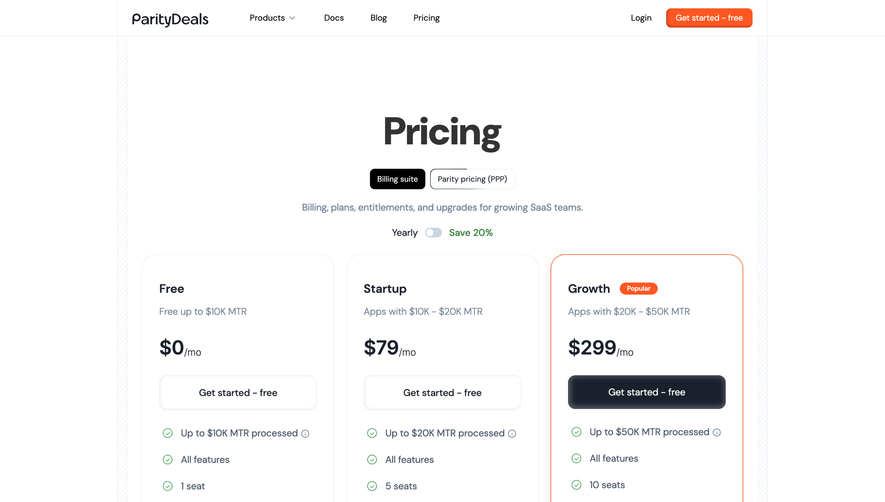
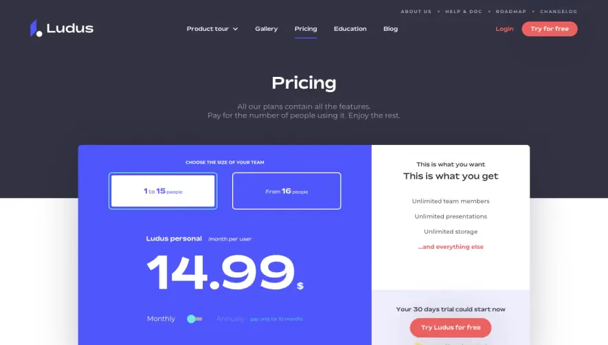
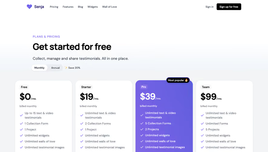
Design with AI
Generate a new design based on this screen using your own content.
# Design from Reference: Butter Pricing Page
Create an original, high-fidelity visual design inspired by the reference. Prioritize composition, typography, colors, spacing, and component styling over technical implementation.
## Reference
- **Product:** Butter
- **Category:** Pricing Page
- **Screenshot:** https://cdn.prod.website-files.com/5e9dc792e1210c5325f7ebbc/6acbbd073b6b24eada548836_6acbbc304d71070f5fd308bd_cms-c435825a3778f6f0f59c6775.webp
Analyze the screenshot first. If inaccessible, request it rather than guessing.
## Content
{{content.instructions}}
{{content.data}}
Preserve essential messaging and factual accuracy. Adapt structure and copy length for visual balance; never invent product claims.
## Visual Design
### Overall aesthetic
- **Character:** Expressive pricing page with chunky rounded navy typography, warm gray hero and a yellow featured plan.
### Page composition
- **Capture:** 1440 × 7448 screenshot pixels; estimated CSS scale approximately 1×.
- **Structure:** Navigation, centered pricing hero/toggle, four-column plan block, comparison tables, two promotional cards, oversized FAQ title, long accordion list and navy footer.
### Information hierarchy
- **Priority:** Heavy hero leads to prices and highlighted Pro column; detailed feature matrix precedes discounts and FAQs.
### Typography
- **Family:** Heavy rounded sans-serif display and compact sans-serif body; exact families unverified.
- **Estimated CSS sizes:** Hero 76px, plan headings/prices 28–36px, FAQ display about 190px, accordion labels 30px and body 16px.
### Colors & surfaces
- **Measured palette:** White #FFFFFF, navy #090D1E, warm gray #F1F1ED, table/FAQ gray #F8F8F8/#F5F5F6 and near-white #FEFEFE.
- **Accents:** Bright yellow featured plan/annual segment and mint popularity badge.
### Components
- **Elements:** Billing switch, connected plan columns, rounded signup controls, checkmark comparison cells, deeply rounded promotion cards and pill-like FAQ rows with plus icons.
- **Estimated geometry:** Content 1280px wide, plan-container radius 24px, action 52px high, promotion radii about 80px and FAQ radii 32px.
### Visual rhythm
- **Spacing:** Dense comparison grids contrast with large promotional gaps and monumental FAQ lettering.
### Responsive
- **Suggested adaptation:** Stack plans, retain comparison scrolling and reduce FAQ display dramatically. Mobile behavior is unverified.
### Adaptation guidance
- **Transfer:** Preserve playful heavy type and yellow plan emphasis while replacing all prices/limits with verified terms.
Use this context to reproduce the reference's visual language: layout, typography, colors, spacing, borders, radii, and distinctive elements. The screenshot takes priority if descriptions conflict.
## Direction
{{preferences.fidelityInstructions}}
## Output
{{output.instructions}}
Deliver a polished, cohesive design with precise alignment, hierarchy, and spacing. Produce the requested visual artifact, not just a description. If unsupported, explain the limitation.