SaaSFrame
Exit-Intent Popups for SaaS: When They Work and How to Design Them
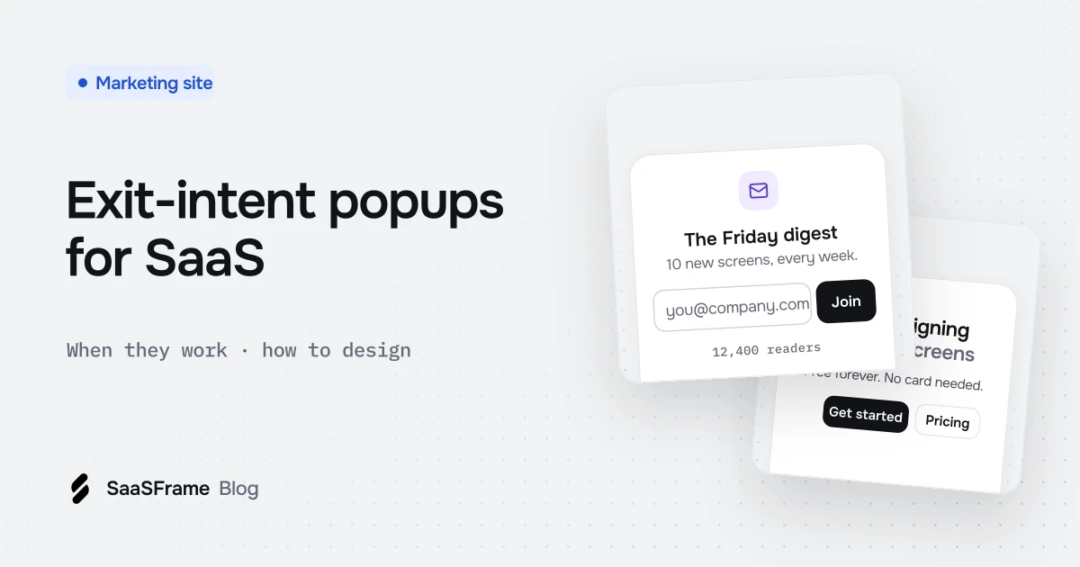
An exit-intent popup appears when a desktop visitor moves to leave the page. On a SaaS site it works best on content and pricing pages, with one specific offer (a template, a guide, a demo slot), a single field, an obvious close button, and a frequency cap so the same visitor sees it once. Avoid intrusive interstitials on mobile.
- Exit intent is detected by cursor movement, so it is a desktop technique; mobile needs other triggers.
- Offer one specific thing related to the page, not a generic newsletter.
- Ask for one field, usually email, and make closing as easy as accepting.
- Show it once per visitor and never on signup, checkout or app pages.
- Google may rank pages lower when intrusive interstitials cover content on mobile.
Most visitors leave a SaaS website without signing up. An exit-intent popup is a last, small offer at the moment they leave: useful when it is relevant, irritating when it is not.
What is an exit-intent popup?
A modal triggered when a visitor shows signs of leaving. On desktop, scripts detect the cursor moving quickly toward the top of the window; on mobile there is no cursor, so tools fall back on scroll or back-button signals, which are less reliable.
When should a SaaS site use one?
On pages where a specific, smaller next step makes sense. Blog articles, comparison pages and pricing are good candidates; signup, checkout and in-app pages are not.
| Page | Offer that fits |
|---|---|
| Blog article | A template or checklist on the article's topic |
| Pricing page | A comparison guide, a demo slot or an annual discount |
| Comparison page | A migration guide from the competitor |
| Home page | Usually none; a visible newsletter section works better |
What makes an exit-intent popup convert?
- One specific offer tied to the page, stated in the headline.
- One field, usually email, and one button that repeats the offer ("Send me the template").
- An easy close: a visible close button, Escape key and a click outside.
- A frequency cap: once per visitor, never after they subscribe or dismiss it.
- Accessible markup: focus moves into the dialog and back when it closes.
Mobile caution Google's guidance on page experience warns against intrusive interstitials that cover content on mobile. Use a small banner instead of a full-screen popup there.
What is the alternative to a popup?
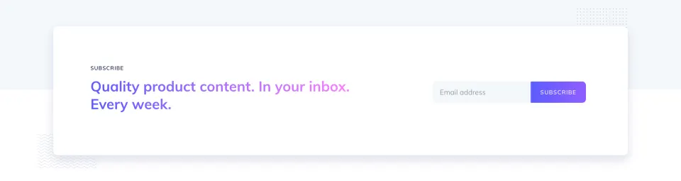
An inline form at the end of the content. It reaches readers who finished the page, without interrupting anyone; many SaaS sites use this instead of popups.

How do you implement one?
Most teams use a marketing tool rather than custom code: OptinMonster, Poptin, Popupsmart or the forms built into their CMS or email platform. Whatever the tool, check the frequency rules, mobile behaviour and accessibility of its dialogs before publishing.
Where can you see more?
Browse newsletter forms, call to action sections and landing pages. Related: pricing page best practices.
Frequently asked questions
What is an exit-intent popup?
A modal that appears when a visitor shows signs of leaving, usually detected on desktop when the cursor moves quickly toward the browser bar or close button.
Do exit-intent popups work for SaaS?
They can on blog and pricing pages when the offer matches the page, for example a template on an article or a comparison guide on pricing. Generic "Subscribe to our newsletter" popups tend to be dismissed.
Are popups bad for SEO?
Google's guidelines on intrusive interstitials say pages whose content is covered by popups on mobile may rank lower. Small banners and exit-intent popups on desktop are less of a concern.
What should an exit-intent popup offer?
Something specific to the page the visitor is leaving: a downloadable template, a checklist, a short demo slot or a pricing discount. One offer, one field.
How often should a popup appear?
Once per visitor for a period such as 30 days, and never again after they subscribe or close it. Repeated popups erode trust.
 Newsletter Signup13 examples
 Call to Action83 examples