
Thank you! Your submission has been received!
Oops! Something went wrong while submitting the form.
Get SaaSFrame Pro
Monthly
$18
Quarterly
$48
Yearly
$180
Upgrade to access this feature
Browse all screens & flows
Filter and search screens & flows
Access Figma files
Access mobile versions
Bookmark screens & flows
Join now

Zendesk 404 Pages

Zendesk
Customer support platform
Designed by
No items found.

Bookmark
Bookmark

Design with AI
Thank you! Your submission has been received!
Oops! Something went wrong while submitting the form.
# Design from Reference: Zendesk 404 Pages
Create an original, high-fidelity visual design inspired by the reference. Prioritize composition, typography, colors, spacing, and component styling over technical implementation.
## Reference
- **Product:** Zendesk
- **Category:** 404 Page
- **Screenshot:** https://cdn.prod.website-files.com/5e9dc792e1210c5325f7ebbc/62ec9c6cf6c55f061657abeb_1659621450151-screenshot-device-b17e72dee5f10d15f040deaa2a2e4911-1659600905428.webp
Analyze the screenshot first. If inaccessible, request it rather than guessing.
## Content
{{content.instructions}}
{{content.data}}
Preserve essential messaging and factual accuracy. Adapt structure and copy length for visual balance; never invent product claims.
## Visual Design
### Overall aesthetic
- **Character:** Playful corporate error page using a large 404 data-visualization motif, dark teal copy and a conventional navigation/footer frame.
- **Evidence and scale:** Screenshot is 1440 × 1685 image pixels. Sizes estimate 1× CSS capture; DPR and font identities are unverified. The lower portion after the footer is blank white in the capture.
### Page composition
- **Header:** A small upper utility row aligns right; the main row places the brand left, six product/navigation links across the center and a dark Get started action right.
- **Error hero:** Two columns share a broad white region. The left builds 404 from two large gray fours around a turquoise donut; the right contains two short bold explanatory paragraphs.
- **Chart annotations:** The donut contains Page not found and has two small leader-line percentage explanations below.
- **Footer:** Pale-gray full-width region contains five link columns, a newsletter/social row and legal links/copyright separated by thin horizontal rules.
### Information hierarchy
- **Error recognition:** Huge digits and donut ring establish 404 before the supporting text.
- **Recovery:** The right-hand message directs attention to top navigation; no separate large recovery button appears in the hero.
- **Explanatory playfulness:** Small percentage annotations add a humorous data-story layer beneath the main error graphic.
- **Footer routes:** Dense navigation groups provide many alternate destinations, with newsletter entry and social links below.
### Typography
- **Error digits:** Approximately 180px CSS, heavy sans-serif in gray.
- **Hero text:** Donut label around 30px bold; right-hand paragraphs around 24px bold with 32px leading.
- **Annotations:** Percentage labels near 16px semibold, explanations near 16px with 24px leading.
- **Navigation/footer:** Main navigation around 16px medium, utilities around 11px, footer group titles around 15px and links around 13px. Exact families remain unverified.
### Colors & surfaces
- **Measured ground:** White #FFFFFF in header/hero and pale #F9F9F9 in the footer.
- **Measured chart:** Turquoise #30ABBD dominates the ring.
- **Measured text:** Dark teal #17494C supports strong headings/brand; gray #67737D supports digits, metadata and footer text.
- **Surface treatment:** Borderless hero with sparse chart rules; fine gray footer separators and a dark teal rectangular header action provide structure.
### Components
- **404 donut:** Approximately 300px ring diameter, thick turquoise stroke, small missing arc and centered two-line label. Small dark points connect to vertical annotation leaders.
- **Header action:** Dark teal rectangular button around 150 × 46px, white label and square corners.
- **Footer columns:** Five evenly distributed groups with many short links and consistent line spacing.
- **Newsletter:** Label/description left, wide outlined email field with dark-gray arrow-submit segment in the middle and social symbols right.
- **Legal row:** Small underlined policy routes and copyright aligned left beneath a second divider.
### Visual rhythm
- **Container:** Main content aligns to approximately 1080px centered width, with side margins near 180px.
- **Hero spacing:** Broad gaps around the 404 composition keep the error message from feeling cramped; the two columns align around their visual centers.
- **Footer density:** A tighter repeated link rhythm contrasts with the open hero.
- **Horizontal rules:** Fine separators divide navigation groups, newsletter/social utility and legal information without heavy cards.
### Responsive
- **Observed limit:** Only desktop is shown; menus, recovery destinations, newsletter behavior and mobile layout are unobserved.
- **Recommended hero:** Stack chart and explanatory text, scaling the 404 graphic without making annotation text too small.
- **Recommended navigation:** Collapse header links into a compact menu and reorganize footer columns into readable groups.
- **Recommended newsletter:** Stack label, email and social controls with comfortable tap targets.
### Adaptation guidance
- **Preserve the concept:** A branded data-style 404 illustration can add personality while retaining an explicit error label.
- **Keep recovery clear:** Maintain obvious navigation and consider a concise direct recovery route when adapting.
- **Implementation:** Provide a textual error heading and accessible navigation/form labels; treat chart percentages as decorative captured copy, not verified analytics.
Use this context to reproduce the reference's visual language: layout, typography, colors, spacing, borders, radii, and distinctive elements. The screenshot takes priority if descriptions conflict.
## Direction
{{preferences.fidelityInstructions}}
## Output
{{output.instructions}}
Deliver a polished, cohesive design with precise alignment, hierarchy, and spacing. Produce the requested visual artifact, not just a description. If unsupported, explain the limitation.


Category
Patterns
No items found.
Tech Stack


Added on
June 20, 2020
Similar screens
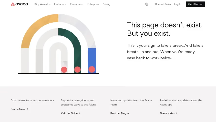


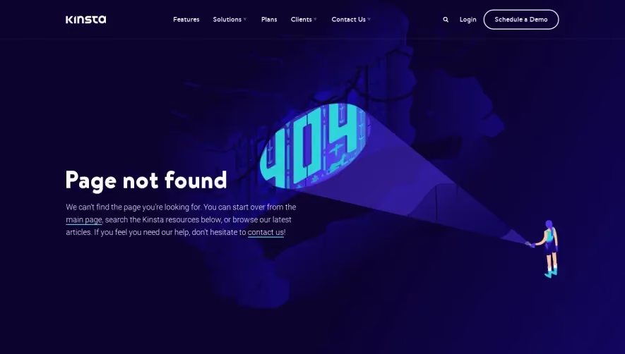

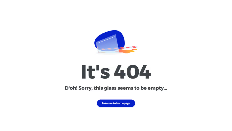

Upgrade to SaaSFrame Pro now to see similar examples.
Monthly
$18 /month
Billed $18 monthly
Browse all screens & flows
Filter and search screens & flows
Search text in screenshots
Access Figma files
Access mobile versions
Join now
Quarterly
$16 /month
Billed $48 quarterly
Browse all screens & flows
Filter and search screens & flows
Search text in screenshots
Access Figma files
Access mobile versions
Join now
Yearly
$15 /month
Billed $180 yearly
Browse all screens & flows
Filter and search screens & flows
Search text in screenshots
Access Figma files
Access mobile versions
Join now