Design with AI
Generate a new design based on this screen using your own content.
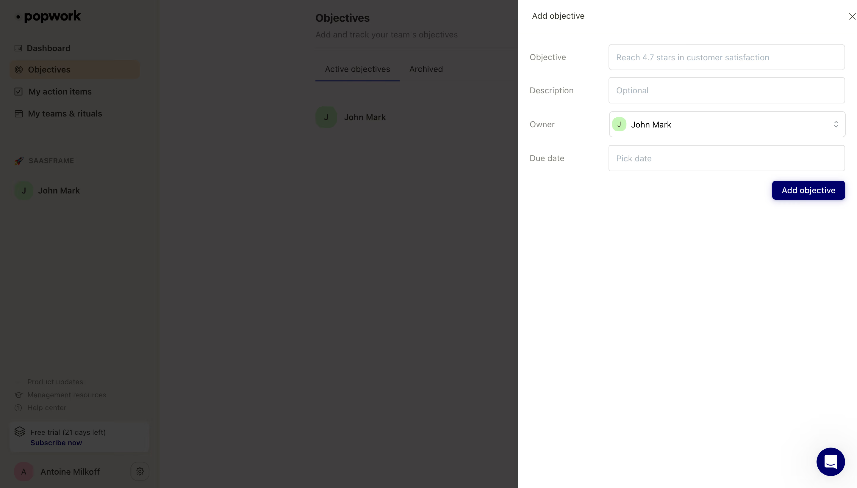
# Design from Reference: Popwork Add An Objective
Create an original, high-fidelity visual design inspired by the reference. Prioritize composition, typography, colors, spacing, and component styling over technical implementation.
## Reference
- **Product:** Popwork
- **Category:** Add & Edit
- **Screenshot:** https://cdn.prod.website-files.com/5e9dc792e1210c5325f7ebbc/6acb65ccb206c0d3f8f0f7ff_6acb6511c2d837f8f41f6cd7_cms-3b70c27117798b87da4afac1.webp
Analyze the screenshot first. If inaccessible, request it rather than guessing.
## Content
{{content.instructions}}
{{content.data}}
Preserve essential messaging and factual accuracy. Adapt structure and copy length for visual balance; never invent product claims.
## Visual Design
### Overall aesthetic
- **Character:** Minimal objective-management screen with a white right-side creation drawer over a strongly dimmed workspace.
- **Accent restraint:** Deep indigo action/support controls contrast with neutral form fields and a small pale-green owner avatar.
- **Scale:** The source measures 2880 × 1642 px. Dimensions below estimate a 1440 × 821 CSS layout at 2× scale; device ratio and zoom are unverified.
### Page composition
- **Background:** A left application sidebar and Objectives page with active/archive tabs remain visible through the dimmer.
- **Drawer:** A roughly 570 CSS px-wide white panel occupies the right edge at full height.
- **Header:** Add objective sits at the top left of the drawer, with close X right and a fine warm divider below.
- **Form:** Four horizontal label/control rows collect objective, optional description, owner and due date.
- **Action:** A small dark-indigo Add objective button aligns beneath the controls at the right.
- **Support:** A circular indigo chat control floats near the lower-right corner.
### Information hierarchy
- **Task:** The drawer title identifies creation without a large introductory block.
- **Fields:** Objective and description precede ownership/date, with an owner already selected.
- **State:** Objective shows an example placeholder, description is optional and due date unset. No creation outcome is visible.
- **Context:** Objectives remains selected in the background sidebar; the dimmer makes it secondary.
### Typography
- **Family:** Neutral sans-serif; exact identity is unverified.
- **Drawer title:** Approximately 14–15 CSS px, regular-to-medium.
- **Labels/values:** Around 14 px; labels are muted and values darker.
- **Action:** About 13–14 px white text on indigo.
- **Background:** Page heading is larger/bold but subdued by overlay.
### Colors & surfaces
- **Measured base:** ICC-aware sRGB sampling yields #FFFFFF for the drawer.
- **Measured composites:** #403F3F and #3E3C3A dominate the dimmed workspace; these are overlay-composited colors.
- **Measured accent:** #00006B appears in deep-indigo action/support regions.
- **Measured neutral:** #E1E1DF occurs in pale rules/details.
- **Depth:** Fine field borders and a subtle button shadow provide restrained separation.
### Components
- **Inputs:** Long outlined rectangular controls with small corners and pale placeholder text.
- **Owner select:** A compact pale-green initial avatar precedes the selected owner; small chevrons sit at the right.
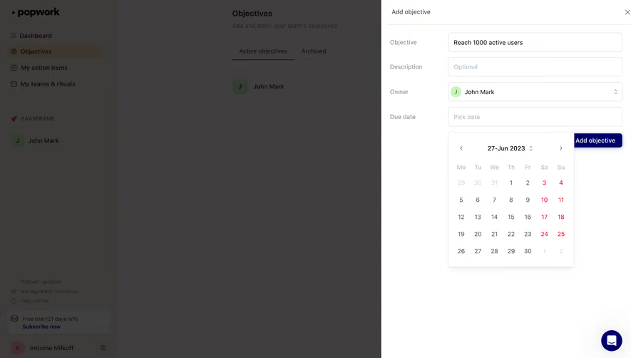
- **Date control:** A plain outlined field shows a date prompt.
- **Primary action:** Small rounded indigo button aligns with the input right edge.
- **Close/chat:** Plain X and circular message control are secondary utilities.
### Visual rhythm
- **Grid:** Narrow left labels align against a wide consistent control column.
- **Rows:** Compact even vertical gaps create a small form at the drawer top.
- **Whitespace:** Most of the drawer below the action remains empty.
- **Focus:** Strong dimming separates creation from the background objective list.
### Responsive
- **Evidence limit:** Only desktop is shown; recommendations follow.
- **Drawer:** Use full-screen width on mobile.
- **Form:** Stack labels above controls and keep owner/date touch targets usable.
- **Actions:** Preserve close and submit reachability without support overlap.
### Adaptation guidance
- **Reusable pattern:** Use a lightweight side drawer for creating one objective while retaining list context.
- **State clarity:** Explain required fields and show explicit creation/error feedback.
- **Accessibility:** Label controls, trap/restore focus and announce drawer state.
- **Privacy:** Keep owner identity generic in reusable examples.
Use this context to reproduce the reference's visual language: layout, typography, colors, spacing, borders, radii, and distinctive elements. The screenshot takes priority if descriptions conflict.
## Direction
{{preferences.fidelityInstructions}}
## Output
{{output.instructions}}
Deliver a polished, cohesive design with precise alignment, hierarchy, and spacing. Produce the requested visual artifact, not just a description. If unsupported, explain the limitation.