Generate a new design based on this screen using your own content.
Thank you! Your submission has been received!
Oops! Something went wrong while submitting the form.
# Design from Reference: Pitch Account Setup
Create an original, high-fidelity visual design inspired by the reference. Prioritize composition, typography, colors, spacing, and component styling over technical implementation.
## Reference
- **Product:** Pitch
- **Category:** Account Setup
- **Screenshot:** https://cdn.prod.website-files.com/5e9dc792e1210c5325f7ebbc/6aca27ecaca7079066e8e872_6aca2709391fed6b9e15b5d4_cms-5894492aab385a31ae561e8f.webp
Analyze the screenshot first. If inaccessible, request it rather than guessing.
## Content
{{content.instructions}}
{{content.data}}
Preserve essential messaging and factual accuracy. Adapt structure and copy length for visual balance; never invent product claims.
## Visual Design
Use this context to reproduce the reference's visual language: layout, typography, colors, spacing, borders, radii, and distinctive elements. The screenshot takes priority if descriptions conflict.
## Direction
{{preferences.fidelityInstructions}}
## Output
{{output.instructions}}
Deliver a polished, cohesive design with precise alignment, hierarchy, and spacing. Produce the requested visual artifact, not just a description. If unsupported, explain the limitation.
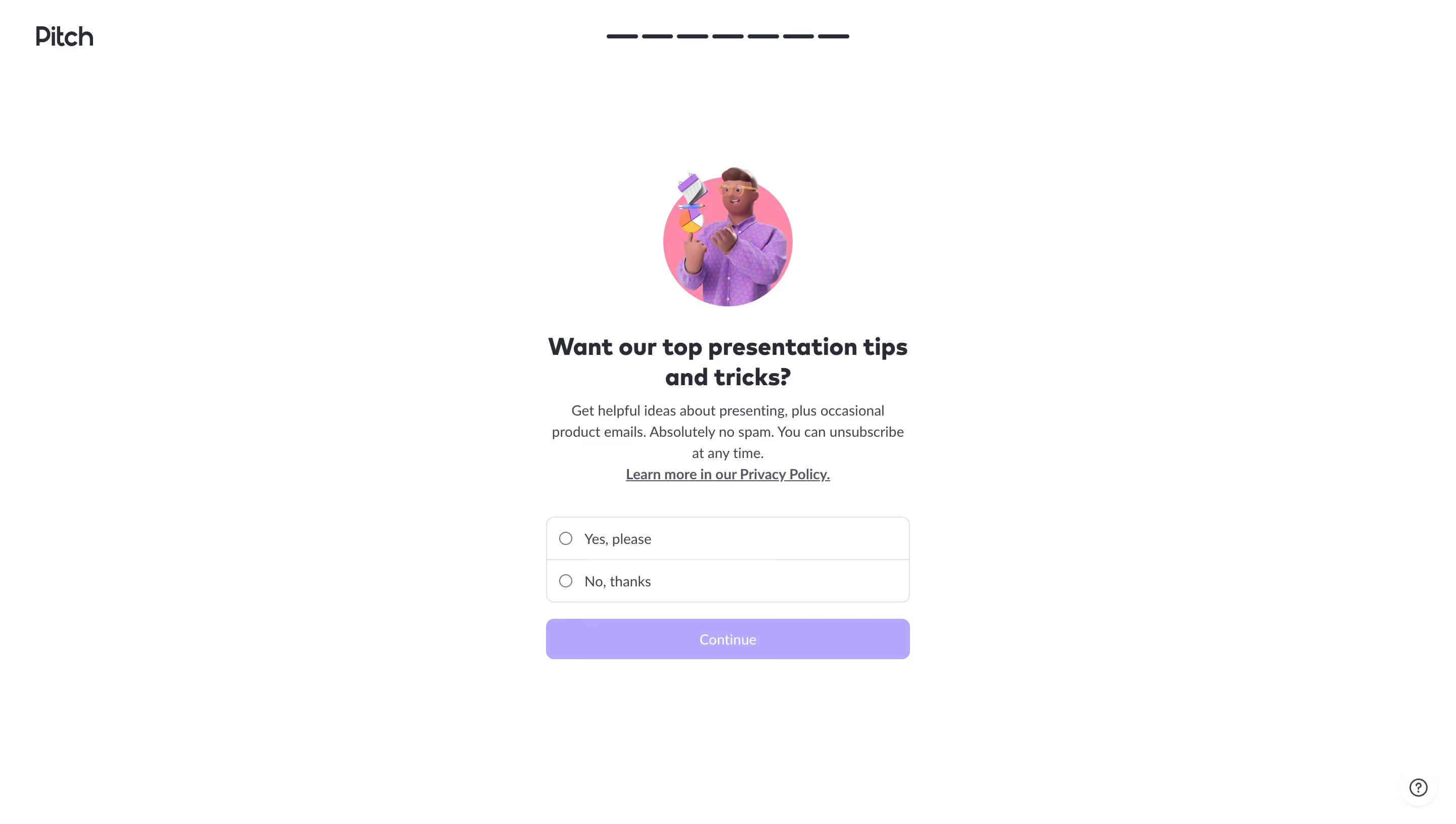
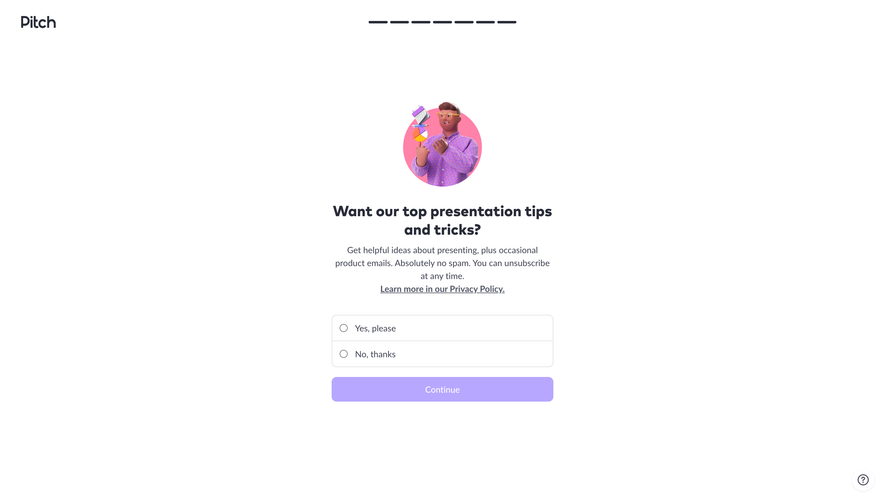
This is a great example of how to make a boring opt-in screen feel warm. The illustrated character in a purple jacket juggling geometric shapes immediately pulls your eye to the center. It's playful without being childish. The whole page breathes. So much whitespace.
One Question, Zero Friction
The layout is dead simple: illustration, headline, description, two radio buttons, one CTA. That's it. No sidebar, no nav, no distractions. The progress bar at the top (those six dashes) gives just enough context about where you are in the onboarding flow. The "Continue" button in soft lavender feels low-pressure, almost inviting you to just tap through.
Typography That Stays Out of the Way
The bold serif headline contrasts well with the lighter body text underneath. The copy itself is honest and refreshing: "Absolutely no spam. You can unsubscribe at any time." That builds trust fast. The Privacy Policy link is right there too. No dark patterns. What makes this stand out? It treats a marketing consent screen like a moment of care, not a checkbox to rush past.