
Thank you! Your submission has been received!
Oops! Something went wrong while submitting the form.
Get SaaSFrame Pro
Monthly
$18
Quarterly
$48
Yearly
$180
Upgrade to access this feature
Browse all screens & flows
Filter and search screens & flows
Access Figma files
Access mobile versions
Bookmark screens & flows
Join now
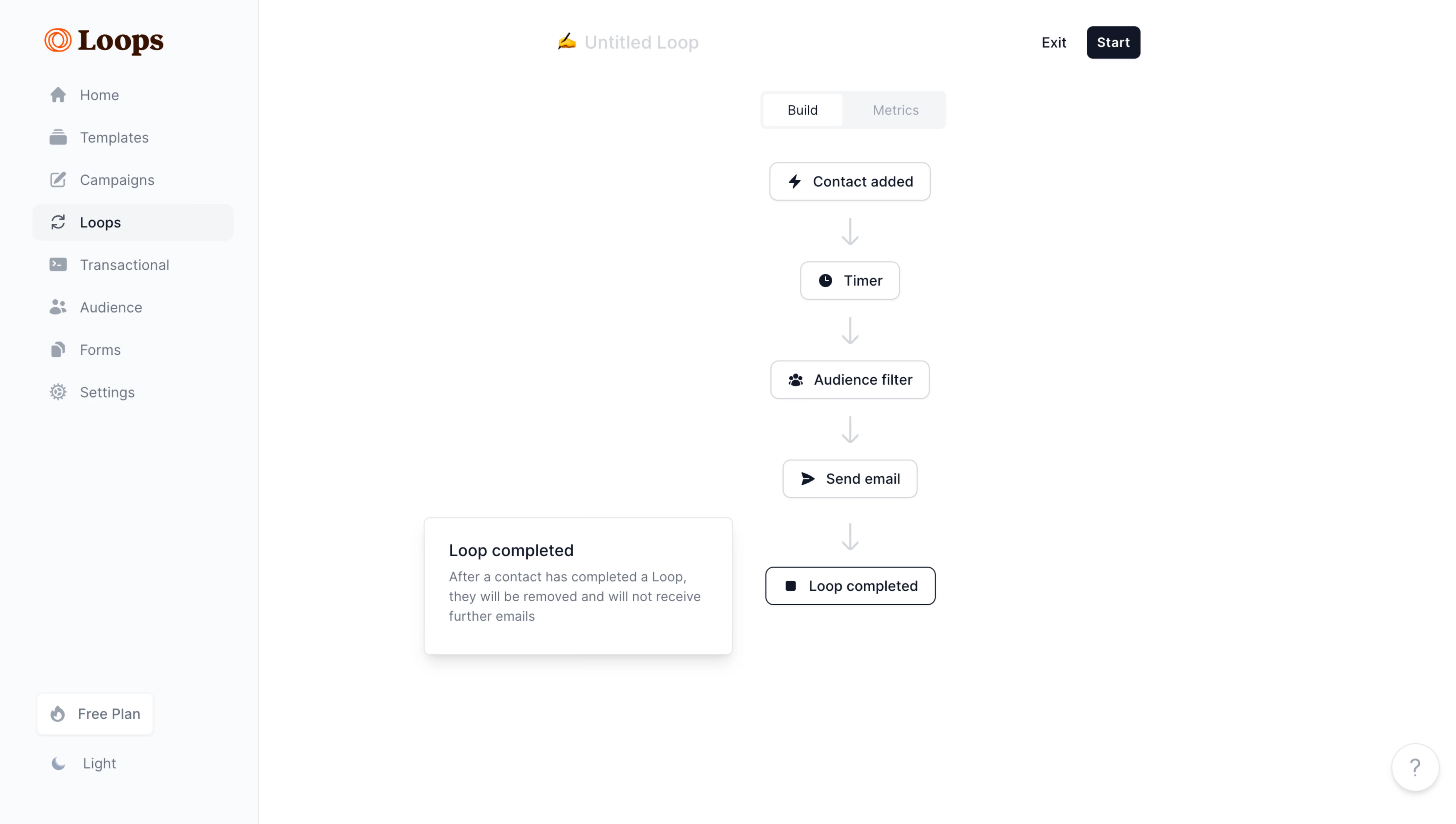
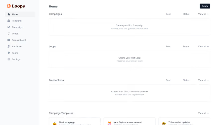
Loops Loop Flowchart

Loops
The email platform built for SaaS
Designed by
No items found.

Bookmark
Bookmark

Design with AI
Thank you! Your submission has been received!
Oops! Something went wrong while submitting the form.
# Design from Reference: Loops Loop Flowchart
Create an original, high-fidelity visual design inspired by the reference. Prioritize composition, typography, colors, spacing, and component styling over technical implementation.
## Reference
- **Product:** Loops
- **Category:** Flowchart
- **Screenshot:** https://cdn.prod.website-files.com/5e9dc792e1210c5325f7ebbc/6acadbf3d05a3f53c0a8641d_6acadb4bf20dd41981c5f8db_cms-f3048a7c227c7856b4402161.webp
Analyze the screenshot first. If inaccessible, request it rather than guessing.
## Content
{{content.instructions}}
{{content.data}}
Preserve essential messaging and factual accuracy. Adapt structure and copy length for visual balance; never invent product claims.
## Visual Design
### Overall aesthetic
- **Character:** A minimal automation builder presents a simple vertical flow on a largely empty white canvas.
- **Capture scale:** The screenshot measures 5760 × 3260 image pixels. Approximate CSS measurements assume a 1440 × 815 viewport at 4× density; this is an estimate.
- **Visual language:** Pale gray navigation, fine borders, compact nodes and restrained navy text keep the sequence easy to scan.
### Page composition
- **Sidebar:** A roughly 256px CSS-wide pale rail contains the Loops wordmark and eight icon-and-label navigation entries.
- **Canvas header:** An untitled-loop label with a small writing emoji sits above the flow area; Exit and a dark Start action align to its upper right.
- **Mode control:** A compact Build/Metrics segmented control sits above the vertical node sequence.
- **Flow sequence:** Contact added, Timer, Audience filter, Send email and Loop completed form a centered vertical chain.
- **Context panel:** A small explanatory card opens to the left of the final node.
- **Utilities:** A Free Plan pill and Light theme label sit at the lower sidebar; a circular help control is lower right.
### Information hierarchy
- **Builder focus:** The five-node vertical sequence is the principal content, with each step labeled and paired with a small icon.
- **Current mode:** Build appears active; Metrics is muted within the segmented control.
- **Selected endpoint:** Loop completed has a darker outline than the preceding nodes and an explanatory card nearby.
- **Action priority:** The dark Start button is the strongest action; Exit is plain text.
- **Navigation state:** Loops is selected with a pale filled row and darker label.
### Typography
- **Family:** Interface text uses a neutral sans-serif; the brand uses a contrasting serif wordmark. Exact font identities are unverified.
- **Loop title:** Approximately 18px CSS, light gray, medium weight.
- **Node labels:** Approximately 14px medium, with compact 20px line-height.
- **Navigation:** Approximately 14px regular, with a stronger selected label.
- **Context card:** A roughly 16px medium title sits above 13–14px muted text with 19–20px line-height.
- **Header controls:** Start and Exit use compact approximately 14px text.
### Colors & surfaces
- **Canvas:** Sampled #FFFFFF is the dominant background and node fill.
- **Sidebar:** Sampled #F9FAFB supplies the subtly gray navigation region.
- **Selected and mode surfaces:** Sampled #F3F4F6 supports pale selected areas.
- **Primary ink:** Sampled #0F1828 supplies dark navy text and the Start button.
- **Borders and arrows:** Sampled #D0D5DB supplies light gray outlines and connectors.
- **Brand accent:** Orange-red is confined to the Loops logo, leaving the working canvas neutral.
### Components
- **Flow nodes:** Compact white rectangles around 100–165px wide and 38px high use thin pale borders, around 7px radii and small left icons.
- **Connectors:** Short vertical light-gray lines terminate in downward arrowheads; each node has generous clear space around it.
- **Endpoint state:** The final node uses a stronger dark outline; its icon is a small solid square.
- **Explanation card:** Approximately 305 × 136px CSS with a thin border, 7px radius, soft shadow and around 24px padding.
- **Segmented mode:** A pale roughly 184 × 38px control contains a white active Build segment and muted Metrics segment.
- **Start action:** A small navy rounded rectangle uses white semibold text.
- **Help control:** A white circle with a pale outline, subtle shadow and centered question mark sits near the viewport corner.
### Visual rhythm
- **Flow cadence:** Node centers repeat roughly every 96–104px vertically, with connectors filling only part of each gap.
- **Canvas openness:** Broad white margins isolate the flow from navigation and contextual help.
- **Sidebar rhythm:** Navigation rows repeat around 42px apart, with plan and theme utilities separated by flexible space.
- **Alignment:** Every node and connector shares one vertical axis; the explanation card sits offset without interrupting the chain.
### Responsive
- **Evidence limit:** Only a desktop builder state is visible; dragging, zooming and breakpoint behavior are unverified.
- **Canvas recommendation:** Preserve a readable node width and allow intentional canvas scrolling rather than compressing labels.
- **Navigation recommendation:** Collapse the sidebar on narrow screens while keeping the current builder destination clear.
- **Context recommendation:** Move endpoint explanations into a bottom sheet or inline panel when there is no safe space beside the flow.
- **Controls recommendation:** Keep mode and start controls reachable without covering the node chain.
### Adaptation guidance
- **Flow model:** Render each step with a consistent node component and connectors that remain aligned as labels change.
- **State system:** Define selected, focused and inactive states clearly; the screenshot establishes only the visible endpoint and Build selection.
- **Contextual guidance:** Keep explanatory content close to the relevant node and dismissible without obscuring workflow structure.
- **Accessibility:** Offer a keyboard-readable ordered representation of the sequence, accessible node labels and visible focus indicators.
Use this context to reproduce the reference's visual language: layout, typography, colors, spacing, borders, radii, and distinctive elements. The screenshot takes priority if descriptions conflict.
## Direction
{{preferences.fidelityInstructions}}
## Output
{{output.instructions}}
Deliver a polished, cohesive design with precise alignment, hierarchy, and spacing. Produce the requested visual artifact, not just a description. If unsupported, explain the limitation.


Category
Patterns
Tech Stack


Added on
August 14, 2023

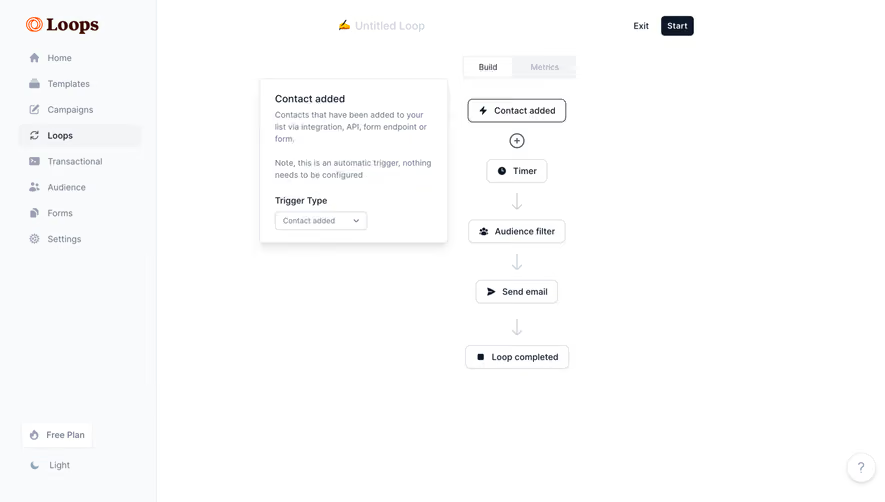

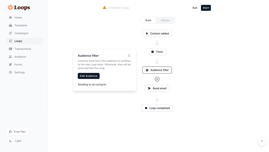
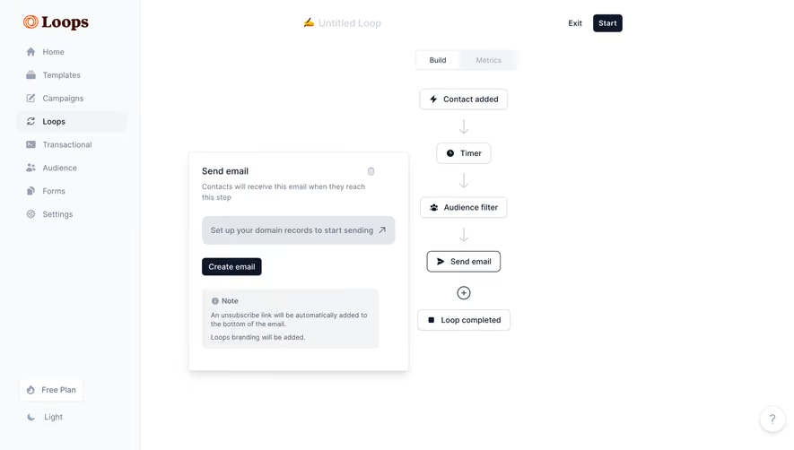


Similar screens

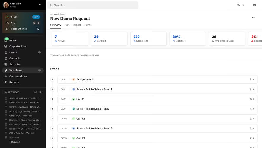

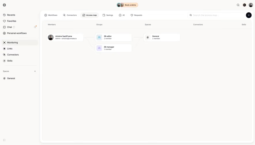

Upgrade to SaaSFrame Pro now to see similar examples.
Monthly
$18 /month
Billed $18 monthly
Browse all screens & flows
Filter and search screens & flows
Search text in screenshots
Access Figma files
Access mobile versions
Join now
Quarterly
$16 /month
Billed $48 quarterly
Browse all screens & flows
Filter and search screens & flows
Search text in screenshots
Access Figma files
Access mobile versions
Join now
Yearly
$15 /month
Billed $180 yearly
Browse all screens & flows
Filter and search screens & flows
Search text in screenshots
Access Figma files
Access mobile versions
Join now