Generate a new design based on this screen using your own content.
Thank you! Your submission has been received!
Oops! Something went wrong while submitting the form.
# Design from Reference: Libeo Features Page
Create an original, high-fidelity visual design inspired by the reference. Prioritize composition, typography, colors, spacing, and component styling over technical implementation.
## Reference
- **Product:** Libeo
- **Category:** Features Page
- **Screenshot:** https://cdn.prod.website-files.com/5e9dc792e1210c5325f7ebbc/6acb72bd018523cfee2da296_6acb7045b328e2f9e303f28c_cms-05719cf0178a37b937b23882.webp
Analyze the screenshot first. If inaccessible, request it rather than guessing.
## Content
{{content.instructions}}
{{content.data}}
Preserve essential messaging and factual accuracy. Adapt structure and copy length for visual balance; never invent product claims.
## Visual Design
Use this context to reproduce the reference's visual language: layout, typography, colors, spacing, borders, radii, and distinctive elements. The screenshot takes priority if descriptions conflict.
## Direction
{{preferences.fidelityInstructions}}
## Output
{{output.instructions}}
Deliver a polished, cohesive design with precise alignment, hierarchy, and spacing. Produce the requested visual artifact, not just a description. If unsupported, explain the limitation.
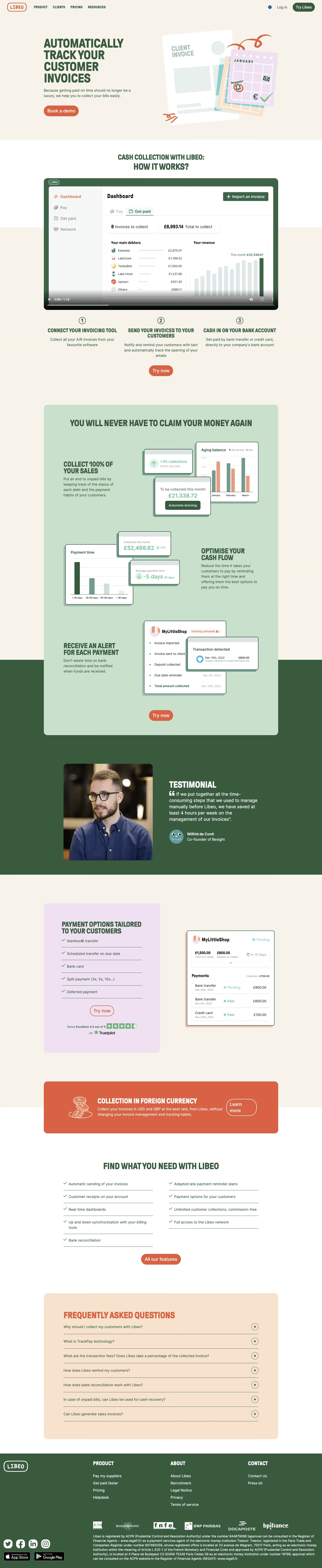
Libeo’s Accounts Receivable page showcases a crisp, modern aesthetic grounded in a clean, minimalist approach. The design radiates professionalism and trust—with a subtle sense of innovation—perfectly suited to SaaS financial tools. Ample white space, balanced visual hierarchy, and strategic splashes of color foster both clarity and visual engagement.
Layout and Structure
The page’s structure follows a proven SaaS flow: a bold hero section featuring concise value props and a prominent CTA; followed by an informative features section with digestible chunks; social proof with customer logos or testimonials; and, finally, a comprehensive footer. This thoughtful sequence gives visitors clear guidance and reassurance at every step.
Visual Elements
Custom vector illustrations and sleek icons lend an approachable yet professional vibe, keeping the focus on product benefits rather than generic imagery. Soft drop shadows, rounded edges, and smooth animation highlights create subtle visual dynamism without overwhelming the content. Occasional product screenshots help bridge the gap between abstract features and real-world application.
Color Palette and Typography
A foundational palette of blues and whites suggests dependability, complemented by energetic accent colors that highlight CTAs and critical info. Modern sans-serif fonts, likely with varying weights and sizes, enforce a clean information hierarchy and ensure effortless readability.
User Experience Patterns
Navigation is frictionless, with a sticky navbar ensuring persistent access to key sections. Prominent, clearly-labeled CTAs—often in contrasting colors—encourage sign-ups or demos. Animated scroll interactions and section reveals add polish, guiding the eye intuitively down the page and helping users focus on one element at a time.
Unique or Notable Design Choices
The use of playful microinteractions (like hover states and animated icons) adds a layer of sophistication. Strategic customer logo placement builds instant credibility. Overall, the tone is confident and trustworthy, balancing financial seriousness with UI charm—delivering both reassurance and a touch of delight for SaaS design seekers.