Design with AI
Generate a new design based on this screen using your own content.
# Design from Reference: Lemon Squeezy Loading Screen
Create an original, high-fidelity visual design inspired by the reference. Prioritize composition, typography, colors, spacing, and component styling over technical implementation.
## Reference
- **Product:** Lemon Squeezy
- **Category:** Loading Screen
- **Screenshot:** https://cdn.prod.website-files.com/5e9dc792e1210c5325f7ebbc/6acb6dacb206c0d3f8f3a9c4_6acb6b9cb5df5d2dd4cf7ad1_cms-97421b5d64a549b02cd9f5c8.webp
Analyze the screenshot first. If inaccessible, request it rather than guessing.
## Content
{{content.instructions}}
{{content.data}}
Preserve essential messaging and factual accuracy. Adapt structure and copy length for visual balance; never invent product claims.
## Visual Design
### Overall aesthetic
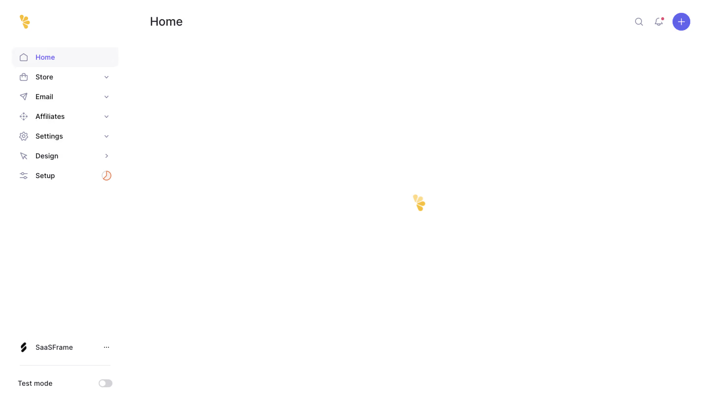
- **Character:** Minimal white application shell with pale-gray navigation selection, purple utilities and a small yellow brand-shaped loading mark.
- **State:** The main content area is blank except for the central loading symbol; no loaded dashboard content is visible.
- **Scale:** The screenshot measures 1440 × 821 image px. Dimensions below are observed image estimates; CSS scale is unverified.
### Page composition
- **Sidebar:** A roughly 260 px rail contains the yellow brand mark, seven main destinations and bottom workspace/test-mode utilities.
- **Header:** Home appears at the upper left of the main area; search, notification and circular plus controls sit at the upper right.
- **Loading area:** A small yellow segmented symbol sits near the center of the remaining white canvas.
- **Footer utilities:** Workspace identity/ellipsis and a divider precede a test-mode toggle near the sidebar bottom.
### Information hierarchy
- **Location:** Home title and selected sidebar row establish the current area.
- **Loading focus:** The lone central symbol indicates an unresolved content-loading state.
- **Navigation:** Store, Email, Affiliates, Settings, Design and Setup remain available in the shell.
- **Evidence limit:** The still image cannot establish animation, load duration or successful completion.
### Typography
- **Family:** Neutral sans-serif; exact identity is unverified.
- **Page title:** Approximately 24–26 image px, regular-to-medium.
- **Sidebar:** Around 14 px, with a stronger purple active label.
- **Bottom utilities:** Compact text around 13–14 px.
- **Content:** No body copy or metric typography is visible in the loading region.
### Colors & surfaces
- **Measured base:** ICC-aware sRGB sampling yields #FFFFFF and pale #F7F7F8.
- **Measured accent:** Purple #6262E8 appears in utility/active treatment; yellow #F0C047 appears in brand/loading marks.
- **Measured foreground:** #25262D and #121217 are dark tones; #898CA2 is muted iconography.
- **Measured rules:** #D3D3D6 and #E5E7EB define subtle separators/toggle details.
- **Depth:** Flat surfaces dominate, without card shadows in the empty workspace.
### Components
- **Selected row:** A pale rounded rectangle highlights Home with outline house icon and purple text.
- **Navigation controls:** Small outline icons precede labels; several rows have tiny chevrons.
- **Loading mark:** A small yellow cluster of rounded wedge shapes echoes the upper-left brand mark.
- **Header utilities:** Search and bell are thin outline icons; the plus sits in a filled purple circle.
- **Setup marker:** A small orange clock-like symbol appears beside Setup.
- **Test mode:** A small gray toggle appears off in the visible bottom row.
### Visual rhythm
- **Sidebar cadence:** Evenly spaced compact rows contrast with the blank main canvas.
- **Alignment:** Page title and sidebar content use consistent insets.
- **Whitespace:** The central loading symbol is isolated by large uninterrupted white areas.
- **Bottom anchoring:** Workspace/test controls sit far below the main navigation.
### Responsive
- **Evidence limit:** Only desktop is shown; recommendations follow.
- **Shell:** Collapse sidebar and retain a clear current-page heading.
- **Loading:** Center the indicator within the available content region.
- **Controls:** Preserve readable navigation and usable utility targets.
### Adaptation guidance
- **Reusable pattern:** Keep the application shell stable while content loads, using a restrained brand-related indicator.
- **State handling:** Provide accessible loading status and explicit failure/retry states if needed.
- **Evidence discipline:** Do not infer loaded content or timing from this still frame.
- **Accessibility:** Label icon controls and avoid relying on animation alone to communicate loading.
Use this context to reproduce the reference's visual language: layout, typography, colors, spacing, borders, radii, and distinctive elements. The screenshot takes priority if descriptions conflict.
## Direction
{{preferences.fidelityInstructions}}
## Output
{{output.instructions}}
Deliver a polished, cohesive design with precise alignment, hierarchy, and spacing. Produce the requested visual artifact, not just a description. If unsupported, explain the limitation.