
Thank you! Your submission has been received!
Oops! Something went wrong while submitting the form.
Get SaaSFrame Pro
Monthly
$18
Quarterly
$48
Yearly
$180
Upgrade to access this feature
Browse all screens & flows
Filter and search screens & flows
Access Figma files
Access mobile versions
Bookmark screens & flows
Join now
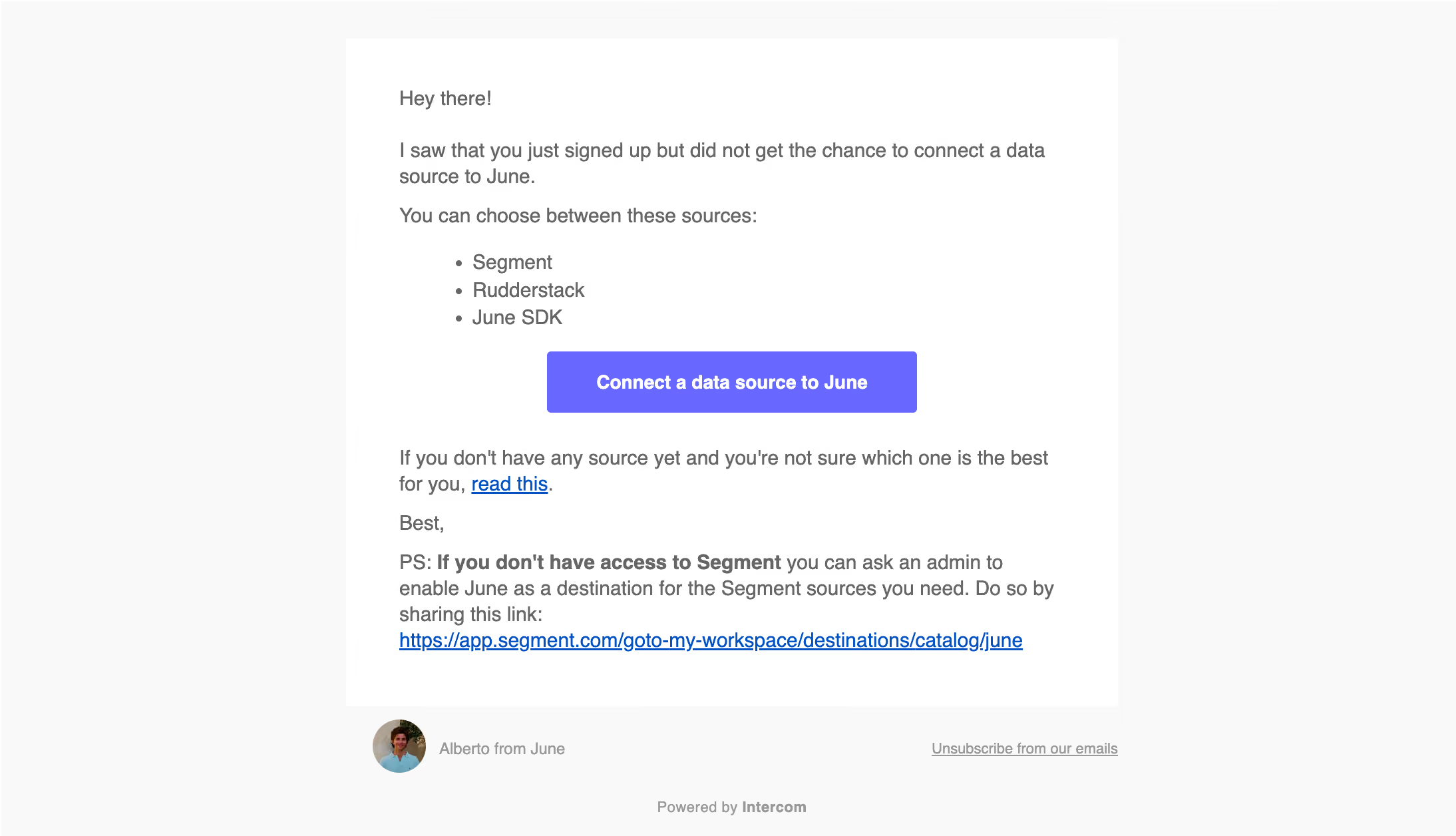
June Activation Emails

June
Actionable product insights, out of the box.
Designed by
No items found.

Bookmark
Bookmark

Design with AI
Thank you! Your submission has been received!
Oops! Something went wrong while submitting the form.
# Design from Reference: June Activation Emails
Create an original, high-fidelity visual design inspired by the reference. Prioritize composition, typography, colors, spacing, and component styling over technical implementation.
## Reference
- **Product:** June
- **Category:** Activation Emails
- **Screenshot:** https://cdn.prod.website-files.com/5e9dc792e1210c5325f7ebbc/6acb6addbf2e69a0c03b6a62_6acb6a192837b9f3168eb543_cms-c0c2af33d0872189024a878b.webp
Analyze the screenshot first. If inaccessible, request it rather than guessing.
## Content
{{content.instructions}}
{{content.data}}
Preserve essential messaging and factual accuracy. Adapt structure and copy length for visual balance; never invent product claims.
## Visual Design
### Overall aesthetic
- **Style:** Simple activation email with a white message panel on a very light-gray background and one violet call-to-action.
- **Character:** Conversational copy, a small sender portrait and a plain sign-off create a personal customer-success tone.
- **Capture:** The image measures 2188 × 1256 pixels. CSS estimates assume a 2× capture, equivalent to approximately 1094 × 628 CSS pixels; actual email scale and font identity are unverified.
### Page composition
- **Message panel:** A centered white rectangle approximately 580 pixels wide begins near the top, with roughly 40-pixel horizontal padding.
- **Content sequence:** Greeting, signup reminder, three-item source list, centered action button, help paragraph, sign-off and a longer postscript.
- **Postscript:** A bold introductory clause is followed by regular explanatory copy and a long blue underlined URL.
- **Sender footer:** A small circular portrait and sender label sit beneath the panel at left; unsubscribe aligns right.
- **Platform footer:** A muted centered attribution sits near the bottom.
### Information hierarchy
- **Activation purpose:** The opening explains the missing data-source connection without a separate display headline.
- **Available choices:** A three-item bullet list identifies supported source options before the action.
- **Primary action:** The violet button is the strongest visual element in the message.
- **Secondary help:** A short blue link supports users who need source-selection guidance.
- **Admin route:** The postscript highlights a permissions-related alternative with a bold opening and direct resource link.
- **Footer priority:** Sender, unsubscribe and platform attribution use smaller muted text.
### Typography
- **Family:** A conventional sans-serif is visible; exact identity is unverified.
- **Body:** Approximately 14–15-pixel CSS size with around 20-pixel line height.
- **Button:** Approximately 14 pixels, bold, white and centered.
- **Emphasis:** The postscript's opening clause uses bold weight at the same body size.
- **Links:** Blue underlined text remains inline with the surrounding prose.
- **Footer:** Approximately 11–12 pixels, regular, in muted gray.
### Colors & surfaces
- **Measured background:** #F9F9F9 surrounds the message.
- **Measured panel:** White #FFFFFF fills the message rectangle.
- **Measured action:** Violet #6868FF fills the central button.
- **Measured body:** Gray #666666 carries the main copy.
- **Measured links:** Blue #0053C0 appears among underlined resource-link pixels.
- **Measured footer:** Gray #999999 supports secondary identity and attribution details.
- **Depth:** No visible shadow or outline frames the message; the white/light-gray contrast defines it.
### Components
- **Message container:** A plain rectangular white panel with approximately 40-pixel inset and no conspicuous corner rounding.
- **Source list:** Standard circular bullets use a compact vertical rhythm and conventional text indent.
- **Primary button:** Approximately 278 × 46 CSS pixels, with small corners and centered connection-action text.
- **Resource links:** One short help link and one long URL provide secondary paths; the URL occupies its own final line.
- **Sender identity:** A circular portrait around 40 pixels wide precedes a small muted sender label.
- **Unsubscribe:** A small underlined text link sits opposite the sender identity.
- **State scope:** This is one static activation email; no connected state or wider email sequence is shown.
### Visual rhythm
- **Reading measure:** The centered narrow panel creates broad neutral margins.
- **Paragraph spacing:** Roughly 12–16 pixels separate short text groups.
- **Action break:** The button is centered between the source list and follow-up guidance, with additional vertical breathing room.
- **Postscript density:** The final block is denser and longer than the opening paragraphs.
- **Footer separation:** A small gap distinguishes the sender row from the panel, followed by a larger pause before platform attribution.
### Responsive
- **Recommendation — width:** Use a fluid message panel with a maximum near 580 pixels and comfortable side padding.
- **Recommendation — action:** Keep the primary button large enough to tap and fit its label without clipping.
- **Recommendation — URL:** Allow long resource URLs to wrap safely in narrow clients.
- **Recommendation — footer:** Stack sender and unsubscribe when they cannot share one row. No mobile rendering is evidenced.
### Adaptation guidance
- **Preserve the activation focus:** Explain the missing setup step, list choices and provide one dominant connection route.
- **Keep secondary guidance nearby:** Offer source-selection and administrator alternatives without competing with the primary button.
- **Reuse simple tokens:** Retain gray body copy, white panel, light-gray surround and violet action.
- **Maintain personal identity:** Use a small sender portrait and concise sign-off rather than a large promotional header.
- **Use semantic email structure:** Preserve paragraphs, bullets, descriptive links and a robust button treatment across clients.
- **Avoid inferring results:** The screenshot does not show whether a source was connected or how the destination page behaves.
Use this context to reproduce the reference's visual language: layout, typography, colors, spacing, borders, radii, and distinctive elements. The screenshot takes priority if descriptions conflict.
## Direction
{{preferences.fidelityInstructions}}
## Output
{{output.instructions}}
Deliver a polished, cohesive design with precise alignment, hierarchy, and spacing. Produce the requested visual artifact, not just a description. If unsupported, explain the limitation.


Category
Patterns
No items found.
Tech Stack

Added on
May 22, 2023
Found in 1 flow
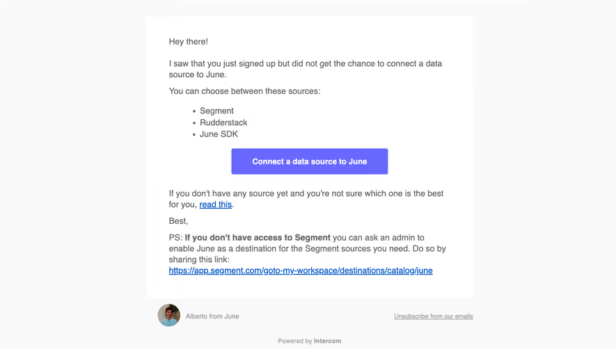
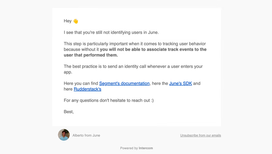
Similar screens
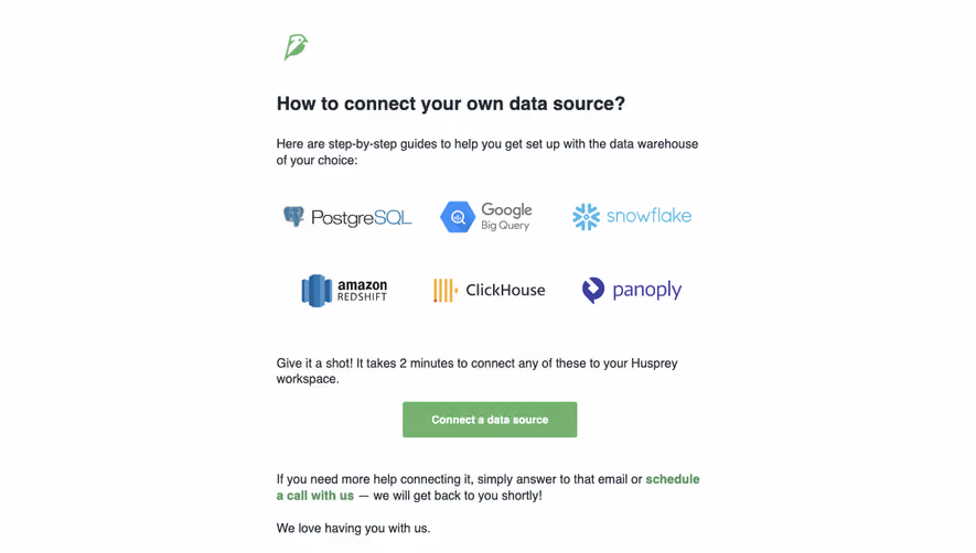





Upgrade to SaaSFrame Pro now to see similar examples.
Monthly
$18 /month
Billed $18 monthly
Browse all screens & flows
Filter and search screens & flows
Search text in screenshots
Access Figma files
Access mobile versions
Join now
Quarterly
$16 /month
Billed $48 quarterly
Browse all screens & flows
Filter and search screens & flows
Search text in screenshots
Access Figma files
Access mobile versions
Join now
Yearly
$15 /month
Billed $180 yearly
Browse all screens & flows
Filter and search screens & flows
Search text in screenshots
Access Figma files
Access mobile versions
Join now