Design with AI
Generate a new design based on this screen using your own content.
# Design from Reference: Help Scout Onboarding Emails
Create an original, high-fidelity visual design inspired by the reference. Prioritize composition, typography, colors, spacing, and component styling over technical implementation.
## Reference
- **Product:** Help Scout
- **Category:** Onboarding Email
- **Screenshot:** https://cdn.prod.website-files.com/5e9dc792e1210c5325f7ebbc/6acbc777a4008ddb747933bf_6acbc5d679661806cce695fb_cms-88167ec7aca0486dfc083841.webp
Analyze the screenshot first. If inaccessible, request it rather than guessing.
## Content
{{content.instructions}}
{{content.data}}
Preserve essential messaging and factual accuracy. Adapt structure and copy length for visual balance; never invent product claims.
## Visual Design
### Overall aesthetic
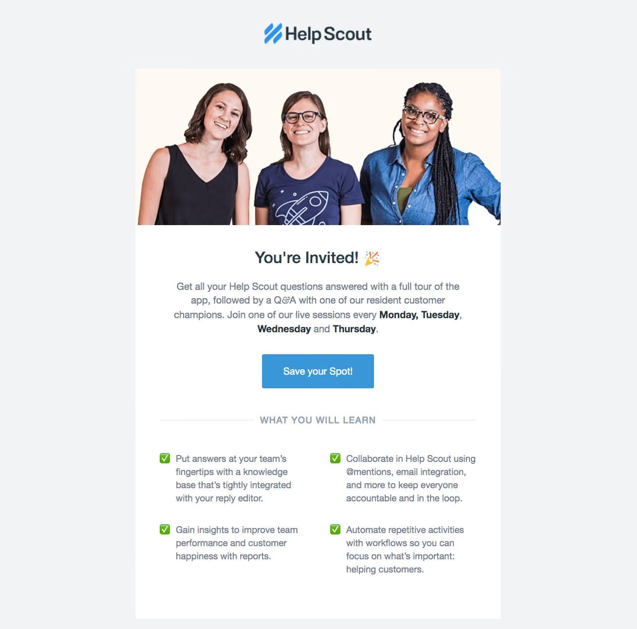
- **Character:** Warm webinar invitation email with team photography, a clear blue CTA and an approachable learning checklist.
### Page composition
- **Canvas:** 1308 × 1291 screenshot px.
- **Structure:** Centered logo above a white email card; wide three-person photo at top; centered invitation heading and paragraph; Save your Spot button; ruled uppercase learning heading; four checklist items in two columns.
### Information hierarchy
- **Priority:** Human photo introduces the message, then the invitation and registration action. Learning outcomes follow as secondary supporting content.
### Typography
- **Family:** Familiar sans serif, exact font unverified.
- **Scale:** Estimated screenshot heading 32 px, body 20–22 px, button 20 px bold and uppercase divider label 18 px; comfortable line height.
### Colors & surfaces
- **Sampled palette:** Outer gray #F1F3F5, card #FFFFFF, warm photo background #FEF9F3, blue #3A97D7, supporting text #72808E and dark heading tones #253540/#2A3B47.
### Components
- **Photography:** Wide team portrait fills the card width above the text block.
- **Action:** Centered rectangular blue button approximately 230 × 70 screenshot px with subtly rounded corners.
- **Checklist:** Green check icons at the start of each learning item; two equal text columns beneath a centered label flanked by horizontal rules.
### Visual rhythm
- **Spacing:** Estimated screenshot card width 750 px; body padding approximately 48–56 px. Generous space around the action and between checklist rows keeps the email airy.
### Responsive
- **Observed:** Email screenshot only.
- **Adaptation:** Scale the photo fluidly, stack checklist columns and keep approximately 20–24 CSS px side padding and a touch-sized registration action.
### Adaptation guidance
- **Preserve:** Personal team imagery, focused registration hierarchy and a short outcomes checklist.
- **Replace:** Use approved team photography, actual session schedule and supplied learning outcomes.
Use this context to reproduce the reference's visual language: layout, typography, colors, spacing, borders, radii, and distinctive elements. The screenshot takes priority if descriptions conflict.
## Direction
{{preferences.fidelityInstructions}}
## Output
{{output.instructions}}
Deliver a polished, cohesive design with precise alignment, hierarchy, and spacing. Produce the requested visual artifact, not just a description. If unsupported, explain the limitation.