Design with AI
Generate a new design based on this screen using your own content.
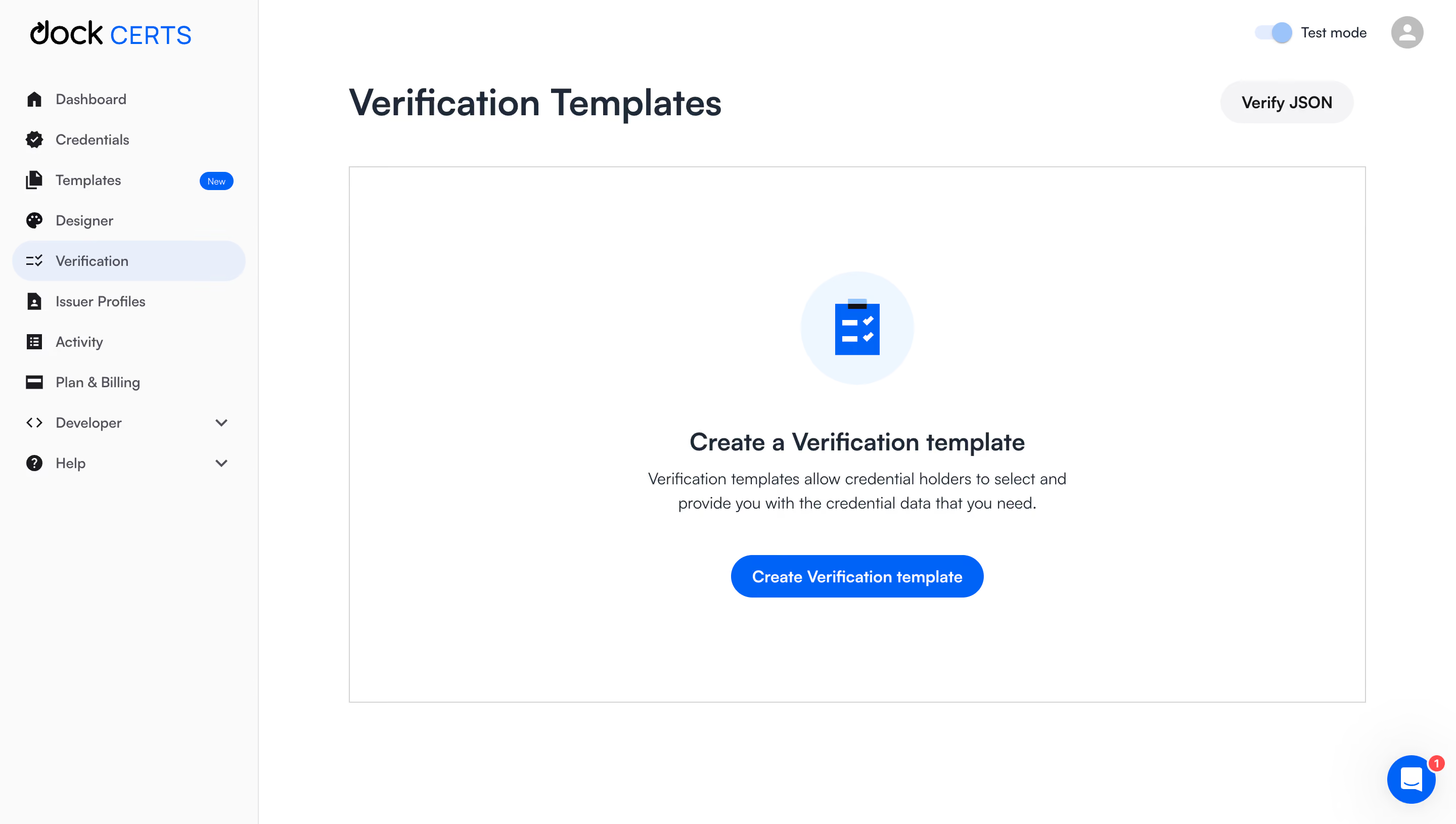
# Design from Reference: Dock Empty Verification Templates Dashboad
Create an original, high-fidelity visual design inspired by the reference. Prioritize composition, typography, colors, spacing, and component styling over technical implementation.
## Reference
- **Product:** Dock
- **Category:** Empty State
- **Screenshot:** https://cdn.prod.website-files.com/5e9dc792e1210c5325f7ebbc/6acad965bd9ce0e960551d70_6acad8da819c110875072813_cms-3118d1d498c83d4fc8a076b2.webp
Analyze the screenshot first. If inaccessible, request it rather than guessing.
## Content
{{content.instructions}}
{{content.data}}
Preserve essential messaging and factual accuracy. Adapt structure and copy length for visual balance; never invent product claims.
## Visual Design
### Overall aesthetic
- **Style:** Minimal verification-template dashboard with a large explanatory empty state.
- **Visual character:** White workspace, very pale sidebar, blue active navigation/action, and dark navy headings.
- **Surface treatment:** A broad thin-bordered rectangle frames the empty state without a heavy card shadow.
### Page composition
- **Screenshot size:** 2880 × 1630 image px. CSS estimates assume an unverified 2× capture.
- **Sidebar:** Approximately 255 CSS px wide with brand, navigation, dropdown groups, and selected Verification pill.
- **Header:** Verification Templates at left; Test mode toggle/avatar upper right; Verify JSON secondary pill near title level.
- **Empty panel:** Approximately 1000 × 530 CSS px, starting below the page title.
- **Centered group:** Pale-blue icon circle, template-creation heading, two-line description, and blue creation pill.
- **Support:** Floating blue chat button with notification badge at bottom right.
### Information hierarchy
- **Page context:** Verification Templates is the dominant heading.
- **Primary task:** Empty-state title explains creation before describing the data-request purpose.
- **Primary action:** Create Verification template appears beneath the explanation.
- **Secondary path:** Verify JSON remains separate above the panel.
- **Navigation:** Verification selection and Templates New badge help orient the user.
### Typography
- **Family:** Clean proportional sans serif; exact family unverified.
- **Page title:** Approximately 36 CSS px, weight 600, line-height 44 px.
- **Empty-state title:** Approximately 24 px, weight 600, line-height 30 px.
- **Description:** Approximately 16 px, regular, line-height 24 px.
- **Navigation/buttons:** Approximately 14–16 px.
- **Precision:** All sizes/weights are visual reconstruction estimates.
### Colors & surfaces
- **Workspace:** Sampled sRGB #FFFFFF.
- **Sidebar:** Sampled #FAFAFA.
- **Primary action/icon:** Sampled blue #0064FF.
- **Active navigation:** Sampled #E7EEFB.
- **Icon backdrop:** Sampled #ECF6FF.
- **Primary text:** Sampled #1C2938.
- **Secondary control:** Sampled #F4F4F5.
- **Panel border:** Sampled #D4D4D8.
### Components
- **Empty panel:** Thin square-cornered neutral outline; generous internal whitespace.
- **Status illustration:** Pale-blue circle approximately 112 CSS px diameter with blue checklist graphic.
- **Primary CTA:** Approximately 250 × 42 CSS px with pill radius and white semibold label.
- **Verify JSON:** Light-gray pill approximately 130 × 42 px with dark label.
- **Sidebar selection:** Pale-blue full-width pill, roughly 40 px high.
- **Test mode:** Compact blue toggle with text; its behavior is not demonstrated.
- **Chat:** Blue circular control with white message glyph and small red badge.
### Visual rhythm
- **Content inset:** Main workspace begins around 90 CSS px after the sidebar edge.
- **Vertical stack:** About 44 px from icon to heading, 12 px to description, and 40 px to CTA.
- **Panel balance:** The central group sits near the panel center with broad equal side margins.
- **Navigation rhythm:** Regular compact row pitch contrasts with the spacious empty state.
### Responsive
- **Observed version:** Desktop only.
- **Navigation recommendation:** Collapse sidebar on small screens.
- **Panel recommendation:** Let empty-state height adapt rather than forcing large blank bands.
- **Text recommendation:** Keep description to a readable narrow measure.
- **Actions recommendation:** Preserve clear separation of JSON verification and template creation.
### Adaptation guidance
- **Preserve:** Explanatory empty-state hierarchy, blue checklist symbolism, and one dominant creation action.
- **Content fidelity:** Describe actual verification-template functionality and supported data requests.
- **Starting values:** Approximately 36 px page title, 24 px empty-state title, 16 px body, and 42 px pill height under the assumed scale.
- **State fidelity:** Show empty state only when there are no templates; use actual mode and notification state.
- **Interaction fidelity:** Template creation and JSON verification are visually observed entry points; subsequent flows are unverified.
Use this context to reproduce the reference's visual language: layout, typography, colors, spacing, borders, radii, and distinctive elements. The screenshot takes priority if descriptions conflict.
## Direction
{{preferences.fidelityInstructions}}
## Output
{{output.instructions}}
Deliver a polished, cohesive design with precise alignment, hierarchy, and spacing. Produce the requested visual artifact, not just a description. If unsupported, explain the limitation.