Design with AI
Generate a new design based on this screen using your own content.
# Design from Reference: Conduktor Create Element
Create an original, high-fidelity visual design inspired by the reference. Prioritize composition, typography, colors, spacing, and component styling over technical implementation.
## Reference
- **Product:** Conduktor
- **Category:** Add & Edit
- **Screenshot:** https://cdn.prod.website-files.com/5e9dc792e1210c5325f7ebbc/6acb6762994832179b560634_6acb6578672175f31f226559_cms-1fd6ed404a492f44cd1ad718.webp
Analyze the screenshot first. If inaccessible, request it rather than guessing.
## Content
{{content.instructions}}
{{content.data}}
Preserve essential messaging and factual accuracy. Adapt structure and copy length for visual balance; never invent product claims.
## Visual Design
### Overall aesthetic
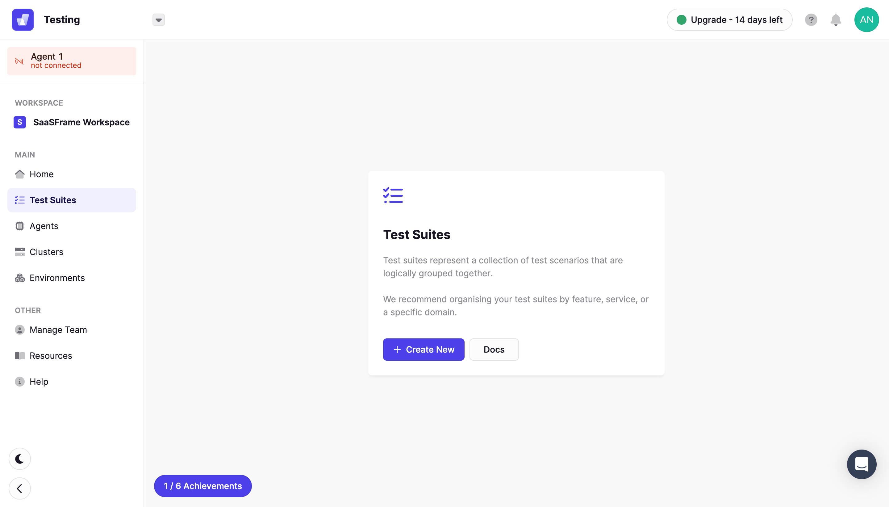
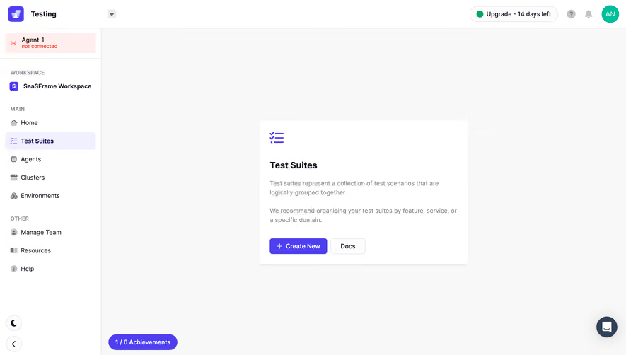
- **Style:** A light technical application shell uses white navigation, an almost-white workspace and violet emphasis.
- **Character:** A compact central empty-state card explains the selected feature, while peripheral status messages remain visible.
### Page composition
- **Capture:** The original measures 2880 × 1642 pixels. Estimated CSS dimensions below assume an unverified 2× capture.
- **Header:** A roughly 64-pixel white bar contains app identity and workspace selector left, trial-status capsule and utility icons right.
- **Sidebar:** A roughly 232-pixel rail contains a disconnected-agent notice, workspace identity and two labeled navigation groups.
- **Workspace:** A centered white card around 480 × 330 pixels sits in a broad pale canvas.
- **Bottom utilities:** An achievements capsule anchors the workspace's lower left; theme/collapse controls sit in the rail and a chat launcher sits bottom right.
### Information hierarchy
- **Feature title:** Test Suites is the central card's strongest text.
- **Explanation:** Two muted paragraphs describe the collection and grouping concept.
- **Actions:** Violet Create New is primary; outlined Docs is secondary.
- **Status:** A pale-red disconnected-agent notice, trial badge and achievement count remain distinct from the central task.
### Typography
- **Family:** Neutral sans serif throughout; exact identity is unverified.
- **Card title:** Approximately 20 pixels, bold.
- **Body:** About 14 pixels with 21-pixel line height and muted gray color.
- **Navigation:** Around 14 pixels, with the selected destination bold.
- **Group labels:** Around 12 pixels uppercase, semibold and muted.
### Colors & surfaces
- **Measured canvas:** Near-white #F9F8F9 contrasts with white #FFFFFF shell and card.
- **Primary accent:** Violet #4E3FF1 defines the main action and selected-feature icon.
- **Secondary surfaces:** Pale lavender #F1F0FF marks selected navigation; pale red #FFEEEC marks agent status.
- **Ink:** Dark near-black headings contrast with gray helper text and icons.
- **Depth:** A subtle shadow lifts the central card; the rest of the shell uses fine boundaries and flat fills.
### Components
- **Empty-state card:** Roughly 480 × 330 pixels, small corner radius, around 24-pixel padding and a large violet checklist icon above the title.
- **Action row:** A filled violet button around 132 × 36 pixels contains a plus; a smaller outlined Docs button follows after an 8-pixel gap.
- **Selected nav:** A pale-lavender rounded row pairs violet icon and dark bold label.
- **Agent notice:** A small pale-red rectangle contains a red disconnected symbol and two text lines.
- **Trial badge:** A thin outlined capsule combines a green dot and remaining-time label.
- **Utilities:** Small circular theme/collapse buttons, a violet achievements pill and dark circular chat button occupy the lower edges.
### Visual rhythm
- **Whitespace:** The central card is surrounded by broad open canvas.
- **Card spacing:** Icon, title, explanatory paragraphs and actions form a clear vertical stack with 20–30-pixel gaps.
- **Sidebar rhythm:** Consistent row spacing and larger group breaks make navigation scannable.
### Responsive
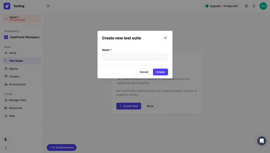
- **Evidence:** Only desktop is observed; creation dialog and mobile behavior are unverified.
- **Recommended layout:** Collapse the rail and make the card fluid with 20–24-pixel viewport insets.
- **Recommended utilities:** Keep achievements and chat clear of card actions on short screens.
- **Accessibility:** Provide labeled icon controls, focus states and readable status descriptions.
### Adaptation guidance
- **Preserve:** Keep the violet action system, quiet shell and concise feature explanation.
- **Scope:** The visible screen is a Test Suites empty state; no create-element dialog is shown.
- **Implementation:** Separate shell, status notices and empty-state component.
- **Behavior:** Define creation, documentation and disconnected-agent handling explicitly; these outcomes are not demonstrated.
Use this context to reproduce the reference's visual language: layout, typography, colors, spacing, borders, radii, and distinctive elements. The screenshot takes priority if descriptions conflict.
## Direction
{{preferences.fidelityInstructions}}
## Output
{{output.instructions}}
Deliver a polished, cohesive design with precise alignment, hierarchy, and spacing. Produce the requested visual artifact, not just a description. If unsupported, explain the limitation.