
Thank you! Your submission has been received!
Oops! Something went wrong while submitting the form.
Get SaaSFrame Pro
Monthly
$18
Quarterly
$48
Yearly
$180
Upgrade to access this feature
Browse all screens & flows
Filter and search screens & flows
Access Figma files
Access mobile versions
Bookmark screens & flows
Join now

Cohere Features Page

Cohere
Build incredible products with world-class language AI
Designed by


Bookmark
Bookmark

Design with AI
Thank you! Your submission has been received!
Oops! Something went wrong while submitting the form.
# Design from Reference: Cohere Features Page
Create an original, high-fidelity visual design inspired by the reference. Prioritize composition, typography, colors, spacing, and component styling over technical implementation.
## Reference
- **Product:** Cohere
- **Category:** Features Page
- **Screenshot:** https://cdn.prod.website-files.com/5e9dc792e1210c5325f7ebbc/6acb725fb10d21a746c479ab_6acb70eef56587432a47f30f_cms-a070b7f7893d57a103ffc899.webp
Analyze the screenshot first. If inaccessible, request it rather than guessing.
## Content
{{content.instructions}}
{{content.data}}
Preserve essential messaging and factual accuracy. Adapt structure and copy length for visual balance; never invent product claims.
## Visual Design
### Overall aesthetic
- **Character:** A distinctive developer-product page with rounded monospaced-looking display type, chamfered controls, dark code panels and soft dimensional gradient objects.
- **Evidence scale:** Original 2880 × 14826 pixels, inspected through all six readable crops. CSS estimates assume an unverified 2× capture scale.
### Page composition
- **Navigation:** Long pale segmented bar with logo, uppercase links and separate Try now control.
- **Hero:** Split light/gray-green layout: title, code sample, description and two actions left; oversized search-result browser demonstration over dimensional abstract objects right.
- **Customer band:** Dark horizontal strip with five white customer logos.
- **Examples:** Large display heading and two widely separated search-demo columns, one English and one multilingual.
- **Quote:** Broad coral/pink gradient testimonial panel.
- **API section:** Dark-green band pairs large heading/copy/docs action left with tall Python/response code panel right.
- **Benefits:** One wide numbered panel above two smaller angled-top panels.
- **Resources:** Three image-led items with metadata, descriptions and article/docs links.
- **Closing/footer:** Large abstract-object contact banner precedes dark newsletter/navigation footer, oversized Cohere wordmark and legal/social row.
### Information hierarchy
- **Hero task:** Large search proposition and visual code-to-results connection explain the product.
- **Examples:** Small uppercase labels identify search type; large descriptive copy and blue article links follow demonstrations.
- **Developer emphasis:** Dark API section isolates code details from the editorial light regions.
- **Benefits:** Large numerals 1–3 make the value statements easy to scan.
- **Resources:** Three equal thumbnail blocks guide deeper reading.
- **Actions:** Black chamfered sales controls contrast with white outlined secondary paths.
### Typography
- **Display:** Unverified rounded/slab-like sans or monospaced-looking family, approximately 48–68 px regular with 60–72 px line height.
- **Body:** Unverified sans-serif around 16 px regular, 22–24 px line height.
- **Example/quote text:** Approximately 24 px regular, 32 px line height.
- **Eyebrows/navigation:** Around 12–14 px uppercase with expanded tracking.
- **Code:** Monospaced around 16 px with line numbers, comments and syntax colors.
- **Footer:** Approximately 16 px links and 12 px uppercase group labels.
### Colors & surfaces
- **Light base:** Measured #FAFAFA, warm #F5F4F2 and #F5F5F5.
- **Warm neutral:** #E9E6DF supports closing/benefit surfaces.
- **Hero backing:** Gray-green #BAC3C0.
- **Dark regions:** Charcoal #212121 footer/customer band; deep green #0C1210 and #16211B code/API family.
- **Accents:** Coral/pink gradients, lavender/green dimensional objects, teal/orange code tokens and restrained blue resource links.
### Components
- **Navigation geometry:** Fine outlined segments with slanted/chamfered ends, uppercase labels and small circular markers.
- **Code cards:** Dark rounded rectangles with line numbers and syntax highlighting; cut-corner detail appears in the hero sample.
- **Search demonstration:** Large white browser-style panel with rounded query field, five mountain thumbnails and smaller result rows.
- **Example mockups:** White/black miniature search windows within pale rounded image tiles, with subtle shadows.
- **Testimonial:** Wide approximately 1220 px gradient rectangle with rounded corners, large quote and small uppercase attribution.
- **API panel:** Tall outlined dark code frame with Python header, coral rules, copy icon and separate response region.
- **Benefit panels:** Thin warm outlines, large corner radii and angled top edges; large numeral/icon left and text right.
- **Resource cards:** Three square-ish image thumbnails, small author/date metadata and unboxed text/link below.
- **Actions:** Long rectangular labels with chamfered right edge and separate arrow tile.
- **Footer:** Compact email field plus arrow button, four navigation columns and contact group, giant pale logo text and small lower legal links.
### Visual rhythm
- **Page gutters:** Roughly 108 px side insets repeat across most sections.
- **Large spacing:** Broad 100–160 px intervals separate example columns, benefits and resources.
- **Alternation:** Light explanatory sections alternate with dark developer and footer regions.
- **Geometry:** Repeated soft rounding, angled edges and thin connector lines unify code, cards and navigation.
### Responsive
- **Observed limit:** Desktop only; mobile behavior is unverified.
- **Recommendation:** Stack split sections and examples, collapse resource/benefit grids and reduce display size.
- **Code/search:** Keep code horizontally scrollable and simplify demo cropping without shrinking readable text.
- **Footer/artwork:** Reposition abstract objects and wrap navigation groups to avoid overlapping content.
### Adaptation guidance
- **Retain:** Connect code examples to concrete visual outcomes, then offer benefits and deeper resources.
- **Implement:** Reuse chamfered controls, warm neutrals, dark-green code regions and a restrained dimensional-art palette.
- **Verify:** Confirm fonts, scale and API/search behavior separately; examples and claims are captured content, and no API key or service was used.
Use this context to reproduce the reference's visual language: layout, typography, colors, spacing, borders, radii, and distinctive elements. The screenshot takes priority if descriptions conflict.
## Direction
{{preferences.fidelityInstructions}}
## Output
{{output.instructions}}
Deliver a polished, cohesive design with precise alignment, hierarchy, and spacing. Produce the requested visual artifact, not just a description. If unsupported, explain the limitation.


Category
Patterns
No items found.
Tech Stack

Added on
April 20, 2023
Similar screens
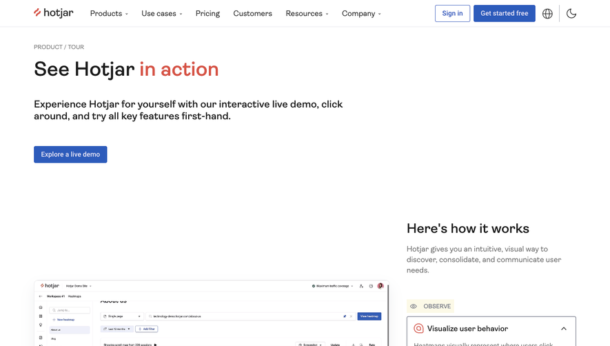


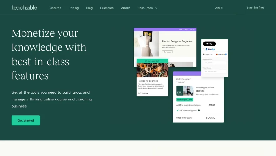



Upgrade to SaaSFrame Pro now to see similar examples.
Monthly
$18 /month
Billed $18 monthly
Browse all screens & flows
Filter and search screens & flows
Search text in screenshots
Access Figma files
Access mobile versions
Join now
Quarterly
$16 /month
Billed $48 quarterly
Browse all screens & flows
Filter and search screens & flows
Search text in screenshots
Access Figma files
Access mobile versions
Join now
Yearly
$15 /month
Billed $180 yearly
Browse all screens & flows
Filter and search screens & flows
Search text in screenshots
Access Figma files
Access mobile versions
Join now