Design with AI
Generate a new design based on this screen using your own content.
# Design from Reference: Café Product Tour
Create an original, high-fidelity visual design inspired by the reference. Prioritize composition, typography, colors, spacing, and component styling over technical implementation.
## Reference
- **Product:** Café
- **Category:** Product Tour
- **Screenshot:** https://cdn.prod.website-files.com/5e9dc792e1210c5325f7ebbc/6acb72ae018523cfee2d9ffd_6acb6f269b286159c4676935_cms-078011ff608298a83d4fec2c.webp
Analyze the screenshot first. If inaccessible, request it rather than guessing.
## Content
{{content.instructions}}
{{content.data}}
Preserve essential messaging and factual accuracy. Adapt structure and copy length for visual balance; never invent product claims.
## Visual Design
### Overall aesthetic
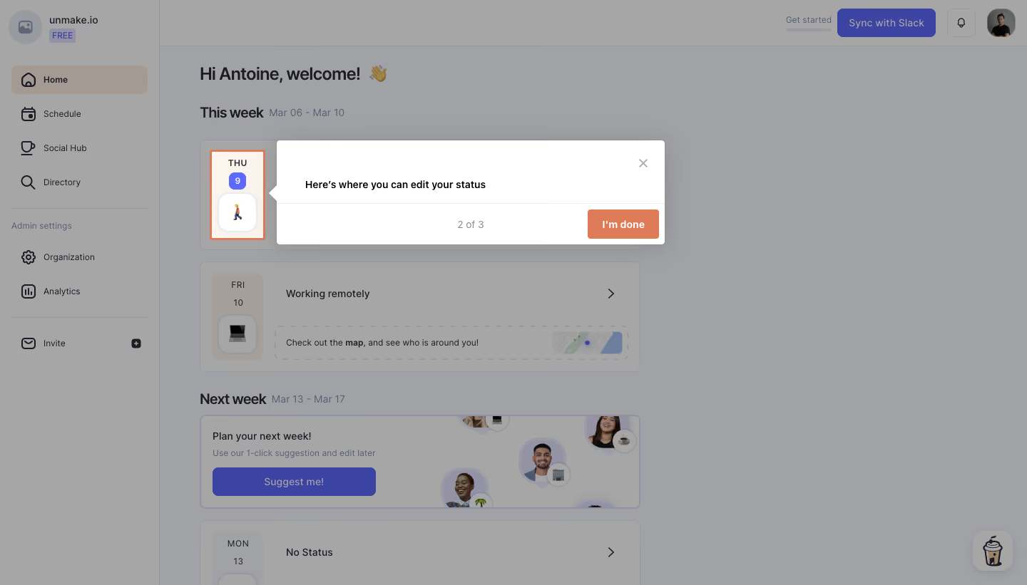
- **Character:** A light workplace dashboard is covered by a dimming overlay and a crisp white guided-tour popover.
- **Accent:** Coral highlights the targeted status control and completion action, while the underlying application uses muted purple and warm neutral cards.
### Page composition
- **Capture:** The source measures 1440 × 821 image pixels. Observed dimensions below approximate CSS only under an unverified 1× capture assumption.
- **Application shell:** A roughly 220 px left sidebar contains workspace identity, navigation and admin links. A top utility row holds Slack sync, notifications and avatar.
- **Dashboard:** A welcome heading precedes current-week status cards and a next-week planning section in a roughly 620 px content column.
- **Tour overlay:** A roughly 545 × 145 px white popover sits beside a narrow highlighted day/status tile, with a left-pointing notch.
- **Popover structure:** Instruction text occupies the upper area; a separated footer contains progress and an I'm done action.
### Information hierarchy
- **Target:** The narrow Thursday status tile remains bright within a coral outline while surrounding content is dimmed.
- **Instruction:** A bold sentence explains the status-edit location.
- **Progress:** A small 2 of 3 label identifies the tour position.
- **Action:** The coral completion button is the most prominent popover control; a small gray close icon sits at the top right.
### Typography
- **Family:** A neutral sans serif is visible; exact identity is unverified.
- **Popover:** Instruction and button labels are approximately 14–16 px, semibold.
- **Progress:** Approximately 14 px in medium gray.
- **Background hierarchy:** The welcome title is around 24 px, with smaller week headings and compact status-card labels.
### Colors & surfaces
- **Measured overlay:** ICC-aware sRGB sampling yields dimmed grays #A1A2A5 and #A6A6A6.
- **Measured foreground:** White #FFFFFF fills the popover and highlighted target.
- **Measured accent:** Coral #DE7C5A supports the tour action/highlight; the background's dimmed purple includes #3B44A2.
- **Other surfaces:** Warm neutral #A39B93 appears in dimmed selected navigation, with gray-blue #979A9F in secondary details.
### Components
- **Tour popover:** A white rectangular panel with small rounded corners, left notch and soft shadow is split by a thin horizontal rule.
- **Target tile:** A tall narrow day/date/status block has a coral rectangular outline, purple date badge and rounded emoji status button.
- **Tour controls:** A compact coral button sits at the lower right; progress is centered in the footer and the close X remains separate above.
- **Sidebar:** Icon/text rows use generous padding; Home has a warm selected fill.
- **Dashboard cards:** Rounded status cards include date tiles, status text and right chevrons. A planning card includes portraits and a purple suggestion action.
### Visual rhythm
- **Overlay focus:** Bright target and popover form one horizontal teaching unit against the dimmed page.
- **Popover spacing:** Broad internal padding keeps the single instruction uncluttered.
- **Dashboard cadence:** Repeated week headings and status cards create a regular vertical structure beneath the overlay.
- **Alignment:** The popover's notch points directly toward the highlighted status area.
### Responsive
- **Evidence boundary:** Only a desktop state is shown; responsive behaviors are recommendations.
- **Tour positioning:** Reposition the popover above or below the target on narrow screens, keeping both visible.
- **Dashboard flow:** Collapse the sidebar and let status cards fill the available width.
- **Action access:** Keep close and completion controls reachable without covering the target.
### Adaptation guidance
- **Contextual tour:** Reuse a single highlighted target, concise explanation and explicit progress/action.
- **Accessible teaching:** Manage focus and provide a clear dismissal route; do not rely only on dimming or color.
- **State boundaries:** The screenshot shows tour step two; editing and completion results are not verified.
- **Dynamic data:** Treat dates, names and statuses as replaceable workspace data.
- **Scale calibration:** Validate observed pixels against the target CSS viewport before implementation.
Use this context to reproduce the reference's visual language: layout, typography, colors, spacing, borders, radii, and distinctive elements. The screenshot takes priority if descriptions conflict.
## Direction
{{preferences.fidelityInstructions}}
## Output
{{output.instructions}}
Deliver a polished, cohesive design with precise alignment, hierarchy, and spacing. Produce the requested visual artifact, not just a description. If unsupported, explain the limitation.