Overall Style and Aesthetic
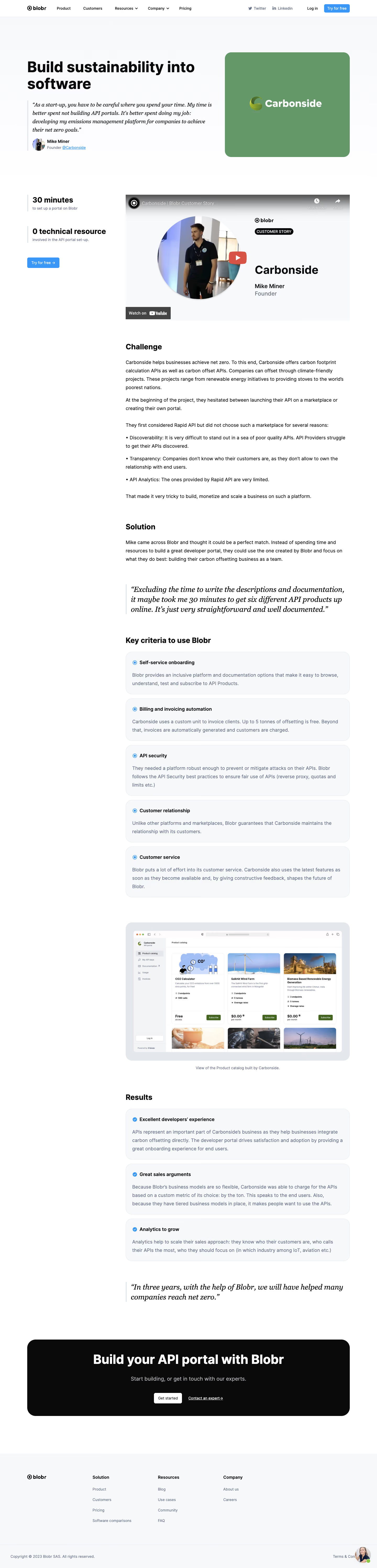
Blobr's Carbonside customer page exemplifies a fresh, minimalist, and highly professional SaaS look. The design feels approachable and contemporary, relying on a clean layout and generous white space to create a sense of clarity and calm. Subtle gradients and soft shadows add gentle visual depth, while the interface avoids unnecessary clutter, supporting a focused and purposeful mood. Layout and Structure
The page unfolds in well-defined sections: a captivating hero at the top, followed by a product overview, feature highlights, testimonial quotes, and a practical CTA zone, all capped by a concise, navigation-friendly footer. Each section is visually separated, ensuring visitors can scan content effortlessly. The hero features branding, a succinct value proposition, and a bold call-to-action button above the fold. Visual Elements
Custom illustrations and crisp, vector-based icons are central to the visual identity, adding both personality and clarity. Brand logos, customer photos, and device mockups provide authentic context, while smooth fade-in animations create a lively but non-distracting browsing experience. No heavy video or intrusive graphics interrupt the flow—everything is thoughtfully integrated to support conversion. Color Palette and Typography
Key colors include energizing blues, fresh greens, and gentle neutrals. Contrasts are used judiciously—accent buttons and highlights pop without overwhelming the page. Typography is sharp, modern, and harmonious, mixing bold headings with legible sans-serif body copy for optimal information hierarchy and readability. User Experience Patterns
Navigation is intuitive, with sticky headers and clear CTAs guiding users along a logical journey. Interactive elements—like buttons and links—are distinct and tactile. Micro-interactions, such as hover states, reinforce engagement. The testimonial section humanizes the experience, instilling trust and confidence. Unique or Notable Design Choices
The standout feature is the seamless integration of brand storytelling—a blend of customer-centric narratives and product showcases feels authentic and relatable. The overall tone is trustworthy, innovative, and quietly confident, projecting a modern SaaS brand that users can rely on and connect with.