Generate a new design based on this screen using your own content.
Thank you! Your submission has been received!
Oops! Something went wrong while submitting the form.
# Design from Reference: Anchor Customer Stories
Create an original, high-fidelity visual design inspired by the reference. Prioritize composition, typography, colors, spacing, and component styling over technical implementation.
## Reference
- **Product:** Anchor
- **Category:** Customer Stories
- **Screenshot:** https://cdn.prod.website-files.com/5e9dc792e1210c5325f7ebbc/6acad5295a5fdf4c30310fc1_6acad4956cd44b3ad4d6d1de_cms-1ce6ddbfcd15dd07f85dee5b.webp
Analyze the screenshot first. If inaccessible, request it rather than guessing.
## Content
{{content.instructions}}
{{content.data}}
Preserve essential messaging and factual accuracy. Adapt structure and copy length for visual balance; never invent product claims.
## Visual Design
Use this context to reproduce the reference's visual language: layout, typography, colors, spacing, borders, radii, and distinctive elements. The screenshot takes priority if descriptions conflict.
## Direction
{{preferences.fidelityInstructions}}
## Output
{{output.instructions}}
Deliver a polished, cohesive design with precise alignment, hierarchy, and spacing. Produce the requested visual artifact, not just a description. If unsupported, explain the limitation.
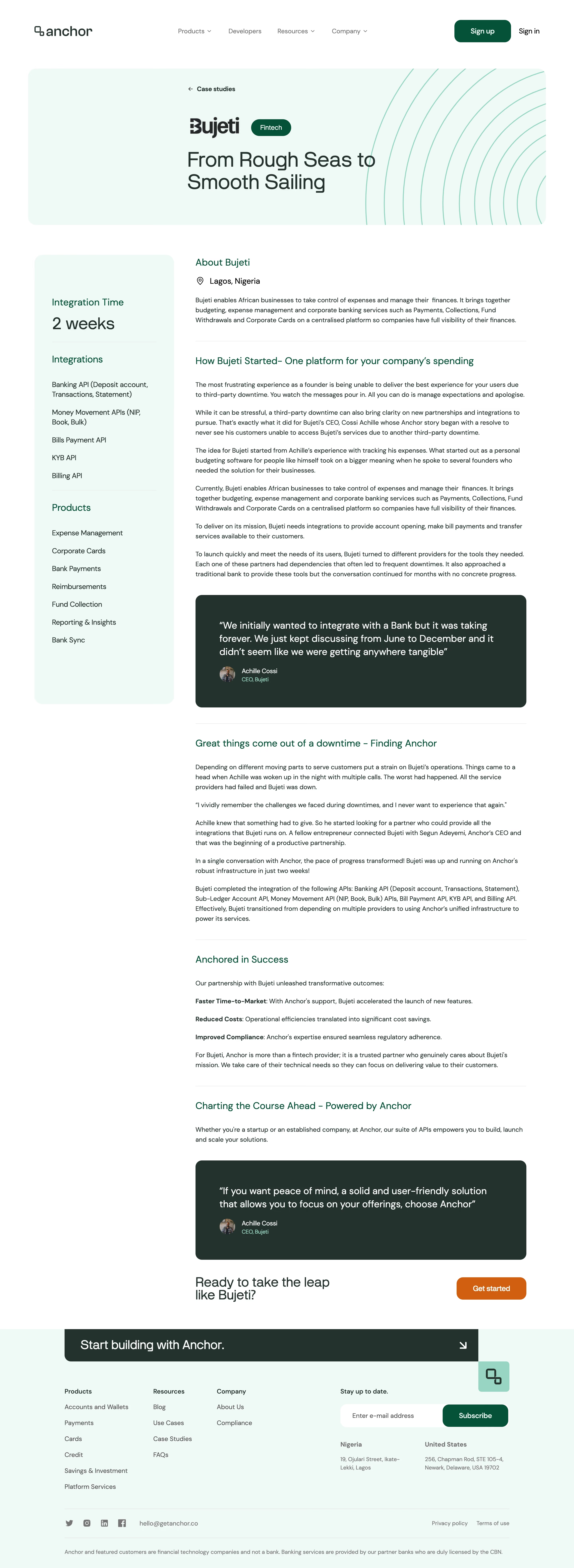
Anchor’s Open Case Study page showcases a distinctly modern, minimalist aesthetic balanced with an understated professionalism. White space is used liberally, giving every element room to breathe and creating a sense of clarity. Large, clean headers and tight content sections reflect a focus on contemporary design with a hint of editorial flair, making the site feel credible but fresh.
Layout and Structure
The page flows seamlessly from a prominent hero section featuring a concise project summary and client logo, to an in-depth narrative of the case study. Clear content blocks break the story into digestible sections—challenge, approach, and outcomes—guiding the visitor through the project journey. The sidebar navigation allows for quick jumps to key areas. A sticky secondary menu enhances usability for longer reads.
Visual Elements
Custom illustrations and subtle animations add visual interest without overwhelming the user. Full-width imagery showcases the product in context, while thoughtful use of icons punctuates key insights. Visual breaks, like image carousels and module cards, keep the story visually engaging and scannable.
Color Palette and Typography
The palette is crisp and restrained—mainly bright white, deep navy, and gentle grays—professionally accented by a single warmth-bringing highlight color. Typography is modern and readable, with bold sans-serif headings establishing hierarchy and lighter body text ensuring legibility.
User Experience and Unique Choices
Anchored CTAs and an intuitive navigation sidebar are standout UX features, encouraging users to explore related work while maintaining context. Microinteractions—such as hover states and subtle section fades—enhance engagement. The overall tone is trustworthy and intelligent, appealing to design-savvy SaaS audiences who value clarity and depth.