Design with AI
Generate a new design based on this screen using your own content.
# Design from Reference: Airtable Free Trial Emails
Create an original, high-fidelity visual design inspired by the reference. Prioritize composition, typography, colors, spacing, and component styling over technical implementation.
## Reference
- **Product:** Airtable
- **Category:** Free Trial Emails
- **Screenshot:** https://cdn.prod.website-files.com/5e9dc792e1210c5325f7ebbc/6acbc0717ce271b12870b63f_6acbbfc07ce271b128707ea8_cms-cb5a99597df30848046d1027.webp
Analyze the screenshot first. If inaccessible, request it rather than guessing.
## Content
{{content.instructions}}
{{content.data}}
Preserve essential messaging and factual accuracy. Adapt structure and copy length for visual balance; never invent product claims.
## Visual Design
### Overall aesthetic
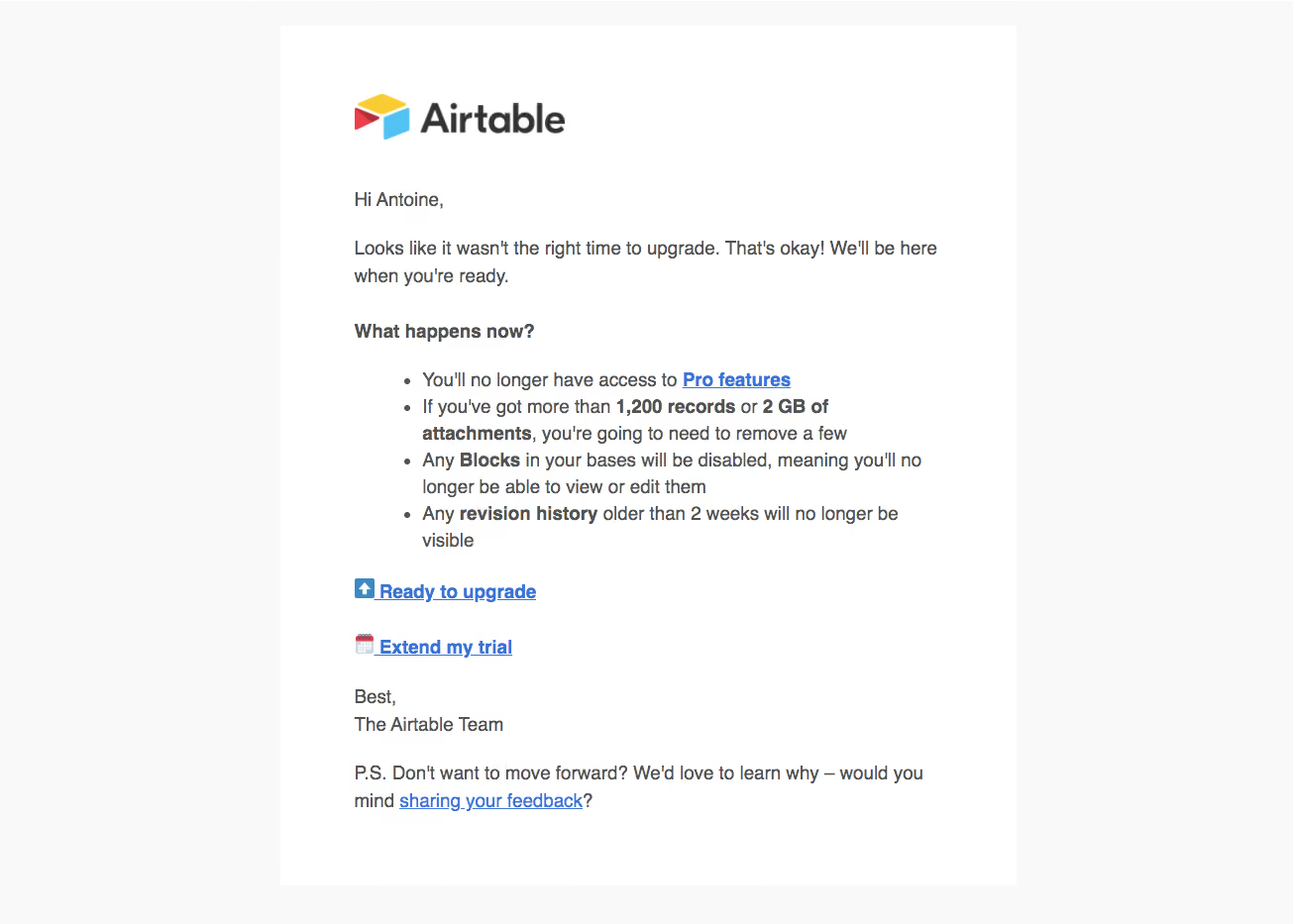
- **Character:** A plain, readable trial-expiry email with a white message sheet on a very pale gray surround. Branding, bold emphasis and conventional blue links provide hierarchy without decorative cards.
- **Image basis:** Observed at the original 1305 × 933 pixels. Dimensions below are image-pixel estimates; email CSS scale and font identity are unverified.
### Page composition
- **Container:** A roughly 744 × 867 px white sheet begins around x283, y26, with broad pale margins around it.
- **Brand:** A multicolor symbol and dark wordmark sit at the upper left of the message content, around x358, y95.
- **Message:** A greeting and short paragraph lead into a bold question-style subheading and four-item consequence list.
- **Actions:** Two separate blue underlined upgrade/trial-extension links appear below the list, each with a small leading emoji-style icon.
- **Closing:** A two-line sign-off and final feedback paragraph complete the visible message. No additional footer is shown.
### Information hierarchy
- **Brand and opening:** The logo is the largest graphic; the message itself retains a conversational email structure.
- **Consequences:** A bold subheading and bulleted list make the practical changes scanable. Selected terms and limits are bold within sentences.
- **Actions:** Two bold blue links offer next steps; the feedback link is smaller in emphasis within the final paragraph.
- **Observed state:** This is static email content. No form, focused link, confirmation or loading state is visible.
### Typography
- **Body:** Approximately 20 px regular sans-serif with roughly 28 px line-height, left aligned.
- **Emphasis:** The subheading and selected list phrases use bold weight at the same body scale.
- **Action links:** Approximately 20 px bold, blue and underlined. The final feedback link uses regular weight.
- **Brand:** The wordmark is substantially larger, around 40 px high as artwork. Its identity does not establish the email body typeface.
### Colors & surfaces
- **Measured foundations:** White #FFFFFF forms the sheet; near-white #F9F9F9 forms the surround.
- **Measured text:** Gray #525252 dominates the reading text, with darker #333333 in stronger details.
- **Measured links:** Blue #3276DC appears in the action/link family.
- **Artwork:** Yellow, red and cyan in the logo provide a small brand accent. No shadows, gradients or enclosing content borders are evident.
### Components
- **Logo block:** Approximately 214 px wide and 46 px high, separated from the greeting by a generous gap.
- **Bullet list:** Four round bullets are indented approximately 48 px from the body edge, with wrapped lines aligned under their text.
- **Text actions:** Two standalone underlined links are vertically separated, each with a small icon. They are not filled buttons.
- **Message sheet:** About 75 px horizontal inner padding provides a readable roughly 594 px text area.
- **Footer content:** Sign-off and feedback paragraph remain in the same reading column; no unseen unsubscribe or legal block is inferred.
### Visual rhythm
- **Alignment:** All content follows one left edge apart from the indented list.
- **Spacing:** Paragraph gaps are roughly 24–32 px; larger separation distinguishes the consequence list and action pair.
- **Density:** Moderate line length and generous line-height support reading despite several wrapped bullet items.
- **Emphasis:** Bold words and blue underlines create scan points within an otherwise uniform body-text layout.
### Responsive
- **Evidence limit:** Only the captured email composition is visible.
- **Recommended container:** Use fluid width with smaller mobile gutters while preserving a readable maximum line length.
- **Recommended list:** Keep natural wrapping and a modest indentation so bullets do not crowd narrow screens.
- **Recommended actions:** Preserve clear underlines and adequate vertical separation for touch use.
- **Recommended branding:** Scale the logo proportionally and provide useful alternative text.
### Adaptation guidance
- **Preserve:** Keep the plain-email structure, explicit consequences, inline bold emphasis and clear next-step links.
- **Build:** Use robust email-compatible layout and real text rather than a single image.
- **Content integrity:** Treat plan names and limits as historical screenshot content; verify any real commercial details before reuse.
- **Validate:** Test email-client rendering, link destinations, text contrast and small-screen line wrapping.
Use this context to reproduce the reference's visual language: layout, typography, colors, spacing, borders, radii, and distinctive elements. The screenshot takes priority if descriptions conflict.
## Direction
{{preferences.fidelityInstructions}}
## Output
{{output.instructions}}
Deliver a polished, cohesive design with precise alignment, hierarchy, and spacing. Produce the requested visual artifact, not just a description. If unsupported, explain the limitation.