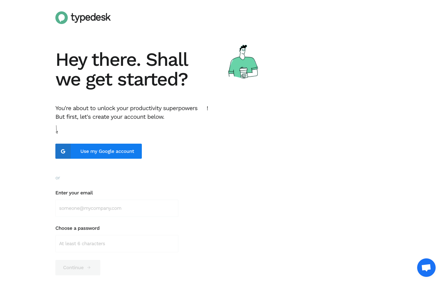
``` Typedesk’s welcome page radiates a fresh, modern minimalism that instantly feels approachable and professional. The generous white space, playful but not childish illustrations, and confident use of color create a visually pleasing balance between energy and clarity—perfect for productivity-oriented SaaS. ```html
Layout and Structure
``` The page embraces a classic SaaS structure, with an impactful hero section showcasing value proposition and a prominent CTA. The flow moves seamlessly through feature highlights, cleverly anchored with succinct copy and illustrations, followed by social proof in testimonials. Call-to-action buttons appear at strategic scroll points, encouraging signup without being intrusive. The footer is comprehensive but unobtrusive, organizing links and trust signals elegantly. ```html
Visual Elements
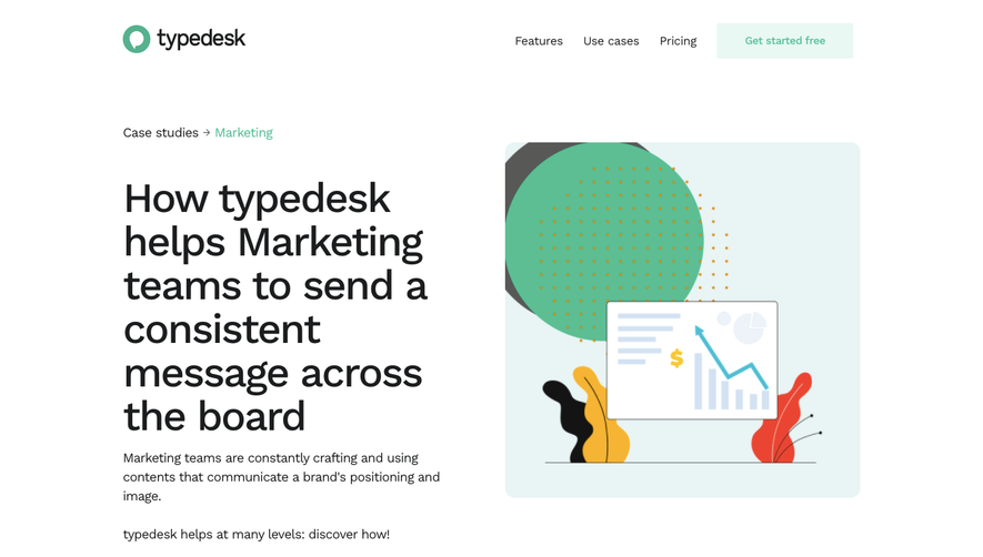
``` Clean, vector-based illustrations inject personality and context without stealing focus from the content. Animated UI mockups subtly demonstrate key features in action, while icons add visual cues that enhance scanability. There’s no heavy photography; instead, visuals serve clear functional and narrative roles. ```html
Color Palette and Typography
``` The palette is vibrant yet controlled, with a signature aqua blue guiding attention and soft accent shades supporting UI elements and illustrations. Typography leans modern and sans-serif, with bold headings ensuring an intuitive content hierarchy and lighter body text for maximum legibility. ```html
User Experience Patterns & Unique Choices
``` Navigation is sticky and streamlined, reducing friction for new users. CTAs are consistently styled for instant recognition. Micro-interactions add tactile delight, while the conversational tone and microcopy foster trustworthiness and warmth. Notably, the blend of playful visuals with sharp clarity achieves an inviting, memorable first impression for prospective users.
 SaaSFrame