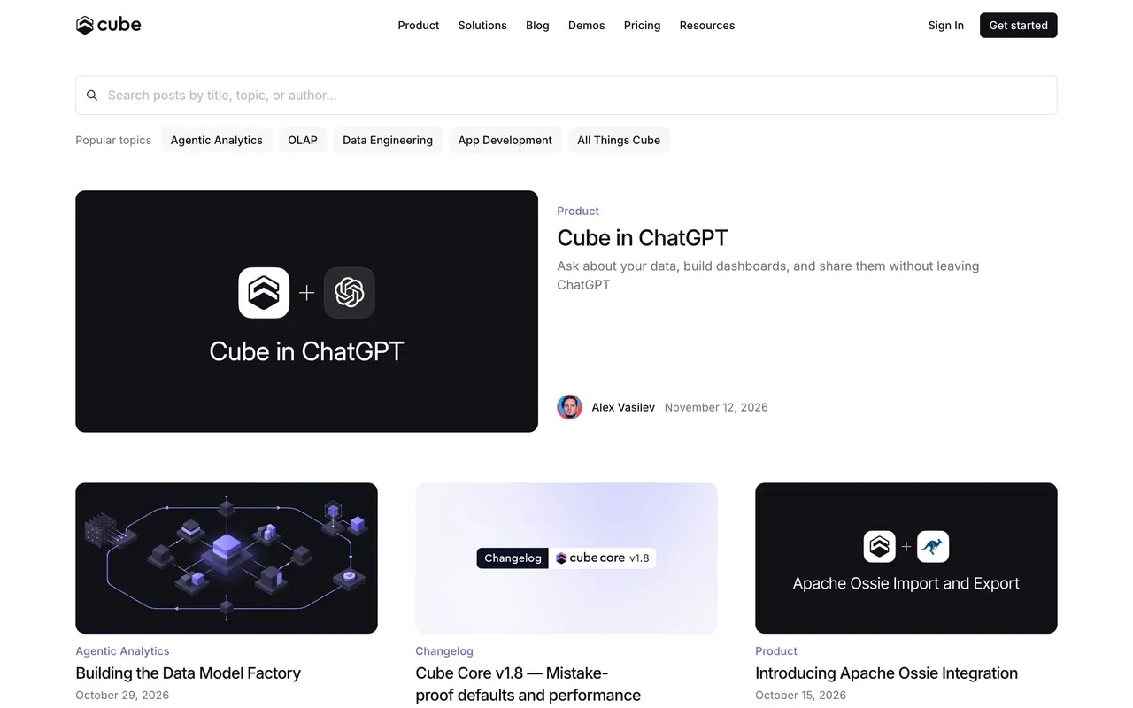
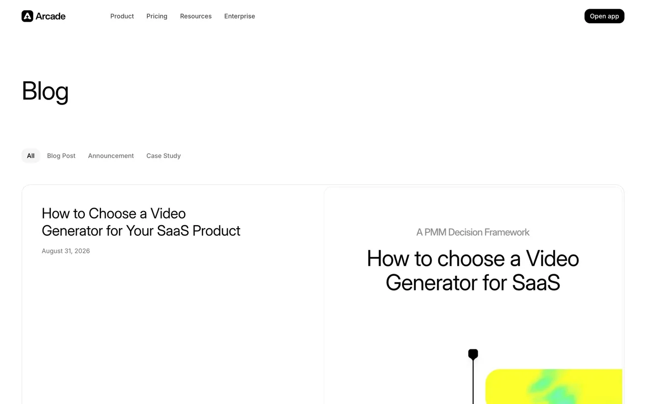
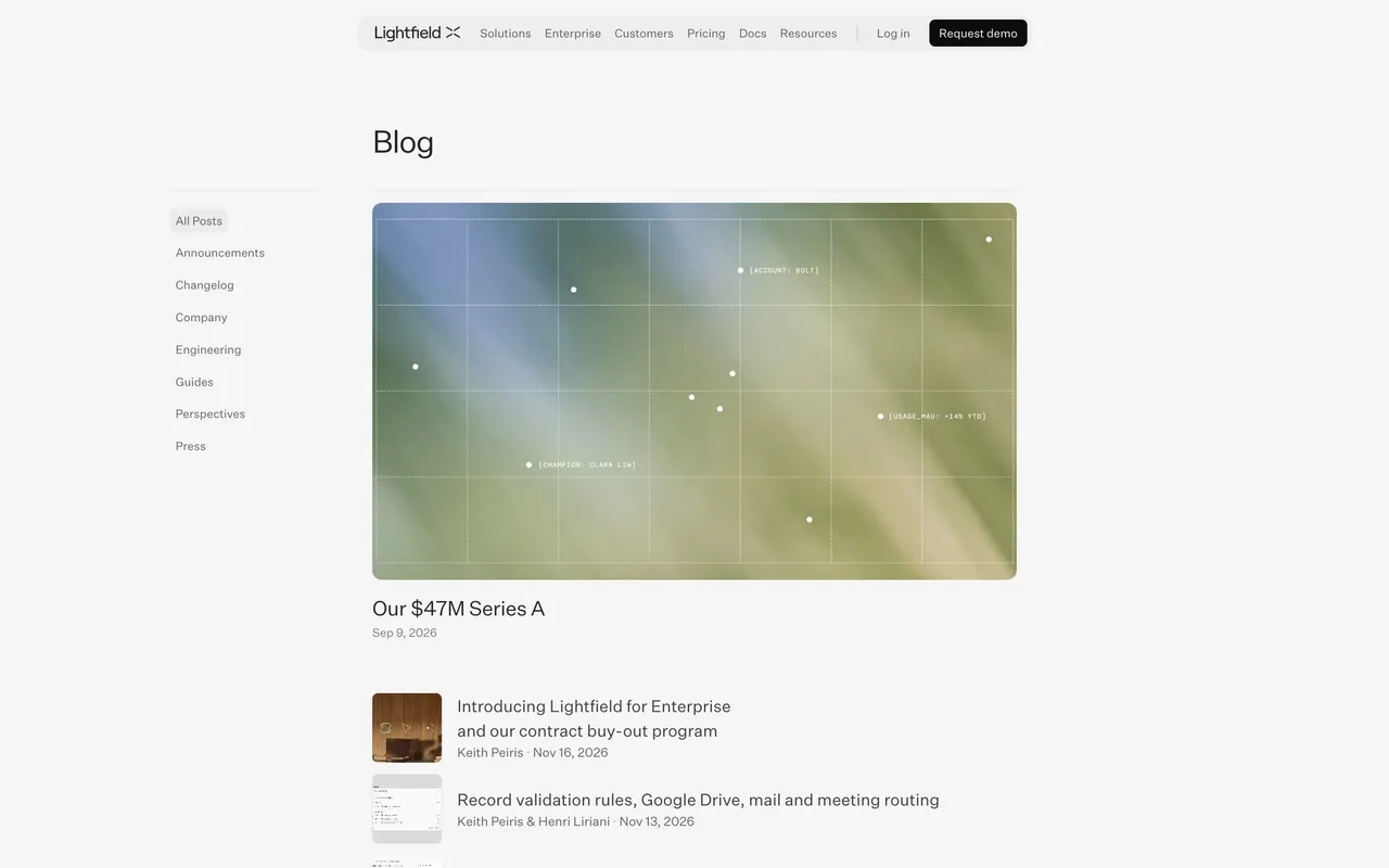
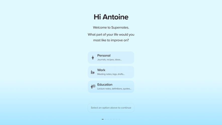
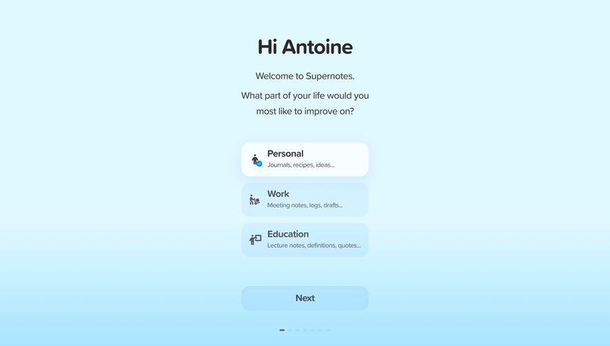
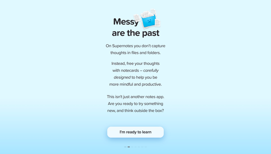
Supernotes’ blog page radiates a minimalist and modern sensibility, balancing crisp professionalism with a touch of approachability. The use of abundant white space, carefully considered layouts, and restrained accents fosters a sense of clarity and focus, inviting deep exploration without distraction.
Layout and Structure
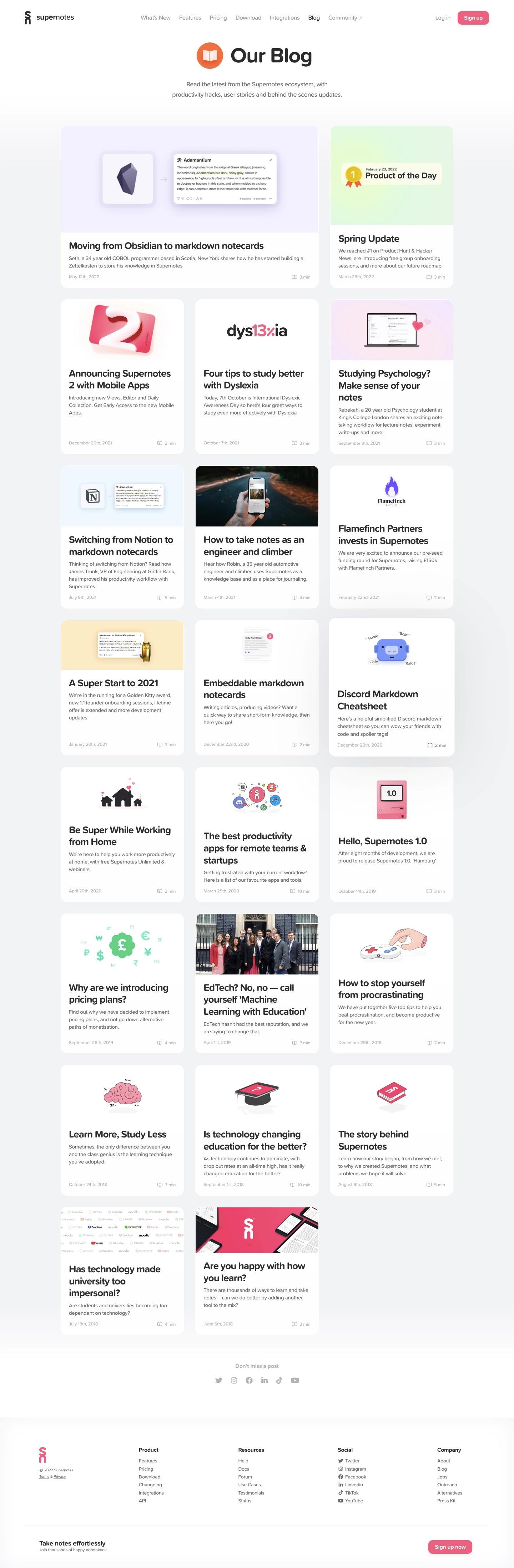
The page opens with a clean hero section—centered title and subtle subtitle—eschewing clutter in favor of simplicity. Posts are organized in a single-column masonry grid, each card featuring gentle shadows and precise spacing, making browsing effortless. The navigation is placed at the top, remaining unobtrusive but always accessible. There’s a sticky header, but no intrusive pop-ups or busy sidebars, ensuring reading flows seamlessly from start to finish.
Visual Elements
Cards showcase custom illustrations: soft gradients, expressive icons, and snippets of markdown or interface screenshots that reinforce the product’s brand. Small touches—hover effects, graceful visual separators—bring the content to life. There’s no reliance on stock photography or video, enhancing authenticity and coherence.
Color Palette and Typography
A fresh palette of teal, mint, deep blue, and dark grey is paired with off-white backgrounds, yielding a calming yet unmistakably distinctive style. Typography is crisp and thoughtful—sans-serif headers in bold weights, paired with highly readable body text. Visual hierarchy is precise, guiding attention from headlines to metadata and snippets.
User Experience Patterns & Unique Choices
Navigation is frictionless: sticky elements, prominent CTAs for “Try Supernotes,” and smooth, instant page transitions create a frictionless journey. Notably, each blog card feels interactive—not just visually clickable but also spatially “lifted” on hover. The overall tone is innovative and trustworthy—lessons in modern SaaS design for those who value usability and serene elegance.
 SaaSFrame