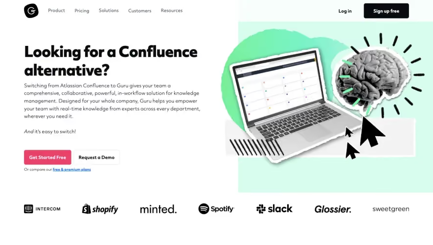
1. The page starts with a header that includes a navigation menu, a logo, and a button to sign up for Sendinblue. 2. The next section is a hero image with a call-to-action button that encourages users to make the switch to Sendinblue. 3. Below the hero image, there is a section that lays out the advantages of Sendinblue over Mailchimp. This section includes a bullet-pointed list and a graphic representation of these advantages. 4. Further down the page, there is a section that provides more detailed information about Sendinblue's features. This section is divided into several sub-sections that focus on specific features, such as email marketing, SMS marketing, and marketing automation. Each of these sub-sections includes a graphic representation of the feature and a brief description of what it offers. 5. Towards the bottom of the page, there is a section that compares pricing plans between Mailchimp and Sendinblue. This section includes a table that shows the different tiers for each platform and what is included in each one. 6. Finally, the page ends with a footer that includes links to different sections of the site, social media icons, and contact information. Overall, the page is well-organized and uses a combination of graphics and text to highlight the advantages of Sendinblue over Mailchimp, making it easier for users to make an informed decision about which platform is best suited for their needs.


Sendinblue Comparison Page

Sendinblue
More than Just Email Marketing
Designed by
No items found.
Category
Patterns
No items found.
Tech Stack
Added on
June 2, 2020