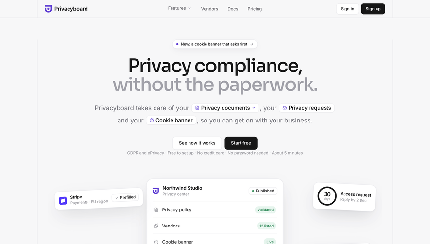
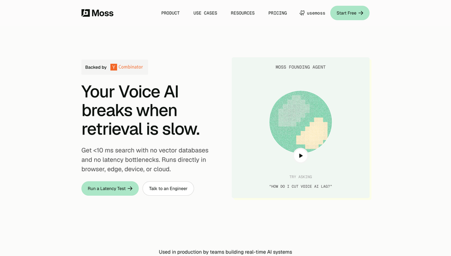
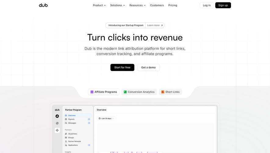
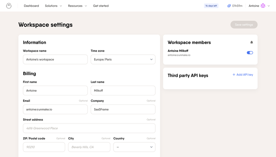
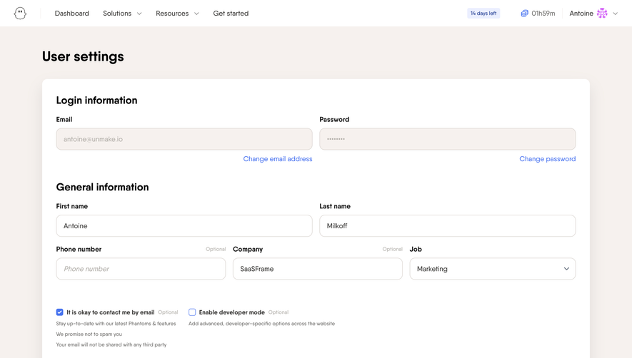
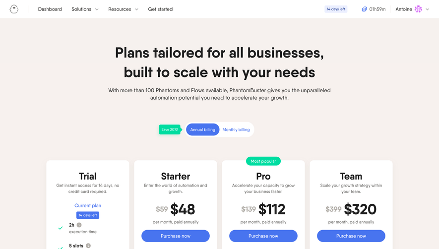
Generate a new design based on this screen, using your own content.
Preview the prompt
# Design from Reference: Phantombuster Landing Page

Create an original, high-fidelity visual design inspired by the reference. Prioritize composition, typography, colors, spacing and component styling over technical implementation.

## Reference

- **Product:** Phantombuster
- **Category:** Landing Page
- **Screenshot:** https://media.saasframe.io/o/62203de45d441adbaa46.webp

Analyze the screenshot first. If you can’t access it, ask me for it rather than guessing.

## Content

**Instructions:**

Generate realistic example content that fits the selected design reference.

Create appropriate headlines, descriptions, labels, buttons, and supporting copy based on the type of interface being designed.

If a product or business description is provided, use it to guide the content.

Otherwise, invent a plausible fictional SaaS product appropriate for the reference.

Keep the content concise, coherent, and visually balanced.

Do not present fictional statistics, customer names, or testimonials as verified facts.

Preserve essential messaging and factual accuracy. Adapt structure and copy length for visual balance; never invent product claims.

## Visual design

Use this context to reproduce the reference’s visual language: layout, typography, colors, spacing, borders, radii and distinctive elements. The screenshot takes priority if descriptions conflict.

### Overall aesthetic
- **Character:** A friendly lead-generation landing page combines warm off-white surfaces, bold rounded sans-serif typography, periwinkle-blue actions, and soft ghost-mascot illustrations.
- **Visual language:** White floating cards, pill controls, subtle shadows, and gently shaded illustrations create an approachable software presentation.
- **Observed scale:** The source measures 1440 × 7339 pixels. Approximate sizes below refer to image pixels; CSS estimates assume an unverified 1× capture.

### Page composition
- **Header:** A small ghost logo and PhantomBuster wordmark sit at left. Why PhantomBuster, Solutions, Resources, Pricing, and Watch video occupy the center; outlined Log in and filled Start free trial pills align right.
- **Hero:** A centered two-line headline emphasizes lead generation in blue. A small uppercase three-part capability line follows, then a combined email field/trial button, a reassurance line, and a downward chevron.
- **Trust band:** A white horizontal region contains a blue uppercase trust caption and six muted customer wordmarks.
- **Benefits:** A centered section heading introduces three large alternating text-and-illustration rows. The first pairs lead-generation copy with network logos and data tables; the second uses a cloud-themed mascot; the third uses a shield mascot.
- **Intermediate conversion:** A centered white rounded signup card repeats the email/trial pattern with a short heading, smaller trial description, and mascot at right.
- **Goal selector:** A centered heading and three broad tabs introduce a selected lead-extraction panel, with text at left and a ghost/machine illustration at right.
- **Tool catalog:** Another three-tab control selects Phantoms, Flows, or Integrations. The visible selected state shows six white tool cards in a three-column, two-row grid, followed by Browse more.
- **Social proof and closing:** A centered trust heading precedes a testimonial carousel. A second signup card appears below, then a white five-column footer and a pale legal/social strip.

### Information hierarchy
- **Hero contrast:** The first headline line is dark and the second blue, giving the product category immediate emphasis.
- **Supporting promise:** The uppercase capability line uses small bold tracking rather than a long paragraph. The email field is the primary conversion action.
- **Benefits pattern:** Each alternating row has a blue eyebrow label, large multiline heading, and three green-check benefit lines.
- **Progressive detail:** The page moves from broad benefits to goal-specific explanation and then concrete tool examples.
- **Selected states:** White raised tab surfaces indicate the active goal and tool category; inactive tabs use pale warm fills and muted text.
- **Trust hierarchy:** Customer logos provide an early compact signal; the later testimonial uses a large quote, small author block, arrows, and pagination dots.
- **Claim handling:** Integration capabilities, trial terms, safety assurances, and business counts are captured historical marketing content, not independently verified current facts.

### Typography
- **Typeface appearance:** A rounded geometric sans-serif with broad bold forms is used for headings; body copy uses a clear sans-serif. Exact families are unverified.
- **Hero headline:** Approximately 80–86 pixels, bold around 700, with line-height near 88 pixels and compact tracking.
- **Section headings:** Around 44–48 pixels, bold, with line-height roughly 54–60 pixels. Benefit headings use deliberate multiline wrapping in narrow columns.
- **Eyebrows:** Approximately 13–14 pixels, uppercase, bold, blue, with expanded tracking.
- **Body and benefits:** Around 16–18 pixels; explanatory paragraphs have roughly 24-pixel line-height, while benefit rows are medium/semibold.
- **Tool-card titles:** Around 22–24 pixels, bold, wrapping to two or three lines. Descriptions are around 14–16 pixels.
- **Utility roles:** Navigation, form labels, buttons, footer links, and category tabs are approximately 14–16 pixels. Tiny badges and legal text use smaller 10–12-pixel roles.

### Colors & surfaces
- **Measured warm neutrals:** Sampled #FBF9F7, #F5F1F0, #FAF8F6, and #F5F3F1 occur across the pale page backgrounds. #FFFFFF defines cards and the trust/footer regions.
- **Measured blue:** #5274E8 appears in the hero emphasis and CTA family.
- **Measured dark text:** #1E1E1E occurs prominently in heading areas.
- **Semantic green:** Mint-green checkmarks distinguish short benefits from dark text. Most illustrations remain white/gray with blue and green details.
- **Muted imagery:** Early customer logos are gray; tool cards use recognizable network/service colors as small accents.
- **Depth:** White cards have soft diffuse shadows and rounded corners. Mascots and their props use gentle gradients and oval ground shadows.
- **Background variation:** Pale sections shift subtly in tone rather than using strong borders. These near-white samples should be consolidated into a few intentional surface tokens in implementation.

### Components
- **Hero signup:** A white pill roughly 455 × 48 pixels combines a muted email placeholder with an inset blue trial button. A small reassurance line sits below.
- **Navigation pills:** Log in uses a thin blue outline; Start free trial uses solid blue. Both have fully rounded ends.
- **Trust logos:** Six wordmarks form a centered evenly spaced row, below a small uppercase caption.
- **Benefit illustrations:** The ghost mascot appears with social/network symbols and tables, clouds with status circles, and a blue shield. These are conceptual graphics rather than actual operating interface states.
- **Signup card:** A white rounded rectangle roughly 750 pixels wide contains left-aligned heading, trial description, email control, and a small ghost at right.
- **Goal tabs:** Three equal-width rounded rectangles form a broad selector. The selected first tab is white with subtle elevation; others have a pale fill.
- **Goal detail:** A small outlined icon precedes a large title, bold short statement, paragraph, and blue Learn more link. An isometric machine/colored-cube illustration occupies the opposite column.
- **Tool tabs:** Phantoms, Flows, and Integrations use small icons beside labels and the same selected/inactive surface vocabulary.
- **Tool card:** Approximately 255 × 325 pixels, with service icon, small slot badge, type/category labels, bold title, short description, and an outlined Discover more pill near the bottom.
- **Catalog action:** A centered blue Browse more pill sits below the six-card grid.
- **Testimonial carousel:** A white card roughly 560 pixels wide contains a bold multiline quote and lower avatar/author-role block. Blue circular arrows overlap its side edges; six small dots sit underneath.
- **Footer:** Five link groups cover product rationale, solutions, resources, assistance, and additional destinations. External-link marks accompany selected links.
- **Bottom utilities:** Legal links sit left; social icons and Follow us sit toward the right. A blue Support pill sits at the far-right edge of the captured lower strip.
- **Unshown states:** Search, form validation, signup completion, alternate tab content, carousel transitions, and video playback are not visible.

### Visual rhythm
- **Large vertical intervals:** Benefits use generous gaps, often around 140–200 pixels between major groups, creating a slow explanatory pace.
- **Alternating rows:** Text and mascot graphics switch sides across the three benefits, avoiding a repetitive left-only layout.
- **Centered anchors:** Hero, section titles, tab groups, catalog CTA, testimonial, and signup cards share a central axis.
- **Grid consistency:** Tool cards use equal widths, aligned tops/bottoms, and gaps around 30 pixels. Buttons remain near a common baseline despite different title wrapping.
- **Repeated conversion:** The same email/trial language returns in the hero and two cards, providing recognizable stopping points along the page.
- **Soft visual continuity:** Rounded pills, ghost silhouettes, white cards, and pale warm surfaces repeat without heavy separators.

### Responsive
- **Evidence limit:** Only a desktop landing page is shown. Mobile arrangements and sticky elements are unverified.
- **Recommended header:** Collapse the central navigation into a menu while retaining a clear trial action.
- **Recommended hero:** Reduce headline size to roughly 42–52 CSS pixels, allow the capability line to wrap, and stack the email/button if needed.
- **Recommended benefits:** Stack text and illustration consistently on narrow screens, keeping the heading and benefits before decorative imagery.
- **Recommended tabs and cards:** Permit horizontal tab scrolling or wrapping with clear active state. Reduce the catalog to two columns and then one.
- **Recommended conversion cards:** Make email controls fluid and reduce or hide the decorative mascot when space is limited.
- **Recommended footer:** Stack link groups and utility rows, preserving readable link spacing and accessible carousel/support controls.

### Adaptation guidance
- **Preserve the narrative:** Introduce the outcome, establish trust, explain three benefits, show goal-specific detail, expose concrete tools, then reinforce with testimony and trial conversion.
- **Use a reusable component set:** Standardize pill buttons, email signup units, three-tab selectors, tool cards, testimonial modules, and signup cards.
- **Keep conceptual art distinct:** Mascot illustrations communicate themes; they should not imply live product status or verified safety guarantees.
- **Design real interaction states:** Add accessible tab semantics, keyboard-operable carousel controls, form validation, loading, success, and focus treatments from actual requirements.
- **Validate content:** Confirm trial terms, counts, supported services, customer permissions, and testimonials before using them as current copy.
- **Maintain restraint:** Use the measured blue for actions and emphasis, green for benefit checks, and warm neutral surfaces as the consistent foundation.

## Direction

**Instructions:**

Use the reference screenshot as the main source of visual inspiration rather than a strict layout template.

Preserve its most distinctive design characteristics, such as typography, visual rhythm, color relationships, component treatments, and overall aesthetic.

Feel free to modify section arrangements, proportions, spacing, and individual components to better suit my content.

Introduce original design decisions where they improve usability, composition, or brand consistency.

The result should clearly reflect the reference's visual language without looking like a direct reproduction.

## Output

**Instructions:**

Generate a high-fidelity visual mockup of the requested interface.

Present the design as a polished, realistic website or product UI screenshot.

Prioritize visual composition, typography, spacing, colors, alignment, and component details.

Use the available image-generation or visual-design capabilities.

Do not replace the mockup with source code, a written design specification, or a textual description.

If direct visual generation is unavailable, clearly explain the limitation.

Deliver a polished, cohesive design with precise alignment, hierarchy and spacing. Produce the requested visual artifact, not just a description. If unsupported, explain the limitation.
 SaaSFrame