Design with AI
Generate a new design based on this screen using your own content.
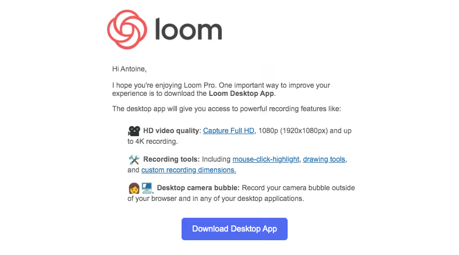
# Design from Reference: Loom Onboarding Emails
Create an original, high-fidelity visual design inspired by the reference. Prioritize composition, typography, colors, spacing, and component styling over technical implementation.
## Reference
- **Product:** Loom
- **Category:** Onboarding Email
- **Screenshot:** https://cdn.prod.website-files.com/5e9dc792e1210c5325f7ebbc/6acbd5ce69afe7296a94f8e5_6acbd32ee761f7d027b96e39_cms-88d6c0862882f42c393151e8.webp
Analyze the screenshot first. If inaccessible, request it rather than guessing.
## Content
{{content.instructions}}
{{content.data}}
Preserve essential messaging and factual accuracy. Adapt structure and copy length for visual balance; never invent product claims.
## Visual Design
### Overall aesthetic
- **Character:** Personal onboarding email with simple text, emoji-led benefits, and one blue action.
### Page composition
- **Canvas:** 900 × 500 screenshot px. Large logo above a narrow left-aligned body; centered download button closes the message.
### Information hierarchy
- **Priority:** Greeting and desktop-app introduction precede three benefits with bold lead-ins and linked details.
### Typography
- **Scale:** Approximate screenshot body 14 px, benefit labels 14 px bold, and button 16 px. Sans serif family/CSS scale unverified.
### Colors & surfaces
- **Palette:** Sampled sRGB #FFFFFF, blue #516BF0, body #555555, dark #434343, and coral logo #EB5C5E.
### Components
- **Details:** Plain blue underlined links, emoji icons for video/tools/camera, and a roughly 208 × 44 screenshot px rounded download button.
### Visual rhythm
- **Spacing:** Roughly 600 screenshot px text width, 16 px paragraph gaps, and 20 px benefit spacing.
### Responsive
- **Adaptation:** Mobile is not shown. Make text fluid, retain link clarity, and allow benefits to wrap naturally.
### Adaptation guidance
- **Transfer:** Preserve concise benefit list and single download goal. Replace feature specifications and app links with supported details.
Use this context to reproduce the reference's visual language: layout, typography, colors, spacing, borders, radii, and distinctive elements. The screenshot takes priority if descriptions conflict.
## Direction
{{preferences.fidelityInstructions}}
## Output
{{output.instructions}}
Deliver a polished, cohesive design with precise alignment, hierarchy, and spacing. Produce the requested visual artifact, not just a description. If unsupported, explain the limitation.