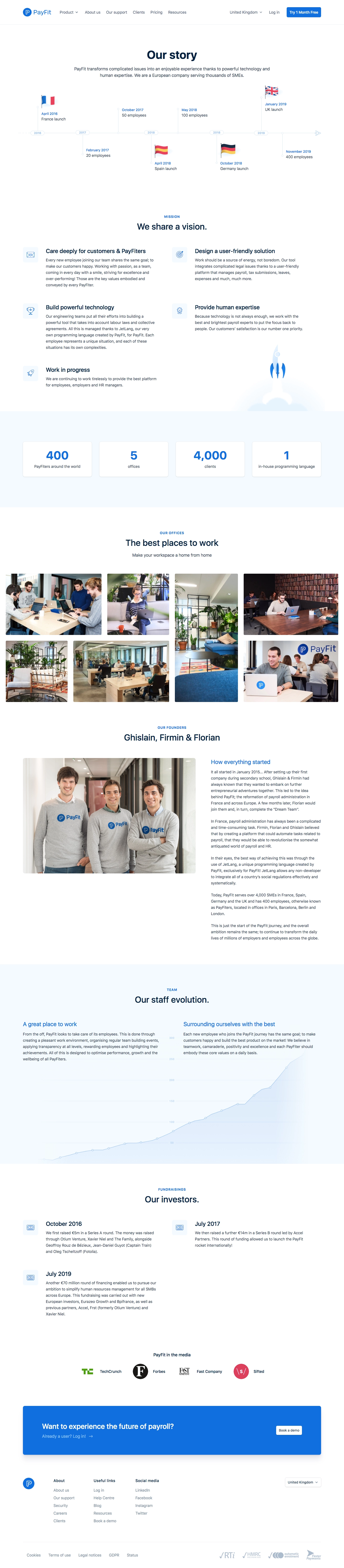
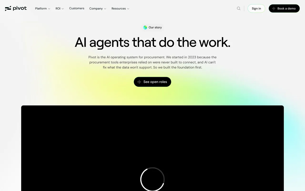
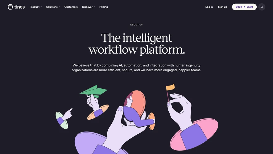
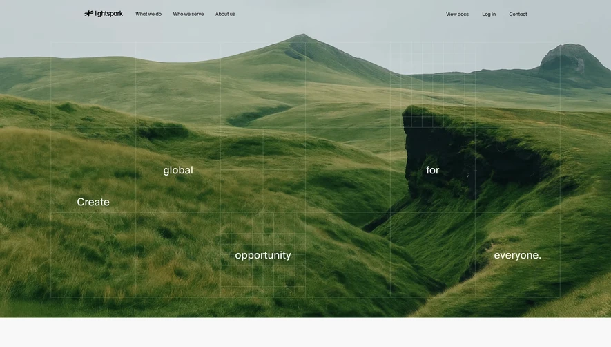
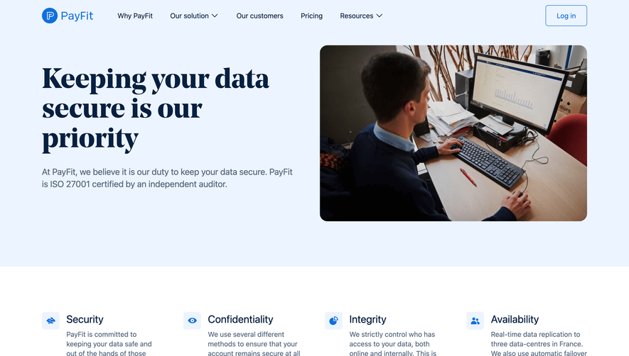
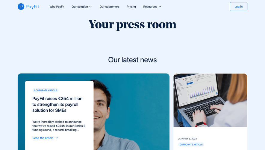
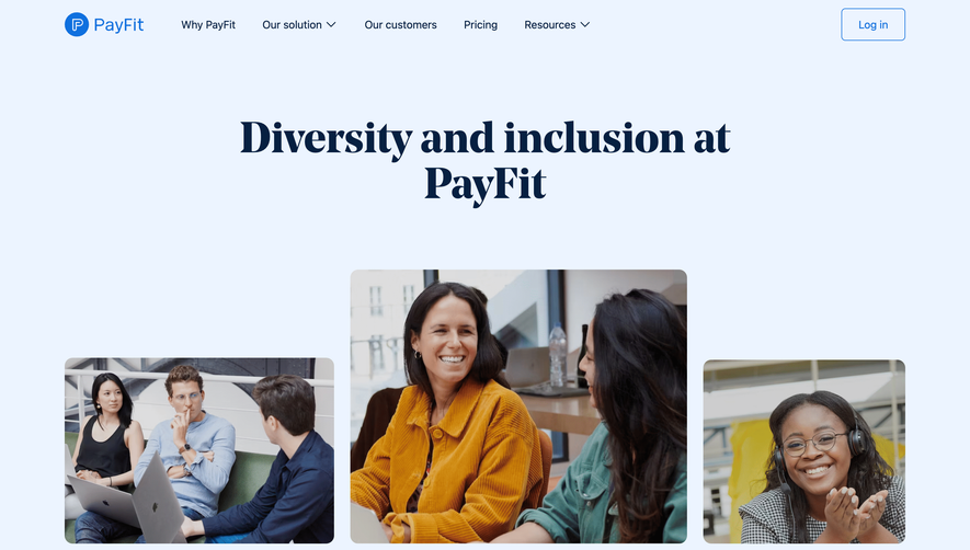
PayFit’s “About Us” page radiates a modern yet refreshingly approachable energy. The design seamlessly blends professionalism with a playful touch, balancing clear structure and vivid personality. Minimalist layouts coexist with bold illustrations, giving the page a distinctly European, forward-thinking tech feel that’s both reassuring and inviting.
Layout and Structure
The structure opens with a spacious hero section featuring bold typography and a clean mission statement, immediately setting the site’s tone. Content is well-organized into stacked horizontal bands—each dedicated to sections like company values, team photos, and milestones. This modular layout supports easy scanning, with each segment clearly demarcated and digestible, guiding the viewer’s eye downward with effortless flow.
Visual Elements
Custom illustrations and charismatic team photography create moments of human connection throughout the page. Delicate animations and illustrated accents enliven the scroll experience, while playful icons punctuate key messages, keeping information visually engaging without distraction.
Color Palette and Typography
The brand’s signature blue and soft neutrals dominate, projecting trust and clarity, while splashes of brighter hues accent calls-to-action and illustrations for visual emphasis. Sans-serif typography is used throughout, pairing friendly body text with standout headlines for robust visual hierarchy.
User Experience & Unique Choices
Navigation is intuitive and fixed, ensuring visitors can smoothly explore or return home. Subtle scroll-triggered animations draw attention to milestones and team culture. Notably, authentic employee photography and lively team spotlights move beyond generic stock imagery—injecting personality and trust. The overall tone is energetic, genuine, and mission-focused, inspiring confidence and engagement at every scroll.
 SaaSFrame