Prompt 1,399 words Copy
# Design from Reference: Help Scout Landing Page

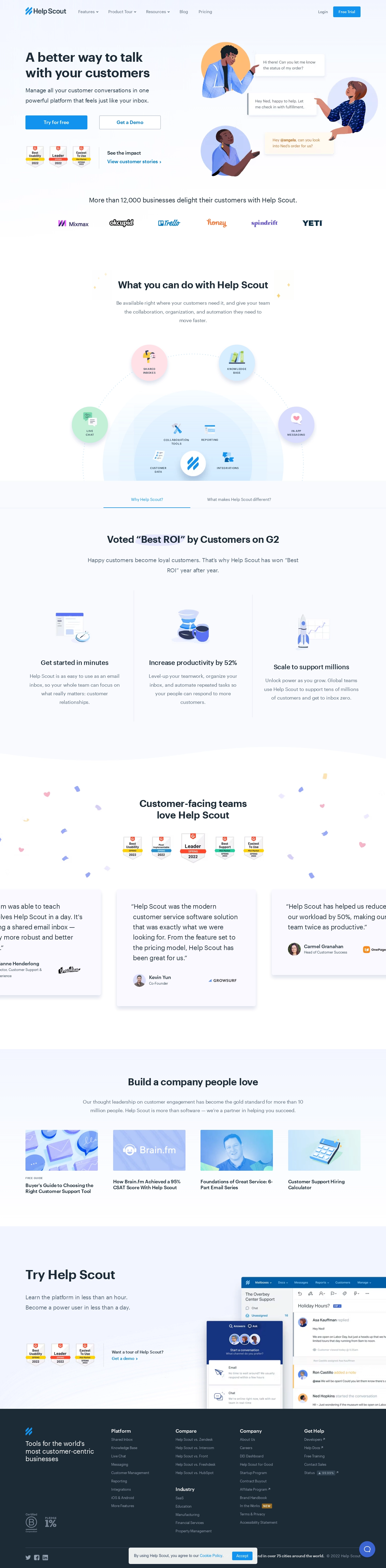
Create an original, high-fidelity visual design inspired by the reference. Prioritize composition, typography, colors, spacing, and component styling over technical implementation.

## Reference

- **Product:** Help Scout
- **Category:** Landing Page
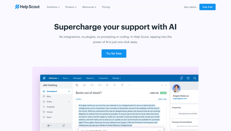
- **Screenshot:** attached to this message (also available at https://media.saasframe.io/o/afd2fac801c5880cf35e.webp)
- **Source:** https://www.helpscout.com/

Analyze the attached screenshot first. If no image is attached, open the screenshot link; if neither is accessible, ask for it rather than guessing.

## Visual Design Context

### Overall aesthetic

- **Style:** Friendly customer-support SaaS landing page with pale blue-lavender backgrounds, dark slate headings and bright-blue actions.
- **Character:** Illustrated people, soft circular diagrams, awards and customer quotations emphasize human service and approachable software.
- **Capture:** The image measures 1440 × 5841 pixels. CSS estimates assume approximately 1:1 capture scale; browser scale and font identity are unverified.

### Page composition

- **Header:** Wordmark and product/resource links align left; login and a blue trial action sit right.
- **Hero:** A two-column region pairs a large benefit headline, explanation and trial/demo actions left with three illustrated people and conversation bubbles right.
- **Early proof:** Three award badges and a story link sit below hero actions, followed by a centered customer-count statement and six logos.
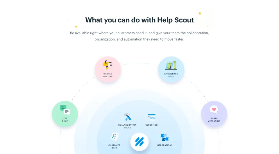
- **Platform overview:** A centered heading and description introduce a large circular feature diagram, with four outer product circles and smaller internal capability labels.
- **Value section:** A tab-like row leads into a pale region with an ROI heading and three icon-led benefit columns.
- **Customer proof:** A white confetti-decorated section presents five awards and a horizontal row of testimonial cards, with side cards partly cropped.
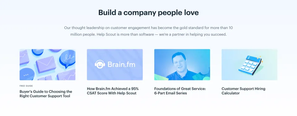
- **Resources:** Four thumbnail-led educational items sit beneath a centered heading and supporting paragraph.
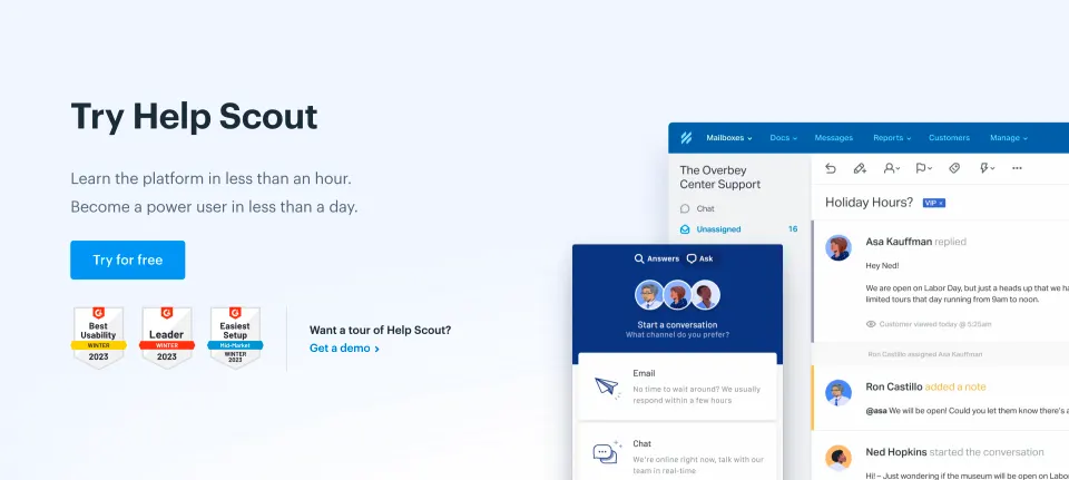
- **Trial region:** A pale two-column closing section places trial messaging and awards left, with large support-product screenshots extending from the right.
- **Footer:** A dark slate multi-column footer includes certifications, social/legal details, a cookie notice and a support launcher.

### Information hierarchy

- **Primary proposition:** The hero's bold two-line heading is followed by a concise two-line explanation.
- **Conversion paths:** Filled trial and outlined demo controls are equally sized but differ in emphasis.
- **Platform scope:** The feature diagram groups shared inbox, knowledge base, live chat and in-app messaging around collaboration/reporting/data/integration capabilities.
- **Value claims:** Three illustrated columns emphasize setup speed, productivity and scale.
- **Customer evidence:** Awards precede large quotations with portrait, name, role and customer logo.
- **Education:** Resource titles are bold beneath colorful thumbnails; one has a small guide label.
- **Footer:** Brighter group labels organize platform, comparisons, industries, company and help links.
- **Captured scope:** Several sections use tab/carousel-like presentation, but only the shown state is evidenced.

### Typography

- **Family:** A rounded sans-serif is visible; exact identity is unverified.
- **Hero heading:** Approximately 48-pixel CSS size, bold, with around 58-pixel line height.
- **Hero body:** Approximately 22 pixels with 36-pixel line height.
- **Section headings:** Approximately 36–40 pixels, bold, often centered over two lines.
- **Benefit titles:** Approximately 24 pixels, medium-to-semibold; descriptions around 18 pixels with 30-pixel line height.
- **Testimonials:** Approximately 24 pixels with 36-pixel line height, giving quotations strong visual weight.
- **Resource titles:** Approximately 18 pixels and semibold.
- **Navigation and controls:** Approximately 14–16 pixels; footer links around 13–14 pixels.

### Colors & surfaces

- **Measured base:** White #FFFFFF fills major content regions.
- **Measured pale surfaces:** #F9FAFE, #F2F5FF, #FAF9FF and #FBFDFF occur in hero, feature and testimonial backgrounds.
- **Measured dark:** Slate #1C2B36 supports headings and footer.
- **Accent role:** Bright blue identifies primary actions, links and product branding.
- **Diagram palette:** Pink, pale blue, mint and lavender circles distinguish product areas.
- **Illustration accents:** Warm orange/yellow and blue clothing add human warmth; small confetti repeats pastel colors.
- **Depth:** Conversation bubbles, feature circles and testimonial cards use soft shadows; the footer is a flat dark field.

### Components

- **Hero controls:** Two approximately 230 × 52-pixel rectangles use filled blue versus white/outlined treatment.
- **Conversation illustration:** Three people in circular backplates exchange floating message cards, including a highlighted internal mention.
- **Awards:** Small shield-shaped badges recur in hero, customer-proof and closing areas.
- **Logo row:** Six customer marks align horizontally beneath a centered statement.
- **Feature diagram:** Dotted orbit lines connect four large labeled circles around concentric pale-blue surfaces and a central brand symbol.
- **Value tabs:** Two centered labels sit above a thin rule, with a blue underline marking the visible selection.
- **Benefit columns:** Three equally spaced groups use small illustrations and vertical separator rules.
- **Testimonial cards:** Pale rounded rectangles contain large quotations and attribution; the row is horizontally cropped at both sides.
- **Resource cards:** Four unboxed image/title groups form a horizontal grid.
- **Closing product media:** A large shared-inbox screenshot overlaps a smaller customer-contact widget.
- **Footer utilities:** Certification marks, status detail and social icons sit within the dark footer.
- **Cookie notice:** A compact light panel overlays the bottom center with a policy link and blue acceptance control.
- **State scope:** No trial form, expanded menu, video or alternate testimonial position is shown.

### Visual rhythm

- **Container:** Approximately 95-pixel desktop gutters align header, hero and lower grids.
- **Section spacing:** Large open breaks distinguish hero proof, platform diagram, value, testimonials and resources.
- **Shape rhythm:** Circles, rounded cards and soft wave-like transitions repeat across the page.
- **Density variation:** Illustrative overview regions alternate with compact evidence rows and text-led resource cards.
- **Closing contrast:** Pale trial media gives way to the dark footer, creating a clear endpoint.
- **Action consistency:** Blue primary and outlined secondary controls maintain a stable conversion vocabulary.

### Responsive

- **Recommendation — hero:** Stack message and illustration, retaining both trial and demo routes.
- **Recommendation — diagram:** Reflow feature circles into a readable list/grid when the orbital layout becomes too small.
- **Recommendation — grids:** Reduce benefit and resource columns while preserving titles and descriptions.
- **Recommendation — testimonials:** Provide explicit accessible carousel controls or stack cards without clipped text.
- **Recommendation — footer and overlays:** Wrap link groups and ensure cookie/support controls do not cover content. No mobile layout is evidenced.

### Adaptation guidance

- **Preserve human-service framing:** Pair product capabilities with conversation imagery and customer evidence.
- **Keep platform structure clear:** Distinguish customer-facing channels from internal collaboration/reporting capabilities.
- **Reuse soft tokens:** Maintain pale surfaces, dark slate text, blue actions and gentle shadows.
- **Separate evidence layers:** Keep customer logos, awards and quotations as distinct modules.
- **Use concrete resource previews:** Retain image/title relationships and clear educational destinations.
- **Define interactions separately:** Tabs, testimonial movement, trial conversion and cookie handling are outside the static evidence.

## Content

**Instructions:**

Generate realistic example content that fits the selected design reference.

Create appropriate headlines, descriptions, labels, buttons, and supporting copy based on the type of interface being designed.

If a product or business description is provided, use it to guide the content.

Otherwise, invent a plausible fictional SaaS product appropriate for the reference.

Keep the content concise, coherent, and visually balanced.

Do not present fictional statistics, customer names, or testimonials as verified facts.

## Design Direction

**Instructions:**

Use the reference screenshot as the main source of visual inspiration rather than a strict layout template.

Preserve its most distinctive design characteristics, such as typography, visual rhythm, color relationships, component treatments, and overall aesthetic.

Feel free to modify section arrangements, proportions, spacing, and individual components to better suit my content.

Introduce original design decisions where they improve usability, composition, or brand consistency.

The result should clearly reflect the reference's visual language without looking like a direct reproduction.

Follow the visual identity of the reference design.

Use its typography, color palette, component styling, and overall aesthetic as the primary design direction.

Do not introduce an unrelated visual identity.

## Output

**Instructions:**

Generate a high-fidelity visual mockup of the requested interface.

Present the design as a polished, realistic website or product UI screenshot.

Prioritize visual composition, typography, spacing, colors, alignment, and component details.

Use the available image-generation or visual-design capabilities.

Do not replace the mockup with source code, a written design specification, or a textual description.

If direct visual generation is unavailable, clearly explain the limitation.

## Constraints

- Use the actual screenshot as the primary visual reference.
- Preserve essential messaging and factual accuracy.
- Prioritize visual quality and consistency.
- Do not invent unsupported product claims.
- Adapt structure and copy length for visual balance.
Reference image Long pages get scaled down: a section works better. Open in ChatGPT ↗ Open in Claude ↗
Build it in Lovable ↗ v0 ↗ Figma Make ↗
Opening a tool copies the screenshot so you can paste it with your prompt.
 SaaSFrame