
Thank you! Your submission has been received!
Oops! Something went wrong while submitting the form.
Get SaaSFrame Pro
Monthly
$18
Quarterly
$48
Yearly
$180
Upgrade to access this feature
Browse all screens & flows
Filter and search screens & flows
Access Figma files
Access mobile versions
Bookmark screens & flows
Join now


Fiberplane Blog Feed

Fiberplane
Collaborative Notebooks for debugging your infrastructure
Designed by
No items found.

Bookmark
Bookmark

Design with AI
Thank you! Your submission has been received!
Oops! Something went wrong while submitting the form.
# Design from Reference: Fiberplane Blog Feed
Create an original, high-fidelity visual design inspired by the reference. Prioritize composition, typography, colors, spacing, and component styling over technical implementation.
## Reference
- **Product:** Fiberplane
- **Category:** Blog Feed
- **Screenshot:** https://cdn.prod.website-files.com/5e9dc792e1210c5325f7ebbc/63ddc963e4e25f3f4be77a83_image-_6_.webp
Analyze the screenshot first. If inaccessible, request it rather than guessing.
## Content
{{content.instructions}}
{{content.data}}
Preserve essential messaging and factual accuracy. Adapt structure and copy length for visual balance; never invent product claims.
## Visual Design
### Overall aesthetic
- **Character:** A long editorial blog feed pairing serif article titles with sans-serif supporting text and vivid technical illustrations.
- **Tone:** Rounded white cards and soft shadows sit on an almost-white canvas; colorful gradients, developer symbols and portraits keep the technical subject matter approachable.
### Page composition
- **Capture:** The source measures 1440 × 9836 pixels. Every portion was inspected in readable crops. A 1× CSS scale is plausible but unverified.
- **Container:** A centered content column is approximately 920 image pixels wide, leaving about 260 pixels on each side.
- **Header and lead:** A compact horizontal navigation precedes one full-width featured article with a large orange illustration and white text region.
- **Feed:** Two equal columns of image-led cards continue down the page with roughly 24-pixel horizontal and vertical gaps.
- **Ending:** A full-width purple/blue gradient conversion area curves at the upper-right corner and fades toward a newsletter/resource footer.
### Information hierarchy
- **Navigation:** The Fiberplane wordmark and small Beta marker lead into muted navigation links; Blog is darker, and a black “Try for free” button marks the primary header action.
- **Article sequence:** Each card presents artwork, a small uppercase colored category, a serif title, a gray excerpt and a bottom author/avatar/date line.
- **Featured priority:** The first card spans both grid columns and uses a much larger illustration, while retaining the same article metadata pattern.
- **Footer priority:** A large two-line serif invitation leads to a black action button; newsletter signup and four compact link groups sit below.
### Typography
- **Font pairing:** Article and conversion headings use a serif; navigation, categories, excerpts and metadata use a sans serif. Exact identities are unverified.
- **Card titles:** Approximately 25–27 image pixels with 29–31-pixel line height and regular to medium weight.
- **Supporting copy:** Excerpts and author/date lines are around 16 pixels with 24-pixel line height; category labels are about 12 pixels, bold, uppercase and slightly tracked.
- **Conversion title:** The final invitation is approximately 56–60 pixels with a compact 64-pixel line height, substantially larger than article titles.
### Colors & surfaces
- **Measured palette:** ICC-aware sRGB sampling identifies #FAFAFA for the dominant canvas, #FFFFFF for cards and #000000 for the darkest text/actions.
- **Artwork colors:** Sampled flat illustration colors include blue #709CF9, purple #8581F6 and green #87C677. Orange, pink, lime and black also distinguish individual thumbnails.
- **Category coding:** Green marks guides/tutorials, blue marks launch content, orange marks interviews, and warm red marks building-related posts.
- **Surface detail:** Cards have roughly 20-pixel corner radii, subtle borders and diffuse lower shadows; the image follows the rounded top corners.
### Components
- **Featured card:** Approximately 920 pixels wide with an image around 400 pixels high, followed by a padded text area near 200 pixels high.
- **Standard card:** Each column is roughly 448 pixels wide, with a wide thumbnail near a 1.9:1 ratio and about 24 pixels of text padding.
- **Author line:** Small circular portraits precede muted author/date text, visually anchored near each card's bottom.
- **Captured irregularities:** Some mid-feed imagery and article content repeat or contain abrupt horizontal seams in this capture. These are observed pixels, not a recommended component behavior.
- **Footer controls:** A black rounded start button includes a right chevron; the newsletter uses a compact pale email field joined to a gray Subscribe button.
### Visual rhythm
- **Grid cadence:** Repeated equal-width cards and 24-pixel gutters form the page's dominant rhythm despite variable title lengths.
- **Internal spacing:** Categories, titles and excerpts use roughly 16–20-pixel separation; metadata is pushed down to create calm, consistent card endings.
- **Contrast pacing:** Bright artwork alternates with white text panels, then transitions into a large atmospheric gradient near the end.
### Responsive
- **Recommendation:** Collapse the feed to one column when two cards cannot retain a comfortable text width; keep the featured card first.
- **Recommendation:** Reduce wide outer margins to 20–24 CSS pixels, preserve thumbnail ratios and allow long serif headings to wrap.
- **Recommendation:** Collapse header navigation and stack newsletter/footer groups on phones. No mobile rendering is shown.
### Adaptation guidance
- **Preserve:** Keep the serif/sans pairing, rounded card construction, category colors and restrained black conversion actions.
- **Build:** Use shared card padding, image ratios and author-line alignment, while allowing natural excerpt lengths.
- **Artwork:** Retain distinct imagery for tutorials, launches and interviews; reproduce clean assets rather than the capture's repeated/seamed regions.
- **Conversion region:** Preserve the large gradient transition and oversized invitation, but verify text contrast across every part of the gradient.
Use this context to reproduce the reference's visual language: layout, typography, colors, spacing, borders, radii, and distinctive elements. The screenshot takes priority if descriptions conflict.
## Direction
{{preferences.fidelityInstructions}}
## Output
{{output.instructions}}
Deliver a polished, cohesive design with precise alignment, hierarchy, and spacing. Produce the requested visual artifact, not just a description. If unsupported, explain the limitation.


Category
Patterns
No items found.
Tech Stack


Added on
February 4, 2023
Similar screens
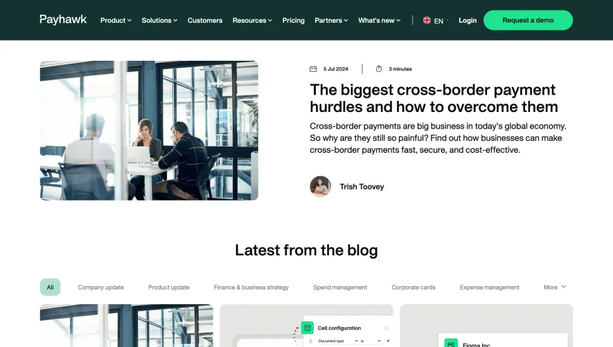


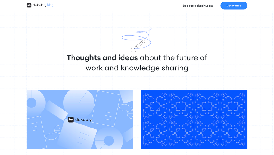

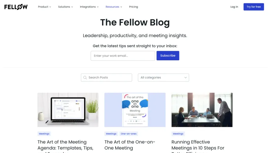

Upgrade to SaaSFrame Pro now to see similar examples.
Monthly
$18 /month
Billed $18 monthly
Browse all screens & flows
Filter and search screens & flows
Search text in screenshots
Access Figma files
Access mobile versions
Join now
Quarterly
$16 /month
Billed $48 quarterly
Browse all screens & flows
Filter and search screens & flows
Search text in screenshots
Access Figma files
Access mobile versions
Join now
Yearly
$15 /month
Billed $180 yearly
Browse all screens & flows
Filter and search screens & flows
Search text in screenshots
Access Figma files
Access mobile versions
Join now