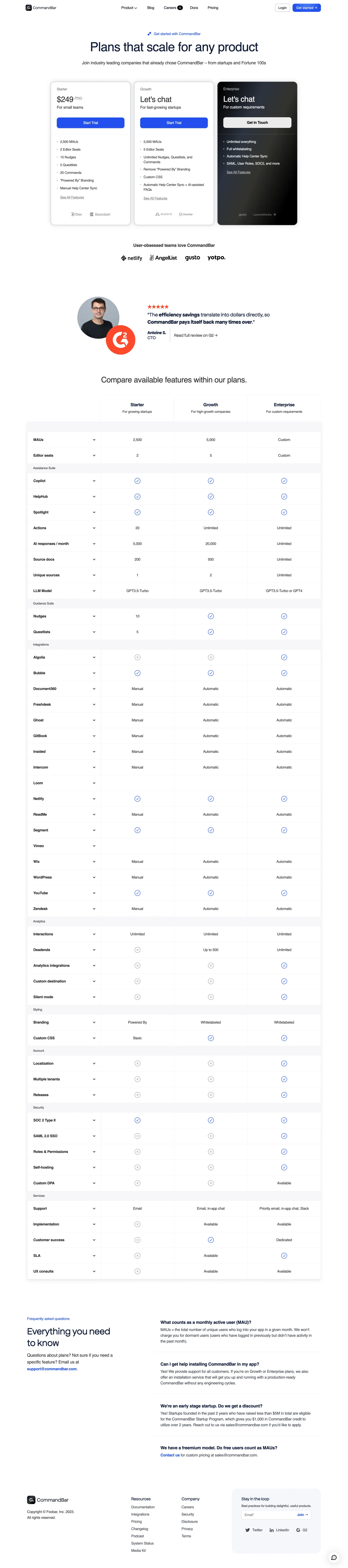
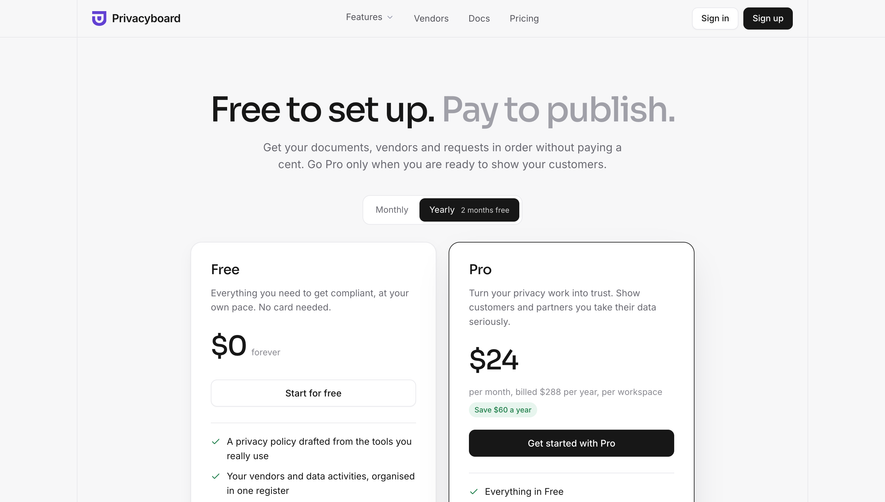
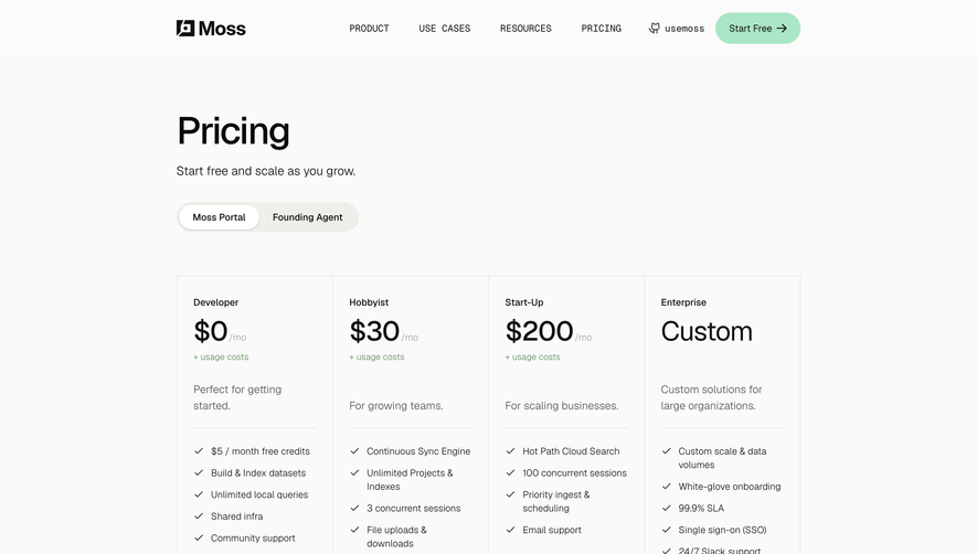
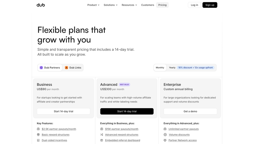
CommandBar’s pricing page radiates a modern, playful professionalism. The design leans into friendly, approachable minimalism with generous white space, rounded corners, and a hint of whimsy woven through illustrated accents and soft geometric shapes. Its visual identity immediately signals innovation and user-centered thinking without overwhelming visitors.
Layout and Structure
The page structure guides users smoothly, starting with a sticky navigation bar and a clean, centered hero section that states “Pricing” boldly. Three pricing tiers are showcased side by side, with toggle options (Monthly/Annual) and succinct plan details. Trust signals—like customer logos and testimonials—are woven between sections, while FAQs and a clear, compact footer round out the journey.
Visual Elements
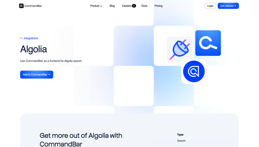
Colorful, friendly illustrations pepper the page, with airy icons and subtle microinteractions (like card hovers and CTA highlights) adding life without distraction. Pricing cards use gentle drop shadows to “lift” them, while mascot graphics and doodle-like flourishes instill a sense of fun and creativity. Visual indicators clearly distinguish the most popular plan, driving focus to the preferred option.
Color Palette and Typography
The palette is fresh and tech-forward: primary blues and teals are balanced with soft gray backgrounds and pale accent shades. Headings are bold and clean (likely Inter or another modern sans-serif), and body text stays highly legible. Careful use of font weights and sizes ensures a crystal-clear hierarchy throughout.
User Experience Patterns
Navigation is sticky and always accessible. Plan comparisons are effortless, and CTA buttons (“Start Free,” “Contact Sales”) are consistently styled and easy to spot. Interactive toggles and expandable FAQ sections enhance usability, inviting user engagement at every step. Forms are brief and approachable, lowering the barrier to conversion.
Unique or Notable Design Choices
Noteworthy is the playful mascot illustration, which injects brand personality, and the way the “recommended” plan visually pops. The page’s blend of professional restraint and expressive illustration balances trustworthiness with a modern, energetic SaaS vibe—perfect for inspiring any contemporary product site.
 SaaSFrame