Design with AI
Generate a new design based on this screen using your own content.
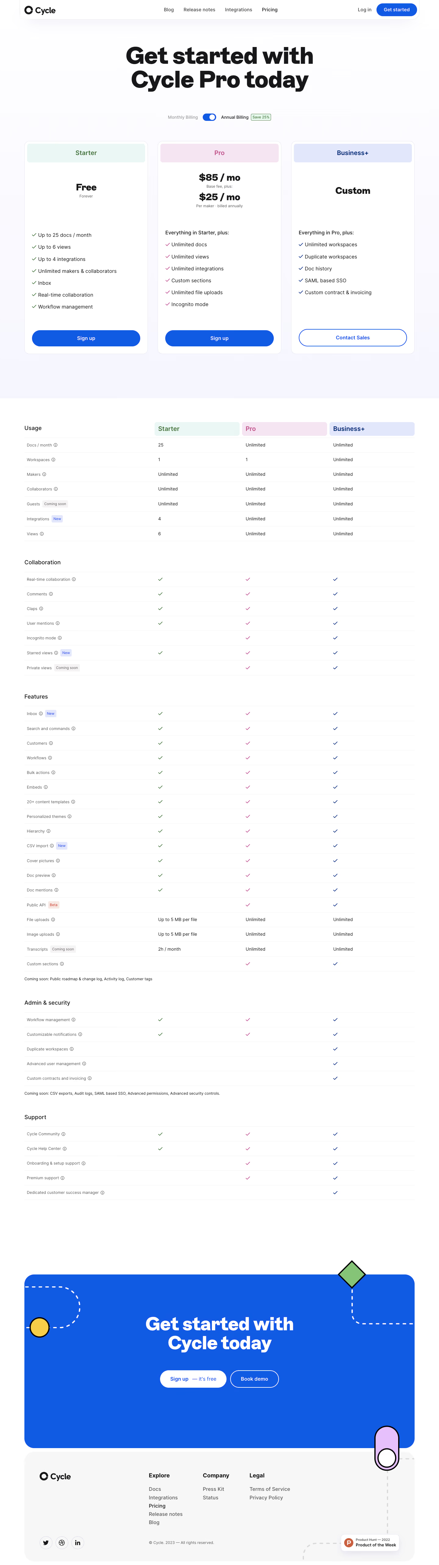
# Design from Reference: Cycle Pricing Page
Create an original, high-fidelity visual design inspired by the reference. Prioritize composition, typography, colors, spacing, and component styling over technical implementation.
## Reference
- **Product:** Cycle
- **Category:** Pricing Page
- **Screenshot:** https://cdn.prod.website-files.com/5e9dc792e1210c5325f7ebbc/6acb72c3018523cfee2da3ae_6acb70510e8221f130849e10_cms-0464de96a4ac485e52110bb8.webp
Analyze the screenshot first. If inaccessible, request it rather than guessing.
## Content
{{content.instructions}}
{{content.data}}
Preserve essential messaging and factual accuracy. Adapt structure and copy length for visual balance; never invent product claims.
## Visual Design
### Overall aesthetic
- **Character:** Bright, friendly pricing with bold typography, pastel plan identities, and vivid blue actions.
### Page composition
- **Canvas:** 1440 × 5128 screenshot px. Rounded navigation, large centered headline, billing switch, three plan cards, extensive comparison groups, blue closing CTA, and rounded gray footer.
### Information hierarchy
- **Priority:** Oversized headline leads to price and plan summaries; usage, collaboration, features, administration/security, and support tables supply detail.
### Typography
- **Scale:** Approximately 72 screenshot px hero, 30 px prices, 20 px plan names, 16 px body, and 14 px table copy. Sans serif family and CSS scale unverified.
### Colors & surfaces
- **Palette:** Sampled sRGB #FFFFFF, action blue #115BE4, footer #F7F7F7, and pale #F6F7FE. Plan headers are pale mint, pink, and periwinkle with matching checkmarks.
### Components
- **Details:** Three equal cards with roughly 16 px corners, 24 px padding, aligned pill actions, and thin borders. Comparison uses hairline row separators, small info icons, and status badges.
### Visual rhythm
- **Spacing:** About 80 screenshot px outer margins, 32 px card gaps, and generous separation before the dense table. Decorative outlined shapes and dashed paths enliven the closing CTA.
### Responsive
- **Adaptation:** Mobile is not shown. Stack plan cards and scroll comparison columns horizontally; retain colored plan identification.
### Adaptation guidance
- **Transfer:** Keep pastel differentiation and blue action hierarchy. Replace prices, limits, forthcoming features, and savings with verified content.
Use this context to reproduce the reference's visual language: layout, typography, colors, spacing, borders, radii, and distinctive elements. The screenshot takes priority if descriptions conflict.
## Direction
{{preferences.fidelityInstructions}}
## Output
{{output.instructions}}
Deliver a polished, cohesive design with precise alignment, hierarchy, and spacing. Produce the requested visual artifact, not just a description. If unsupported, explain the limitation.