Prompt 1,435 words Copy
# Design from Reference: Buffer Press Page

Create an original, high-fidelity visual design inspired by the reference. Prioritize composition, typography, colors, spacing, and component styling over technical implementation.

## Reference

- **Product:** Buffer
- **Category:** Press Page
- **Screenshot:** attached to this message (also available at https://media.saasframe.io/o/b9786f7d9f64c3bb6dbf.webp)
- **Source:** https://buffer.com/press

Analyze the attached screenshot first. If no image is attached, open the screenshot link; if neither is accessible, ask for it rather than guessing.

## Visual Design Context

### Overall aesthetic

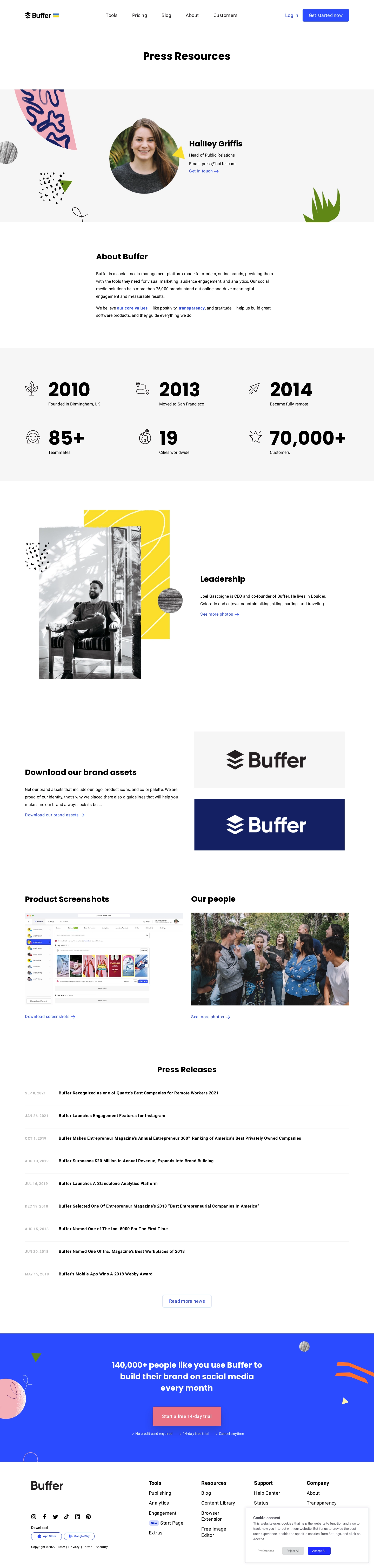
- **Character:** A friendly press-resource page uses bold black headings, white and pale-gray bands, blue text links, and playful collage artwork around portraits and photographs.
- **Evidence:** The original screenshot measures 1440 × 6029 px and was inspected across five readable crops. Dimensions below refer approximately to source pixels; CSS scale is unverified.
- **Visual contrast:** Quiet informational sections lead to a saturated blue conversion band with a pink action near the bottom.

### Page composition

- **Header:** Buffer branding and a small flag accent sit left; five navigation links occupy the middle; login and a blue start button align right.
- **Title and contact:** A centered press-resources heading precedes a broad pale-gray contact band. A large portrait sits beside the press-contact name, role, email, and blue arrow link, with abstract collage shapes around the edges.
- **Company overview:** A narrow centered text column contains a bold heading and two paragraphs.
- **Metrics:** A pale-gray strip presents six icon/number/label groups in three columns and two rows.
- **Media assets:** A split leadership section pairs a large black-and-white portrait collage with text. A following brand-assets section pairs copy with two logo samples. Product screenshots and team photos form two equal side-by-side resource blocks.
- **News:** A centered press-release heading introduces a long dated list with thin rules and an outlined more-news action.
- **Close:** A bright blue trial band precedes a white multi-column footer. A cookie-consent panel overlays the lower-right portion of the captured footer.

### Information hierarchy

- **Contact:** A bold person name and prominent portrait identify the press contact; supporting role/email text and a blue link are subordinate.
- **Overview and facts:** Section headings provide landmarks while oversized black metrics dominate the facts strip.
- **Resources:** Each media block pairs a clear heading, preview image, and blue download/photo link, making available assets recognizable.
- **Releases:** Muted uppercase dates occupy the left column; bold titles occupy the larger right region.
- **Conversion and consent:** The blue band centers a large white message, pink trial button, and three small reassurance items. The separate cookie panel groups explanatory text and three choices.

### Typography

- **Family:** Bold headings have a rounded geometric sans-serif character; body copy uses a more conventional sans serif. Exact identities are unverified.
- **Page title:** Approximately 40 px bold, with around 48 px line-height.
- **Section headings:** Around 29–32 px bold with 38–40 px leading. The press-contact name uses a similar scale.
- **Metrics:** Main numerals are approximately 72–76 px very bold; labels are around 16 px.
- **Body and links:** Approximately 16 px with 28–29 px line-height. Navigation is roughly 18 px; release titles are around 16 px bold.
- **Footer and consent:** Footer group labels are approximately 20 px bold, links around 18 px, and small legal/cookie text around 12–14 px.

### Colors & surfaces

- **Measured palette:** Sampled source pixels include white #FFFFFF, pale gray #F6F6F6, action blue #2B4BFF, dark navy #142063, black #000000, and near-white #FEFEFE.
- **Semantic use:** White is the main canvas; pale gray groups contact and facts. Blue marks links, header action, outlined controls, and the large trial band.
- **Collage accents:** Pink, yellow, orange, olive-green, and textured black shapes add playful emphasis around photographs and the trial band.
- **CTA:** A muted pink button contrasts with the blue closing region. Logo examples demonstrate black-on-light and white-on-navy variants.
- **Depth:** Main sections are largely flat; the cookie-consent panel uses a fine border and soft shadow.

### Components

- **Contact portrait:** A large rounded/oval photographic crop roughly 270–290 px across sits beside a compact text block.
- **Facts grid:** Six cells combine thin black line icons with huge figures and smaller labels. Cells have no visible enclosing borders.
- **Leadership collage:** A tall black-and-white photo overlaps a yellow patterned rectangle and small textured shapes.
- **Resource previews:** Two large logo rectangles stack vertically; product and team resource images occupy roughly equal 600 px-wide columns.
- **Release rows:** Approximately 86 px vertical pitch, with a date region around 130 px wide and bold title text aligned beside it.
- **Trial action:** A large pink rounded rectangle approximately 264 × 74 px is centered beneath the closing message.
- **Footer:** Brand, social icons, download badges, and small legal text sit left; four grouped navigation columns sit right.
- **Cookie panel:** A white rectangular overlay about 475 × 210 px contains a bold label, short paragraph, and Preferences, Reject All, and Accept All controls. Only its displayed state is observed.

### Visual rhythm

- **Main gutters:** Wide sections use roughly 95 px side margins, while the company overview narrows to around 700 px.
- **Section spacing:** Large white gaps distinguish leadership, assets, photo resources, and releases, avoiding a dense press-kit directory.
- **Alternation:** Text and imagery change sides between resource sections, balancing the long composition.
- **List cadence:** Fine separators and consistent date/title alignment make the release archive compact and scannable.
- **Closing rhythm:** The blue band provides a strong visual break before the multi-column footer; the cookie overlay partially obscures footer content.

### Responsive

- **Observed limit:** Only desktop is shown; actual responsive behavior and cookie interactions are unverified.
- **Recommended layout:** Stack contact, leadership, asset, and resource columns; reduce facts to two columns and then one if needed.
- **Recommended releases:** Place dates above titles on narrow screens and allow long headlines to wrap without truncation.
- **Recommended footer:** Stack link groups, wrap social/download controls, and ensure the cookie panel fits the viewport without hiding essential choices.
- **Recommended artwork:** Crop decorative collage assets independently from portraits and important content; use 20–24 CSS px mobile gutters.

### Adaptation guidance

- **Preserve:** Keep the press-contact focus, distinct resource previews, bold facts, chronological release list, and expressive collage accents.
- **Build:** Use separate contact, metric, media-resource, release-row, and conversion components with consistent typography and spacing.
- **Assets:** Use real brand variants, photographs, product captures, and downloadable media. Do not reconstruct miniature application controls as page interactions.
- **Content discipline:** Treat names, metrics, company claims, and dates as observed image content rather than independently verified current information.
- **Accessibility:** Provide image alternatives, descriptive download links, visible focus, readable cookie choices, and sufficient contrast for muted dates and footer text.
- **Validate:** Confirm fonts, actual CSS sizes, responsive image crops, menu states, and consent-panel behavior. Hover, expanded navigation, and consent results are absent from the capture.

## Content

**Instructions:**

Generate realistic example content that fits the selected design reference.

Create appropriate headlines, descriptions, labels, buttons, and supporting copy based on the type of interface being designed.

If a product or business description is provided, use it to guide the content.

Otherwise, invent a plausible fictional SaaS product appropriate for the reference.

Keep the content concise, coherent, and visually balanced.

Do not present fictional statistics, customer names, or testimonials as verified facts.

## Design Direction

**Instructions:**

Use the reference screenshot as the main source of visual inspiration rather than a strict layout template.

Preserve its most distinctive design characteristics, such as typography, visual rhythm, color relationships, component treatments, and overall aesthetic.

Feel free to modify section arrangements, proportions, spacing, and individual components to better suit my content.

Introduce original design decisions where they improve usability, composition, or brand consistency.

The result should clearly reflect the reference's visual language without looking like a direct reproduction.

Follow the visual identity of the reference design.

Use its typography, color palette, component styling, and overall aesthetic as the primary design direction.

Do not introduce an unrelated visual identity.

## Output

**Instructions:**

Generate a high-fidelity visual mockup of the requested interface.

Present the design as a polished, realistic website or product UI screenshot.

Prioritize visual composition, typography, spacing, colors, alignment, and component details.

Use the available image-generation or visual-design capabilities.

Do not replace the mockup with source code, a written design specification, or a textual description.

If direct visual generation is unavailable, clearly explain the limitation.

## Constraints

- Use the actual screenshot as the primary visual reference.
- Preserve essential messaging and factual accuracy.
- Prioritize visual quality and consistency.
- Do not invent unsupported product claims.
- Adapt structure and copy length for visual balance.
Reference image Attach it to your message: assistants can’t open image links. Open in ChatGPT ↗ Open in Claude ↗
Build it in Lovable ↗ v0 ↗ Figma Make ↗
Opening a tool copies the screenshot so you can paste it with your prompt.
 SaaSFrame