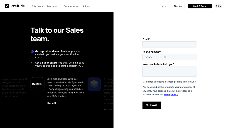
Overall Style and Aesthetic
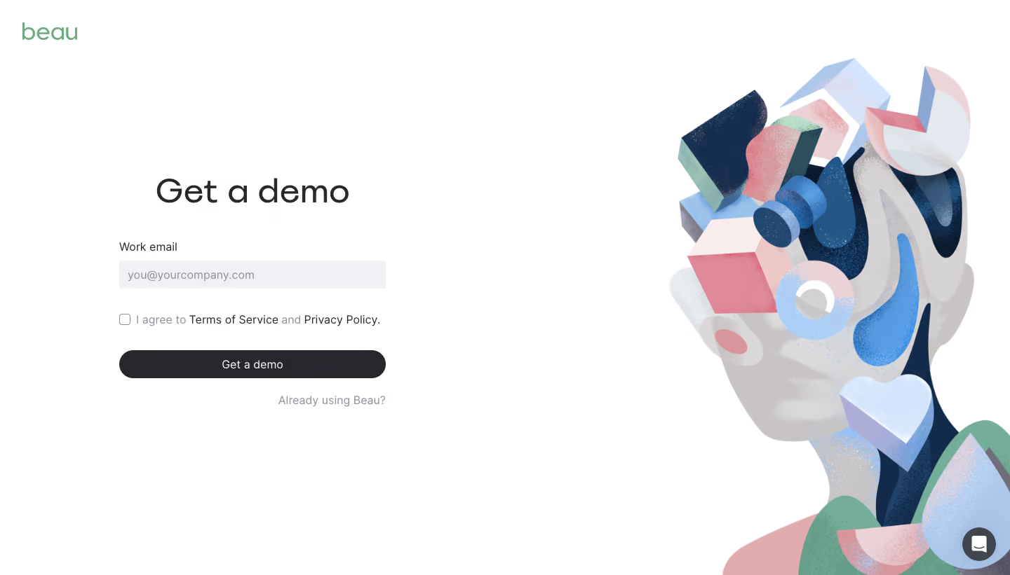
Beau.to’s demo page embraces a crisp, modern aesthetic with a strong minimalist influence. The interface is streamlined and highly professional, balancing generous whitespace with bold, rounded elements that radiate approachability and confidence. Pops of playful color soften the clean lines, while subtle gradients and gentle drop shadows evoke a sense of depth without clutter. Layout and Structure
The layout is thoughtfully segmented for clarity: a spacious hero section introduces the product with a prominent call-to-action, followed by clearly defined sections for features, demo content, and supplementary information. Each section flows seamlessly, guiding users through the value proposition before inviting them to engage deeper. Modular cards and alternating backgrounds anchor the visual rhythm, enhancing scannability. Visual Elements
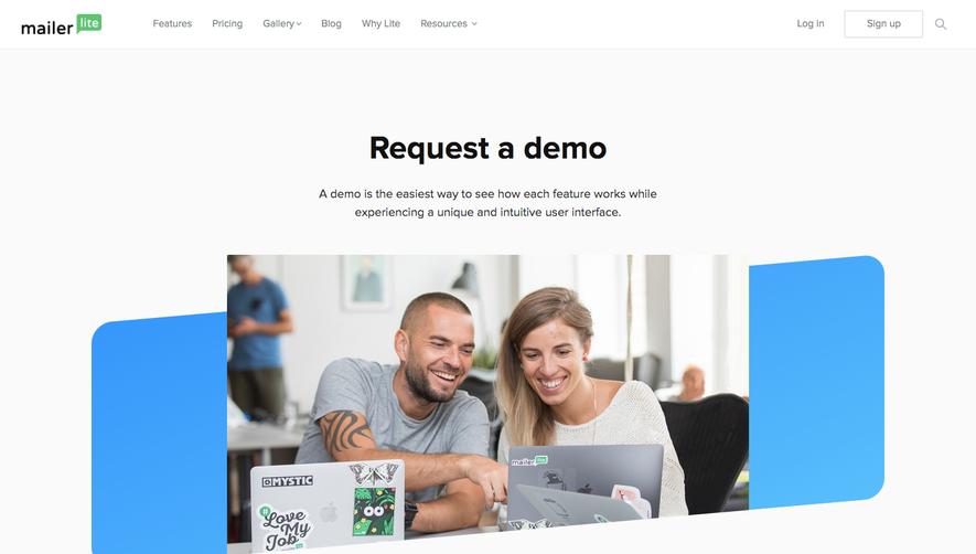
Custom vector illustrations and expressive icons reinforce the product’s brand personality while aiding comprehension. Smooth micro-animations add interactivity—hover states pulse softly, progress bars animate, and transitions fade in, creating a dynamic and polished browsing experience. Imagery is light and contextual, focusing attention on the interactive demo at the core. Color Palette and Typography
The palette spotlights a vibrant indigo-blue accent, balanced by a soft off-white background and strategic use of muted grays. Clear, friendly sans-serif fonts enhance readability, with bold weights for headings and regular weights for body copy establishing a clear hierarchy. Text is generously sized for comfort and accessibility. User Experience Patterns
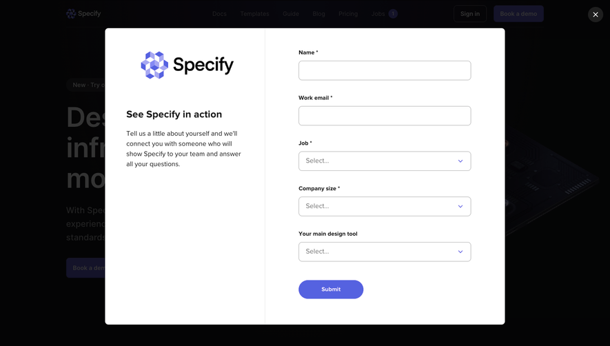
Navigation is frictionless, featuring a sticky top navbar with distinct CTAs. Forms are visually inviting, leveraging oversized fields and clear labels. CTAs use high-contrast buttons with micro-interactions that invite engagement. Smooth scrolling and anchored navigation foster a seamless exploration, minimizing cognitive load. Unique or Notable Design Choices
Notably, the hero demo is highly interactive—it invites actual product trial directly from the landing page, blurring the line between marketing and onboarding. Friendly tooltips and contextual guidance further facilitate exploration. The overall tone conveys trust, innovation, and a customer-first mindset—ideal for SaaS inspiration focused on intuitive engagement and bold, memorable design.