Overall Style and Aesthetic
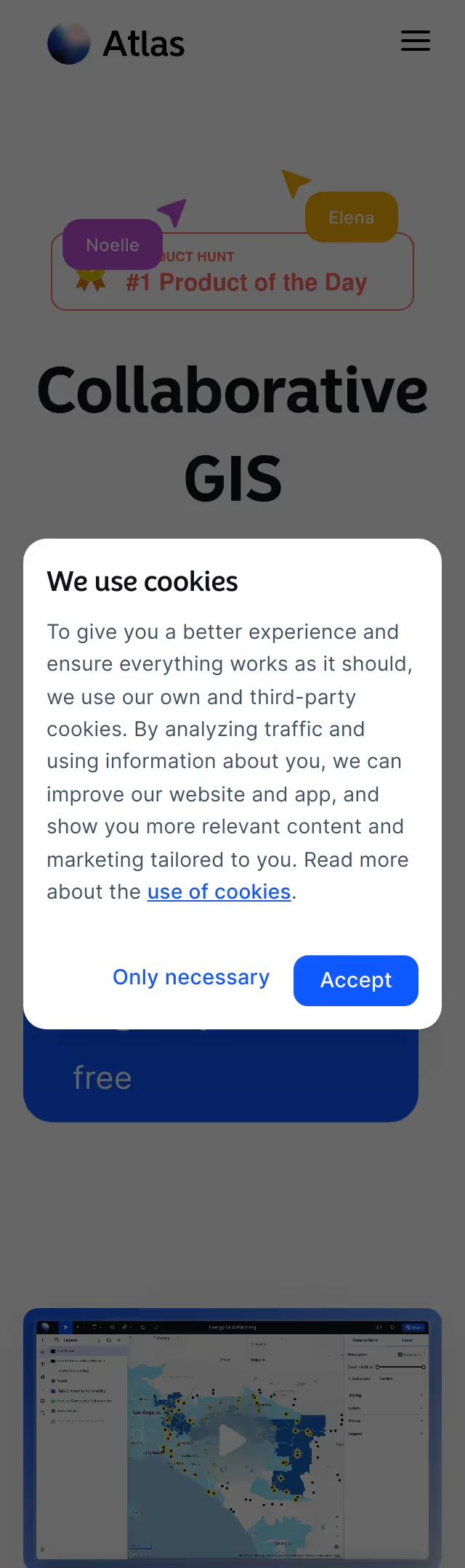
Atlas.co embraces a strikingly modern, minimalist approach that balances visual intrigue with refined simplicity. Its aesthetic radiates creativity and sophistication, combining airy white space, crisp layouts, and bold, colorful accents. The site feels both professional and playful—inviting users to explore dynamic mapping products without overwhelming their senses. Layout and Structure
The homepage opens with an expansive hero section featuring a captivating product visualization that instantly conveys Atlas’s unique value. Scrolling reveals logically sequenced sections: a feature highlight area, social proof through authentic testimonials, a vibrant gallery showcasing customer creations, and a streamlined footer packed with utility. Each section is separated by generous padding, maintaining clarity and focus throughout the journey. Visual Elements
High-resolution photography and immersive, animated previews give the site a tactile, almost interactive quality. Lively SVG illustrations, custom icons, and smooth micro-animations activate as users scroll, transforming the experience from static to delightfully engaging. Product shots are front and center, emphasizing visual storytelling. Color Palette and Typography
Atlas employs a clean neutral base—predominantly whites and light grays—punctuated by lively seasonal hues (turquoise, coral, copper). Typography leverages contemporary sans-serif fonts, with clear weight hierarchy and ample contrast for usability. Headings are bold and inviting, while body text remains crisp and readable. User Experience Patterns
Sticky navigation keeps users oriented; primary CTAs are consistently styled and prominent without being intrusive. Interactive elements feature subtle hover effects. The absence of clutter encourages exploration, while thoughtfully placed forms simplify onboarding. Smooth scroll transitions enhance flow, making the experience seamless and intuitive. Unique or Notable Design Choices
Noteworthy is the site’s use of animated map reveals and contextual visual cues, which breathe life into core functionality. The balance of whitespace and highlighted elements directs attention brilliantly. Overall, Atlas.co projects an innovative, trustworthy feel and stands as a high-impact model for SaaS design inspiration.