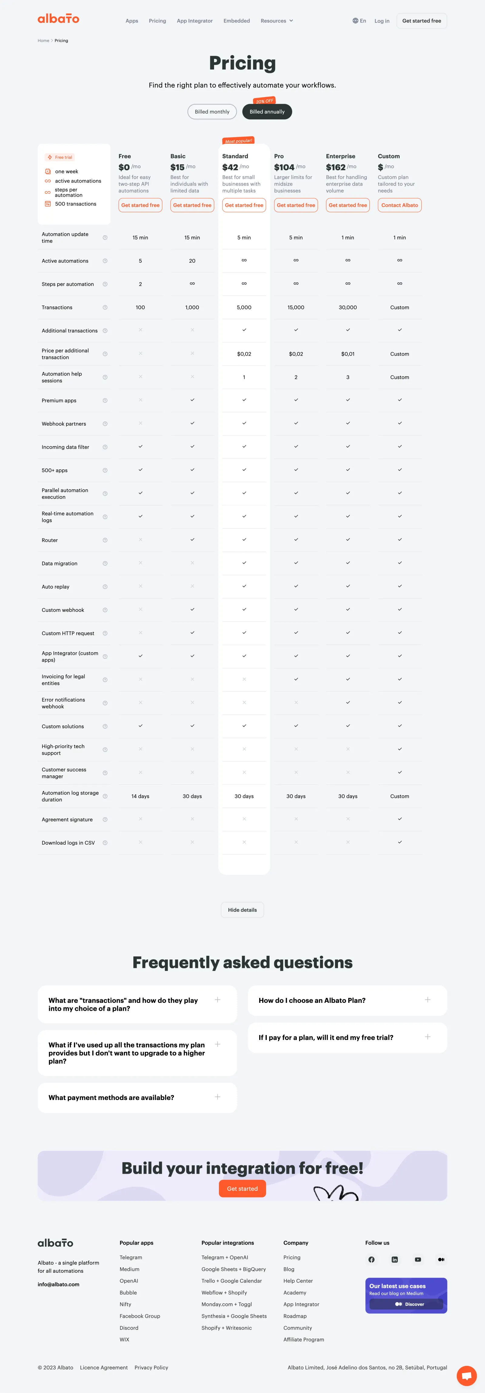
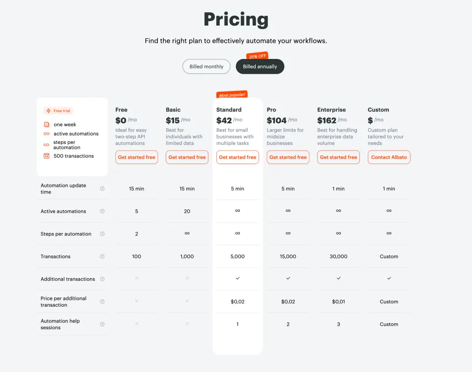
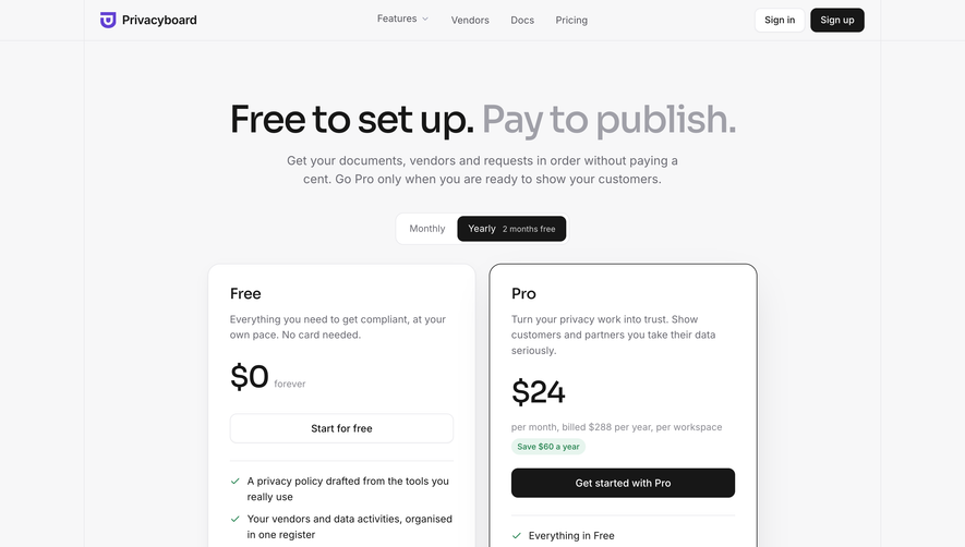
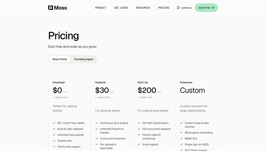
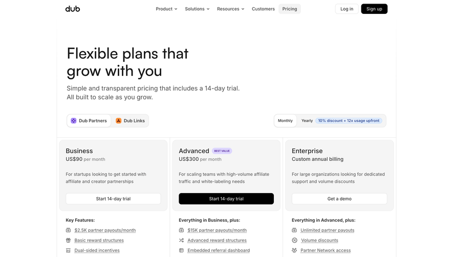
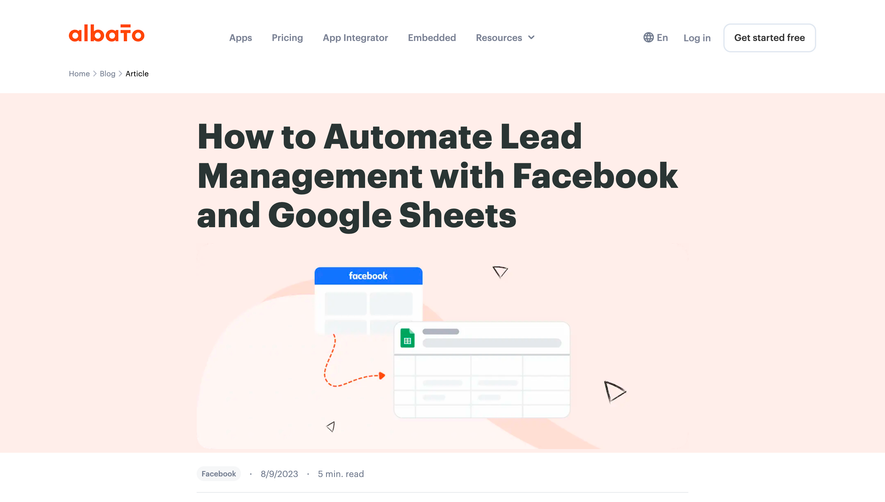
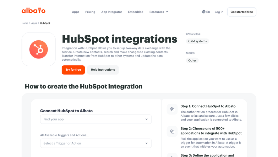
Albato’s pricing page embodies a clean, modern minimalist approach, delivering content with sharp clarity and abundant white space. The design feels professional yet highly approachable, striking a balance between simplicity and vibrancy that appeals to tech-savvy users without feeling sterile or overwhelming.
Layout and Structure
The structure follows a familiar SaaS pattern for ease-of-use: a focused hero section highlighting key messaging and CTAs, followed by a well-organized pricing grid. Supplementary elements include a concise FAQ, a visual comparison table, and a supportive footer. The content hierarchy is logically sequenced, ensuring users glide from top-level value down to granular details and support without cognitive friction.
Visual Elements
Playful vector illustrations and bespoke icons punctuate the page, adding warmth and brand personality. Subtle micro-interactions create a dynamic feel—hover states guide the eye and reinforce clickable elements. The pricing cards use subtle shadows and color accents, creating visual separation and prioritizing engagement.
Color Palette and Typography
A soft, tech-forward palette with splashes of vivid magenta and cool blues injects energy without overwhelming. Light grays fill backgrounds and delineate sections, while deeper colors spotlight CTAs. The typography merges bold, geometric sans-serifs for headings with legible body text, using scale and weight for easy scanning and emphasis.
User Experience Patterns
Sticky navigation, prominent CTAs, and quick-access toggles (for monthly/annual plans) enhance wayfinding and conversions. Smooth anchor linking helps users skip to key page sections, while simple, inviting forms lower the barrier to signup. The responsive design ensures mobile and desktop visitors enjoy a tailored, seamless experience.
Unique or Notable Design Choices
Albato’s persistent “Start for Free” CTA and plan comparison tool stand out, empowering decision-making. The playful illustrations elevate the tone, making automation feel accessible, while strategic white space and mobile-first layouts reinforce the company’s trustworthiness and product sophistication.
 SaaSFrame