.webp)
In SaaS design, one element stands out as a cornerstone of exceptional user experience: navigation. As users interact with your SaaS, intuitive and streamlined navigation can make all the difference in guiding them towards their goals efficiently. In this article, we'll delve into the world of minimalist navigation design, exploring its principles, benefits, and best practices for optimizing user journeys in SaaS interfaces.
Understanding Minimalist Navigation Design
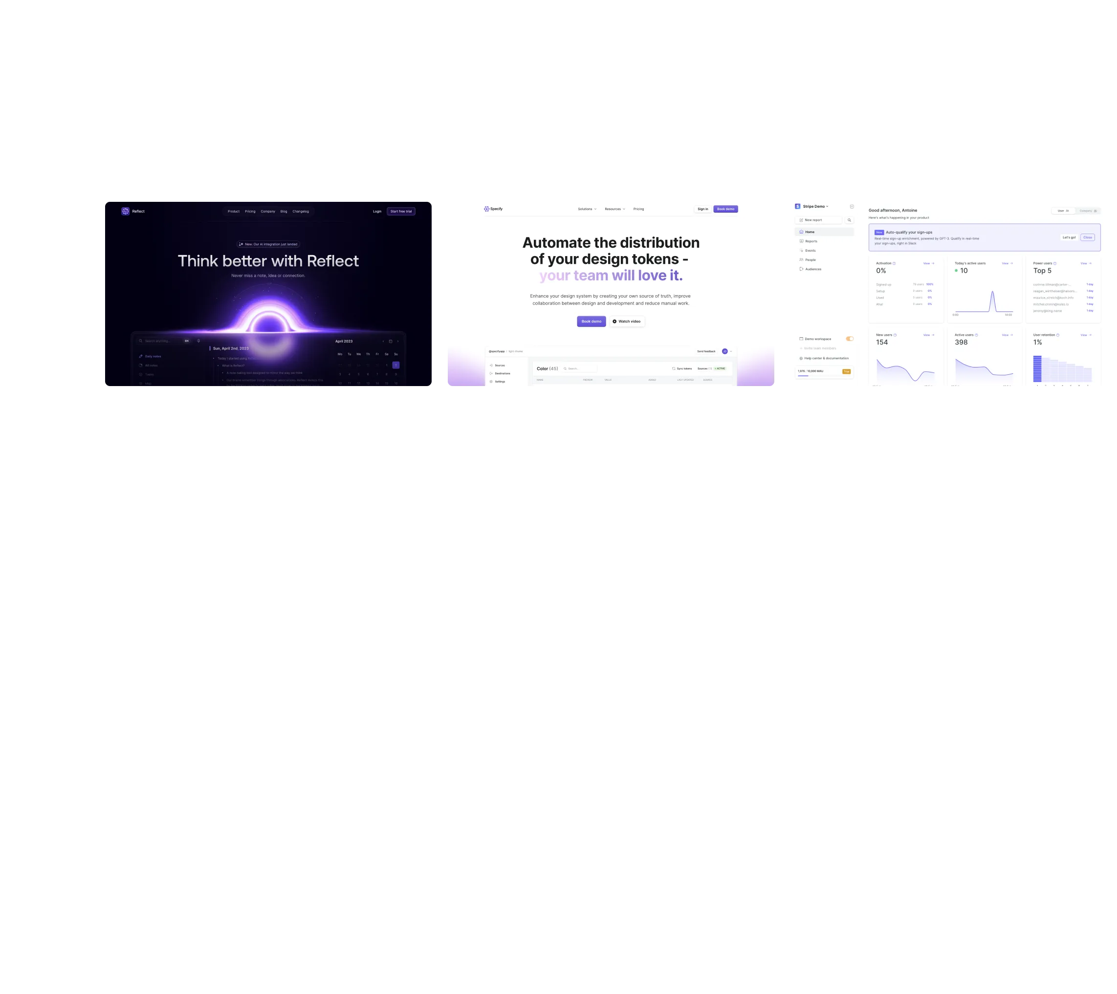
Minimalist navigation design embodies simplicity, clarity, and efficiency. It prioritizes essential elements while eliminating clutter, resulting in interfaces that are easy to navigate and visually appealing. At its core, minimalist navigation aims to reduce cognitive load and empower users to find what they need quickly and effortlessly.

Key Elements of Minimalist Navigation
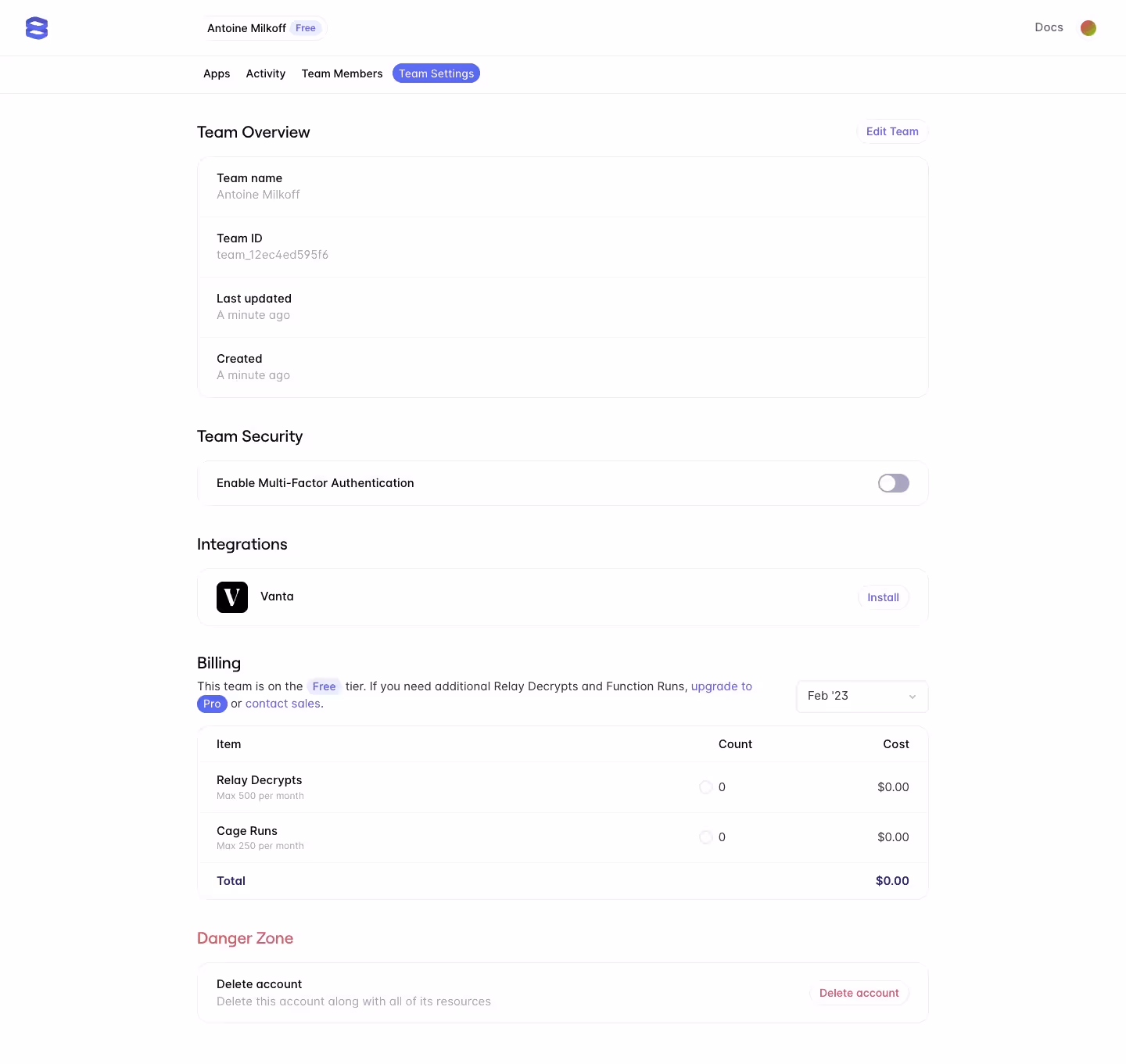
- Simplified Menu Structures: Minimalist navigation starts with a clear and concise menu structure. Prioritize menu items based on user needs and organize them logically to guide users through the application seamlessly.
- Iconography: Icons play a crucial role in minimalist navigation, serving as visual cues for navigation options. Opt for simple, recognizable icons that effectively communicate their respective functions, enhancing both aesthetics and usability.
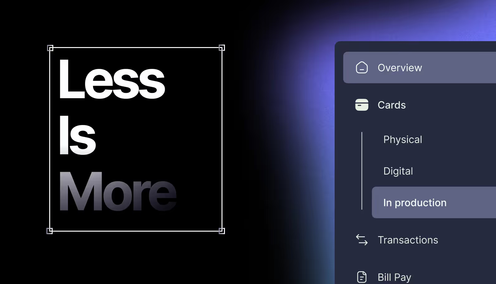
- Hidden Navigation: Concealing navigation elements when they're not in use can help maintain a clean and minimalist interface. Techniques like collapsible menus and off-canvas navigation allow for a more spacious layout while preserving access to all essential features.
- Consistency and Hierarchy: Consistency is key in minimalist navigation design. Maintain uniformity in navigation patterns and establish a clear hierarchy to help users understand the relationship between different menu items and navigate with confidence.

Best Practices for Implementing Minimalist Navigation
- Prioritize Content: Identify core functionalities and prioritize them in the navigation hierarchy. Focus on what matters most to users and ensure that essential features are easily accessible from the main navigation menu.
- Embrace Whitespace: Whitespace, or negative space, is essential in minimalist design. Use ample whitespace to create visual breathing room, enhance clarity, and draw attention to navigation elements without overwhelming the user.
- Use Microinteractions: Subtle animations and microinteractions can enhance the user experience by providing feedback and guidance during navigation interactions. Incorporate microinteractions to make navigation feel more intuitive and responsive.
- Mobile Responsiveness: With an increasing number of users accessing SaaS applications on mobile devices, it's crucial to prioritize mobile responsiveness in minimalist navigation design. Ensure that navigation elements adapt seamlessly to different screen sizes and orientations, maintaining usability across all devices.
Conclusion
Minimalist navigation design is more than just a visual aesthetic—it's a strategic approach to enhancing user experience and driving engagement in SaaS applications. By prioritizing simplicity, clarity, and efficiency, designers can create interfaces that empower users to navigate with ease and accomplish their tasks with confidence. Incorporate the principles and best practices of minimalist navigation into your SaaS design projects to unlock the full potential of your user experience.
Ready to elevate your SaaS navigation to new heights? Dive deeper into minimalist navigation design and discover how it can transform your user journeys for the better.
Stay tuned for more insights and tips on UI/UX design for SaaS applications from SaaSFrame!