SaaSFrame
Microinteractions in SaaS: Small Details That Make a Difference
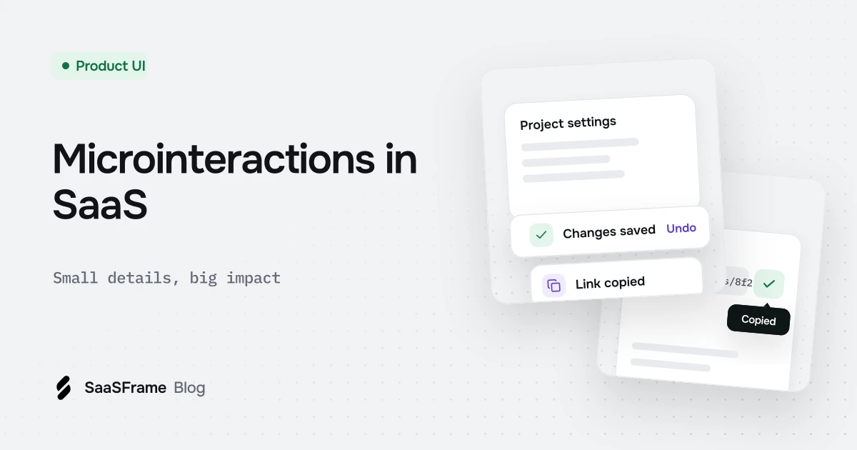
Microinteractions are small, single-purpose responses to a user action: a button that shows progress, a toast confirming a save, a copied label after copy to clipboard, a skeleton while data loads. Design each with a trigger, clear feedback, a short duration and no more motion than the message needs.
- Every microinteraction has four parts: trigger, rules, feedback and loops or modes.
- Confirm actions where the user is looking: on the button, the field or a toast near it.
- Keep motion short (roughly 100 to 300 ms) and respect reduced-motion settings.
- Use skeletons for loads that take more than a moment and progress for long tasks.
- Toasts are for confirmations; anything the user must act on belongs in the page.
Microinteractions are the small responses that tell users an action worked: a toggle that slides, a button that turns into a check, a toast after a save. Individually they are tiny; together they decide whether a product feels reliable.
What is a microinteraction?
A small, single-purpose response to one action or event. Dan Saffer, who popularised the term, describes four parts: a trigger, rules for what happens, feedback the user perceives, and loops or modes for what happens over time.
| Part | Question it answers | Example |
|---|---|---|
| Trigger | What starts it? | Clicking Copy |
| Rules | What happens? | The key goes to the clipboard |
| Feedback | How does the user know? | The label changes to Copied |
| Loops and modes | What happens next time? | The label resets after two seconds |
Where do SaaS products need microinteractions?
Wherever an action has no visible result on its own: saving, copying, sending, deleting, connecting and loading. Those are the moments users repeat an action because they are not sure it worked.
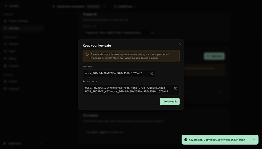
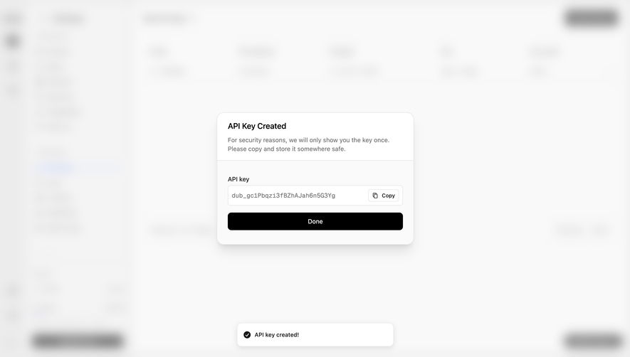
Confirming a sensitive action
Loading content
Use a skeleton when content takes more than a moment, and a progress indicator for long tasks. Spinners alone give no sense of how long to wait.
Validating input
Show a field is valid or invalid when the user leaves it, not on every keystroke. A check mark next to a correct value is enough.
How do you design a good microinteraction?
- Put the feedback where the user is looking: on the button or field, or in a toast near it.
- Keep motion short, roughly 100 to 300 ms, and respect the reduced-motion setting.
- Use toasts for confirmations only; anything to act on stays in the page.
- Make it consistent: the same action gets the same feedback everywhere.
Rule of thumb If removing the animation would leave the user unsure what happened, it is a microinteraction worth keeping. If not, it is decoration.
Where can you see more microinteractions?
Browse toast notifications, loading placeholders and copy to clipboard. For error feedback, read error messages and error states.
Frequently asked questions
What is a microinteraction?
A small, contained response to a single user action or system event, such as a toggle animating, a toast confirming a save or a field showing it is valid. The term was popularised by Dan Saffer's book Microinteractions.
Why do microinteractions matter in SaaS?
They tell users that something happened, which builds trust in actions like saving, sending or copying a secret. Without them users repeat actions or wonder whether data was lost.
When should you use a toast notification?
For short confirmations that need no decision, such as "API key created". Errors that block the user and information they must keep belong in the page or a dialog.
How long should UI animations last?
Most interface transitions feel right between about 100 and 300 milliseconds. Longer animations start to slow people down, and users who enable reduced motion should get minimal or no animation.
What is a skeleton screen?
A placeholder that mimics the layout of content while it loads. It makes waiting feel shorter than a spinner and prevents the layout from jumping when data arrives.
 Toast Notification6 examples
 Loading Indicator52 examples
 Copy to Clipboard111 examples