.webp)
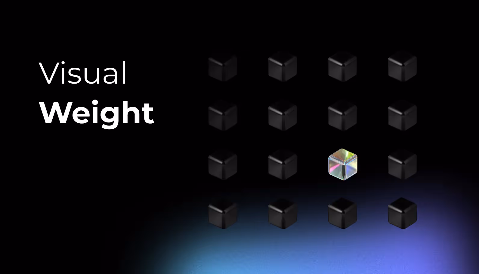
Let me introduce you to a designer named Erika, working in a fast-paced SaaS company. Erika has a unique skill – the ability to make certain design elements stand out, almost as if they're speaking louder than the rest. This skill, my friend, is what we call "visual weight."
Visual weight is like the spotlight in a theater, guiding your eyes to what matters most on the stage. It's what makes a SaaS interface not just look good but also feel intuitive and engaging.
In the world of SaaS design, getting visual weight right can be the difference between a ho-hum application and one that users can't help but love. It's all about creating an experience that flows seamlessly and effortlessly.
So, let's embark on a journey through the landscape of SaaS design, where visual weight is your trusty compass. We'll uncover its secrets – how it shapes perception, taps into psychology, maintains balance, and directs attention. By the end of our voyage, you'll have the wisdom to craft SaaS designs that not only work well but also leave a lasting impression.
The Significance of Visual Weight in SaaS Design
Perception and First Impressions
Visual weight is your secret weapon in creating a strong first impression for your SaaS application. Think of it as the design equivalent of a confident handshake. When a user interacts with your software, their initial perception is greatly influenced by the visual weight of elements on the screen. Large, vibrant, and contrasting elements naturally draw the eye and make a memorable impact.
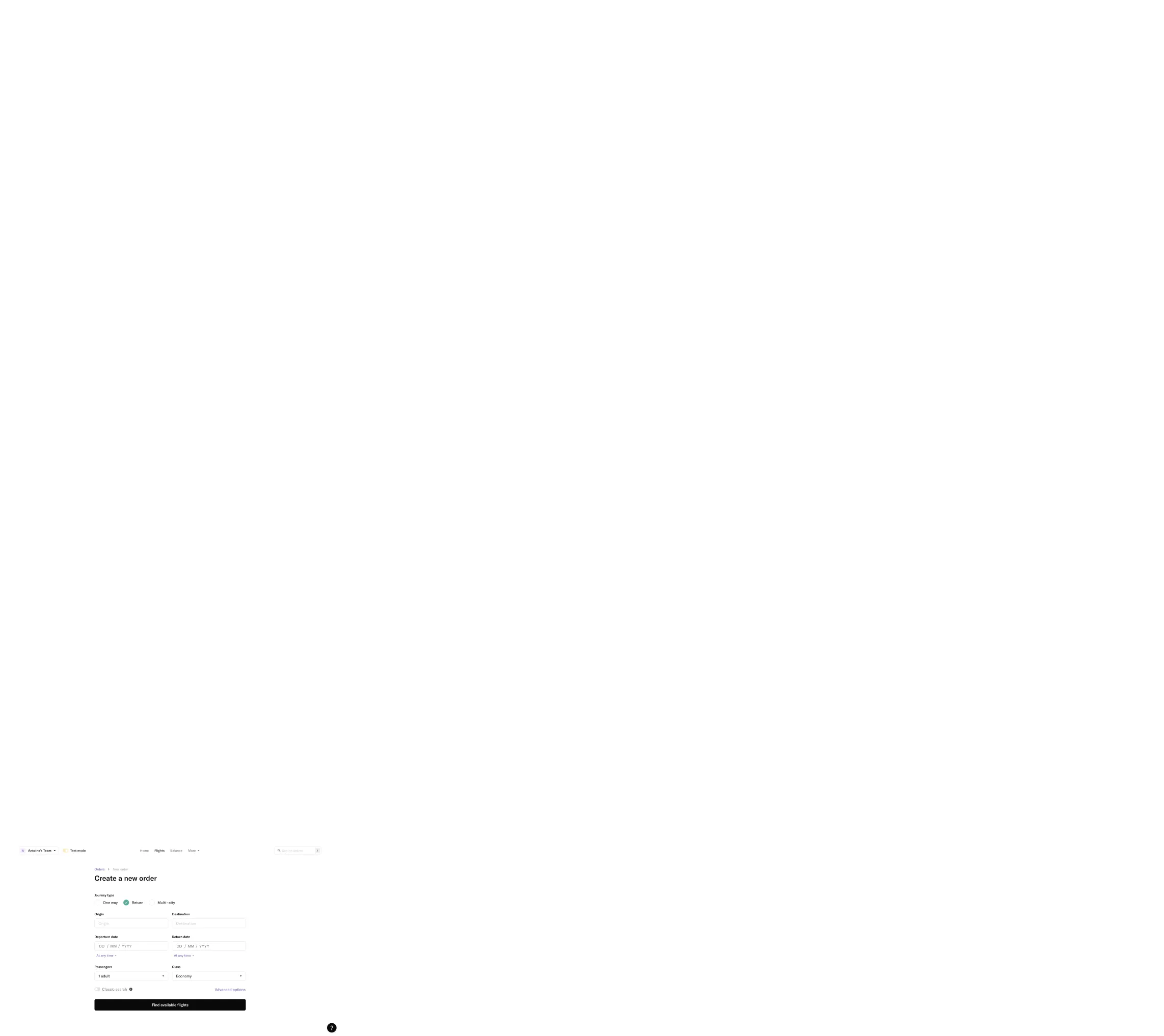
Consider a login page for a SaaS platform. By giving the "Sign In" button more visual weight through a bold color and size, you guide users' attention and invite them to take the desired action. This immediate clarity can significantly enhance the user experience.
Psychological Impact and Emotion
Design isn't just about aesthetics; it's about eliciting emotions and responses. Visual weight can evoke specific psychological responses from users. Bright colors and high-contrast elements can convey energy and excitement, while softer, muted tones may create a sense of calm and serenity.
For example, imagine a project management tool for teams. Using visual weight strategically, you can make critical deadlines and urgent tasks appear heavier, conveying a sense of importance and urgency. Conversely, less crucial elements can be visually lighter, reducing cognitive load and promoting a relaxed atmosphere within the interface.
Achieving Balance and Harmony
Visual weight plays a fundamental role in achieving balance and harmony within your SaaS design. Just like a well-composed symphony, a harmonious UI/UX relies on the careful distribution of visual weight across the screen. Without it, your design may appear chaotic or disjointed.
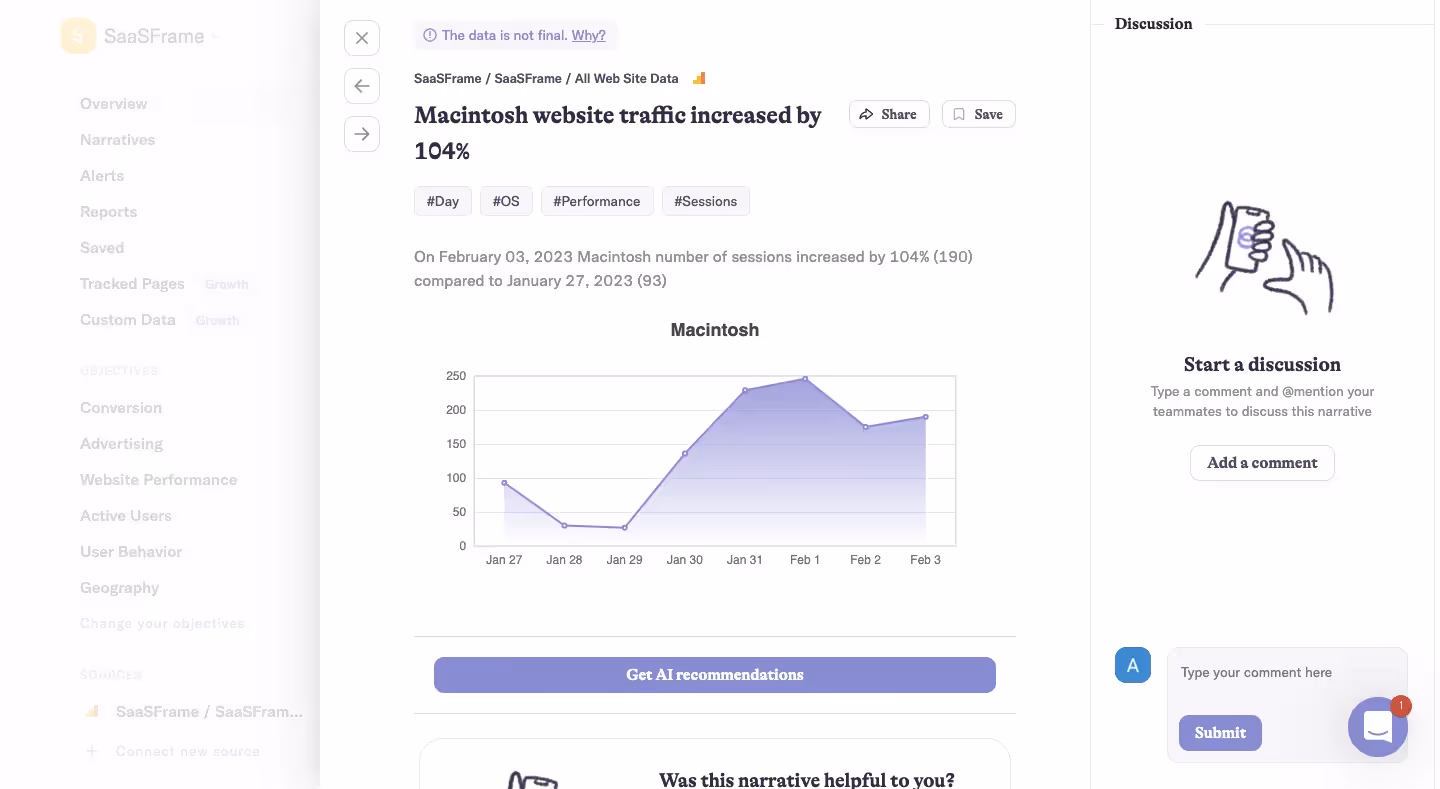
Think of a dashboard for a data analytics tool. By assigning different visual weights to data visualizations, such as larger graphs for essential metrics, you create a sense of hierarchy and organization. This enables users to navigate complex information effortlessly.
Guiding Attention and Interaction
One of the primary functions of visual weight is to guide user attention. In the vast landscape of your SaaS application, you want users to focus on specific elements, actions, or messages. Visual weight can act as a spotlight, illuminating what matters most.
Consider a customer support chatbot within a SaaS platform. By giving the chat window a slightly larger size and a contrasting color, you invite users to engage with this essential feature. Users intuitively understand where to start their interaction, thanks to the deliberate use of visual weight.
Achieving Composition Unity
Visual weight is the glue that holds your design composition together. It ensures that all elements harmonize and create a cohesive user experience. Without proper consideration of visual weight, your design may appear disjointed, causing confusion and frustration.
Imagine a calendar feature within a scheduling SaaS application. By making the dates with upcoming appointments visually heavier, users can quickly scan and identify their busy days. This unifies the composition and aids users in managing their schedules effectively.
Elements Influencing Visual Weight
To harness the power of visual weight effectively, it's crucial to understand the key elements that influence it. Let's explore these elements in detail:
1. Color
Color is one of the most potent tools for controlling visual weight. Bright, saturated colors naturally appear heavier, while muted or desaturated colors seem lighter. For instance, a vivid red button will draw more attention than a pale gray one.
2. Contrast
Contrast involves the difference between an element and its background. High-contrast elements stand out more, while low-contrast elements blend in. This principle is particularly useful for emphasizing important content or calls to action.
3. Lightness and Darkness
The use of light and dark tones can affect the perceived weight of an element. Dark elements on a light background typically appear heavier, while light elements on a dark background appear lighter.
4. Size
Size is perhaps the most straightforward element influencing visual weight. Larger elements naturally command more attention. Consider a SaaS dashboard where critical metrics are displayed in larger widgets, making them visually weightier.
5. Density
Density refers to the amount of content or detail within an element. Dense elements can appear heavier due to the sheer volume of information they convey. For instance, a densely populated calendar day might signal a busy schedule.
6. Proportion
Proportion relates to the relationship between the sizes of different elements within a composition. An element that occupies a significant portion of the screen will inherently carry more visual weight.
7. Complexity
Complexity refers to the intricacy of an element's design. More intricate or detailed elements can appear heavier because they demand closer inspection. For instance, a highly detailed icon may draw more attention than a simple one.
Practical Applications of Visual Weight
Now that we've dissected the elements influencing visual weight, let's explore practical examples of how you can strategically apply this concept in SaaS design:
1. Call-to-Action Buttons
In a SaaS application, call-to-action (CTA) buttons are pivotal for user engagement. By making your primary CTA button larger, bolder in color, and higher in contrast, you guide users towards the most critical actions, such as signing up or making a purchase.
2. Information Hierarchy
In a content-heavy SaaS platform, organizing information effectively is crucial. Assign visual weight to headings and subheadings by increasing their font size and using a bold typeface. This helps users navigate through content and understand its structure.
3. Progress Indicators
When users perform tasks that involve multiple steps, such as completing a form or a multi-page survey, visual weight can be used to indicate progress. Highlight the current step or section, making it visually heavier, while dimming or reducing the weight of completed sections.
4. Data Visualization
For SaaS applications dealing with data and analytics, visual weight is indispensable. Use larger and more vivid charts or graphs to emphasize key insights. Users can quickly identify critical data points without feeling overwhelmed by the entire dataset.
5. Notifications and Alerts
Incorporate visual weight into notifications and alerts to grab users' attention when important updates or messages are available. Use contrasting colors, animation, or larger icons to ensure these critical messages don't go unnoticed.
Conclusion
Visual weight is a powerful tool in the arsenal of SaaS design. By understanding its influence on perception, psychology, balance, attention, and composition, you can craft user-friendly, engaging interfaces that leave a lasting impression. Remember that visual weight is not about mere aesthetics; it's about enhancing the user experience, guiding users, and creating cohesive, harmonious designs.