
Thank you! Your submission has been received!
Oops! Something went wrong while submitting the form.
Get SaaSFrame Pro
Monthly
$18
Quarterly
$48
Yearly
$180
Upgrade to access this feature
Browse all screens & flows
Filter and search screens & flows
Access Figma files
Access mobile versions
Bookmark screens & flows
Join now


Workable Landing Page

Workable
The world's leading talent acquisition software
Designed by
No items found.

Bookmark
Bookmark

Design with AI
Thank you! Your submission has been received!
Oops! Something went wrong while submitting the form.
# Design from Reference: Workable Landing Page
Create an original, high-fidelity visual design inspired by the reference. Prioritize composition, typography, colors, spacing, and component styling over technical implementation.
## Reference
- **Product:** Workable
- **Category:** Landing Page
- **Screenshot:** https://cdn.prod.website-files.com/5e9dc792e1210c5325f7ebbc/62eca44a17fa6365808118e7_1659675153874-62ec9cadbf75bb9855ce6f0f_screenshot-device-2b6dd5bed076b802fd5e7dd7d006a3f2-1659618926686.webp
Analyze the screenshot first. If inaccessible, request it rather than guessing.
## Content
{{content.instructions}}
{{content.data}}
Preserve essential messaging and factual accuracy. Adapt structure and copy length for visual balance; never invent product claims.
## Visual Design
### Overall aesthetic
- **Style:** Illustrated recruiting-software landing page with a rich teal hero, white explanatory sections and deep slate-purple proof/footer regions.
- **Character:** Friendly workplace scenes, floating geometric confetti and layered product mockups make the page energetic and approachable.
- **Capture:** The image measures 1440 × 6115 pixels. CSS estimates assume approximately 1:1 capture scale; actual browser scale and font identities are unverified.
### Page composition
- **Header:** A white wordmark sits left within an approximately 1220-pixel container; navigation, login and a white start button align right on the teal background.
- **Hero:** Left-aligned multi-line headline, supporting sentence and two action paths sit beside a large illustrated remote conversation. The teal section extends roughly 740 image pixels down.
- **Product pillars:** A centered heading introduces three equal columns, each with a layered product illustration, colored uppercase category label, bold benefit heading, paragraph and small learn-more link.
- **Scale proof:** A sweeping curved transition leads into a purple region. A dotted world map occupies the left, while a heading, explanatory text and three large numeric metrics stack on the right.
- **Customer story:** A wide white panel overlaps the purple region, combining a large result statement, serif quotation, portrait attribution, pagination and customer-story link. A tinted customer-logo strip forms its base.
- **Additional benefits:** A white section presents six icon-led benefits in a three-column, two-row grid.
- **Closing conversion:** A centered teal heading, short trial explanation and teal action sit above an illustrated office scene.
- **Footer:** A pale awards-and-ratings strip precedes a purple multi-column footer. A fixed-looking white cookie banner overlays the bottom and hides part of the footer content.
### Information hierarchy
- **Hero proposition:** A bold white four-line headline leads the opening, followed by a single supporting line.
- **Primary paths:** The opening offers a video-style action and a smaller outlined start control, while the header repeats a more prominent white start button.
- **Product explanation:** The three pillars use distinct colored labels to categorize sourcing, evaluation and hiring automation before their larger benefit titles.
- **Quantified proof:** Large white numbers and uppercase labels emphasize company, hire and candidate scale.
- **Testimonial priority:** A bold result statement competes intentionally with the serif quotation, giving both outcome and customer voice clear space.
- **Secondary reassurance:** Partner, support, security, mobile use, advice and onboarding benefits precede the final trial invitation.
- **Footer hierarchy:** Uppercase category headings lead smaller link lists; awards and ratings remain visually separate above the footer.
### Typography
- **Family:** Most content uses a clean sans-serif with rounded forms; exact identity is unverified. The testimonial quotation switches to a serif.
- **Hero heading:** Approximately 44-pixel CSS size, bold, with around 48-pixel line height and a narrow left-column measure.
- **Major headings:** Approximately 40–44 pixels, bold, with 48–52-pixel line height; centered headings often span two lines.
- **Pillar titles:** Approximately 28–30 pixels and bold; category labels around 18–20 pixels, uppercase and strongly weighted.
- **Body:** Approximately 18–20 pixels with 30–32-pixel line height across marketing sections.
- **Metrics:** Approximately 46-pixel bold numbers with smaller uppercase labels.
- **Quotation:** Approximately 26-pixel serif text with 32-pixel line height; attribution is much smaller sans-serif.
- **Controls and footer:** Navigation around 14–16 pixels; small uppercase learn-more links around 11–12 pixels; footer links around 14 pixels.
### Colors & surfaces
- **Measured teal:** #007569 fills the hero and appears in primary branding/action regions.
- **Measured purple:** #373656 supports the proof section and footer.
- **Measured base:** White #FFFFFF dominates explanatory regions; pale lavender #EFF0FB supports the awards strip.
- **Measured light neutrals:** #F2F4F5 and #F3F5F7 occur in product artwork and supporting surfaces.
- **Accent roles:** Orange, blue and violet distinguish the three product pillars. Yellow, turquoise, green and peach geometric marks decorate section boundaries.
- **Text treatment:** White dominates dark regions; charcoal-gray headings and body text appear on white.
- **Depth:** Product mockups and the testimonial panel cast soft shadows, while most benefit content remains unboxed.
### Components
- **Header action:** A white rounded rectangle around 140 × 52 image pixels contains a teal start label and chevron.
- **Hero actions:** A small circular play icon introduces the video link; an outlined compact button follows a short separator word.
- **Hero illustration:** Two organic pale shapes frame people speaking through a desktop video call, with plants, furniture and scattered geometric accents.
- **Pillar illustrations:** Layered recruiting, candidate-profile and scheduling interfaces appear above each benefit, using white panels and soft shadows.
- **Metrics:** Three icon-number-label groups stack vertically beside the world map with generous spacing.
- **Testimonial panel:** Approximately 1170 pixels wide, with two content columns, small circular pagination near the top, portrait attribution and a bottom logo row.
- **Benefit grid:** Six teal outline icons sit above bold labels and centered descriptions, without enclosing cards.
- **Trial action:** A solid teal button with a right chevron sits beneath the closing explanation, approximately 185 × 64 pixels.
- **Awards strip:** Three shield-style awards and four review-source groups align horizontally on a pale lavender surface.
- **Footer:** A large brand symbol sits beside four link columns and an outlined login action. Lower footer details are partly obscured.
- **Cookie banner:** A full-width white overlay contains centered explanatory text, privacy link and two adjacent Accept/Decline controls, with teal fill versus teal outline.
### Visual rhythm
- **Container:** Approximately 110-pixel desktop side gutters align header, pillar grid and footer content.
- **Section pacing:** Large whitespace breaks separate the hero, product pillars, social proof, benefit grid and closing invitation.
- **Curved transitions:** Broad sweeping white/purple boundaries soften the otherwise horizontal section structure.
- **Repeated triplets:** Three pillars, three metrics and three-column benefit rows create recurring visual groupings.
- **Illustration cadence:** Large imagery alternates with concise copy and proof, preventing the long page from becoming a continuous text column.
- **Footer density:** The awards strip and link columns become progressively denser after the spacious closing illustration.
### Responsive
- **Recommendation — navigation:** Collapse the long header menu while retaining a clear start action.
- **Recommendation — hero:** Stack copy and illustration, reduce the headline fluidly and keep both action paths readable.
- **Recommendation — grids:** Reduce three-column pillars and benefit grids to fewer columns, preserving each illustration-title-description relationship.
- **Recommendation — proof:** Stack map, metrics and testimonial columns without shrinking numeric proof or quotation excessively.
- **Recommendation — footer and cookies:** Wrap footer groups and review marks; ensure the cookie banner does not hide critical controls. No mobile state is evidenced.
### Adaptation guidance
- **Preserve the narrative:** Move from recruiting proposition to three product pillars, quantified proof, customer story, practical benefits and trial invitation.
- **Reuse color roles:** Keep teal for brand/action, purple for proof/footer and white for detailed explanation.
- **Keep illustration purposeful:** Use workplace scenes and product mockups to support the recruiting story rather than generic decoration alone.
- **Build repeatable modules:** Standardize pillar spacing, icon-benefit groups, metric stacks and review-source treatments.
- **Balance decorative geometry:** Retain small confetti and broad curves without letting them collide with text or controls.
- **Respect captured limits:** Define carousel, navigation and cookie interactions separately; the screenshot shows one story and an unresolved cookie choice.
Use this context to reproduce the reference's visual language: layout, typography, colors, spacing, borders, radii, and distinctive elements. The screenshot takes priority if descriptions conflict.
## Direction
{{preferences.fidelityInstructions}}
## Output
{{output.instructions}}
Deliver a polished, cohesive design with precise alignment, hierarchy, and spacing. Produce the requested visual artifact, not just a description. If unsupported, explain the limitation.


Category
Patterns
No items found.
Tech Stack

Added on
June 6, 2020
Similar screens



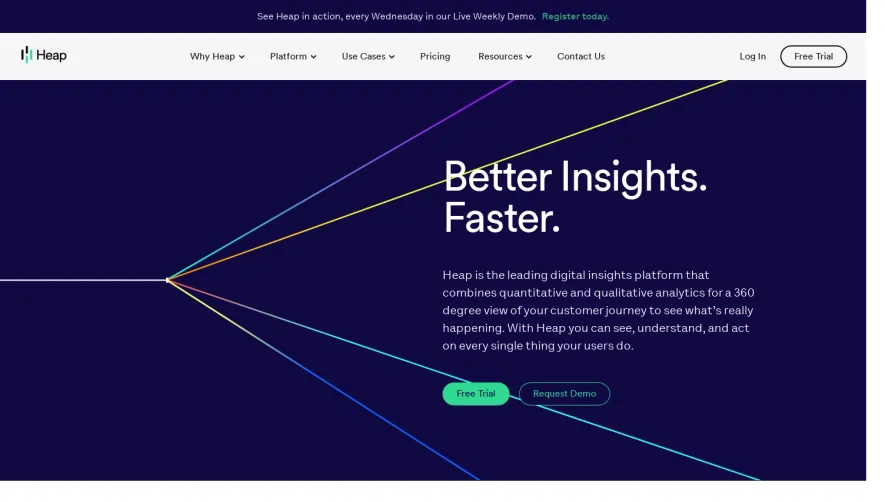
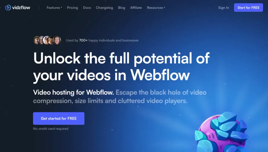

Upgrade to SaaSFrame Pro now to see similar examples.
Monthly
$18 /month
Billed $18 monthly
Browse all screens & flows
Filter and search screens & flows
Search text in screenshots
Access Figma files
Access mobile versions
Join now
Quarterly
$16 /month
Billed $48 quarterly
Browse all screens & flows
Filter and search screens & flows
Search text in screenshots
Access Figma files
Access mobile versions
Join now
Yearly
$15 /month
Billed $180 yearly
Browse all screens & flows
Filter and search screens & flows
Search text in screenshots
Access Figma files
Access mobile versions
Join now