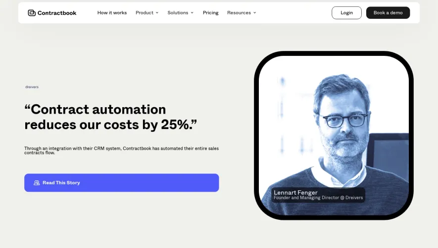
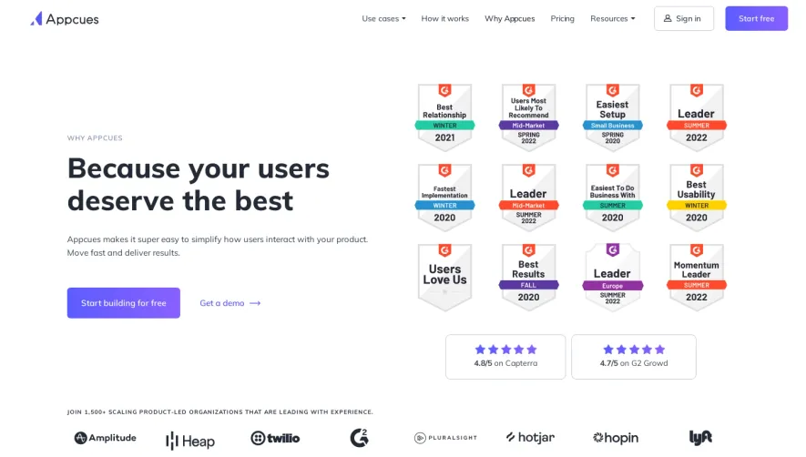
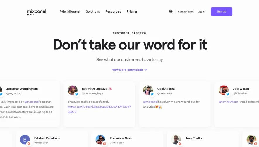
Generate a new design based on this screen using your own content.
Thank you! Your submission has been received!
Oops! Something went wrong while submitting the form.
# Design from Reference: Whimsical Customers Page
Create an original, high-fidelity visual design inspired by the reference. Prioritize composition, typography, colors, spacing, and component styling over technical implementation.
## Reference
- **Product:** Whimsical
- **Category:** Customers Page
- **Screenshot:** https://cdn.prod.website-files.com/5e9dc792e1210c5325f7ebbc/62ec9c8672e5af653f1f809b_1659625067166-screenshot-device-f21010fdcc903164c3f77817967dd59a-1659605172257.webp
Analyze the screenshot first. If inaccessible, request it rather than guessing.
## Content
{{content.instructions}}
{{content.data}}
Preserve essential messaging and factual accuracy. Adapt structure and copy length for visual balance; never invent product claims.
## Visual Design
Use this context to reproduce the reference's visual language: layout, typography, colors, spacing, borders, radii, and distinctive elements. The screenshot takes priority if descriptions conflict.
## Direction
{{preferences.fidelityInstructions}}
## Output
{{output.instructions}}
Deliver a polished, cohesive design with precise alignment, hierarchy, and spacing. Produce the requested visual artifact, not just a description. If unsupported, explain the limitation.
Whimsical’s customers page greets visitors with a refreshingly minimalist and modern vibe, blending playfulness and professionalism. Generous white space keeps the content breathable, while vibrant accent colors inject energy without overwhelming the user. The page is approachable for creative professionals yet keeps things sleek and on-brand for a SaaS tool.
Layout and Structure
The structure is clean and intuitive. The hero section opens with an inviting headline and supporting text, quickly communicating the page’s purpose. Customers are showcased in a visual grid of logos, instantly building credibility. Deeper below, concise testimonial cards pair customer insights with vibrant avatars, followed by interactive "customer story" sections with hoverable cards leading to full case studies. A strong, sticky navigation bar ensures users never lose their place.
Visual Elements
Custom illustrations and playful icons dominate, replacing traditional photography. These illustrations—often featuring hand-drawn elements and lively characters—reinforce the product’s creative ethos. Animations are subtly used for hover effects and transitions, creating a tactile, premium feel without causing distraction.
Color Palette and Typography
Whimsical leverages a signature color palette—soft lavenders, gentle aquas, and warming coral accents—contrasted with deep gray for text. Clear, modern sans-serif fonts establish hierarchy with distinct weights: bold for headings, light for body, and all-caps sublabels. The result is readable, accessible, and distinctly memorable.
User Experience Patterns & Notable Features
Navigation is sticky and persistent, with prominent CTAs encouraging exploration of customer stories and product use cases. Scroll-triggered animations enliven the experience as you progress. Unique touches—like doodle-style highlights and interactive testimonial cards—convey innovation and cheerfulness. The overall tone is trustworthy, energetic, and inspiring, making it a standout reference for SaaS web design.