Overall Style and Aesthetic
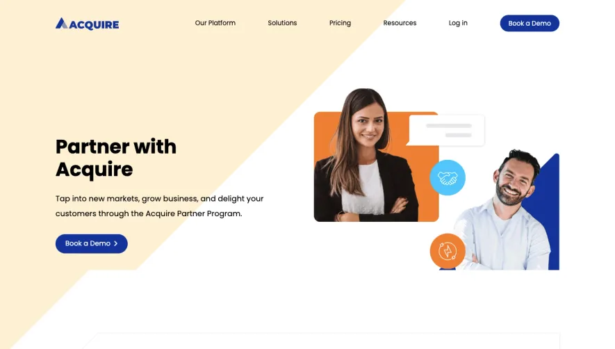
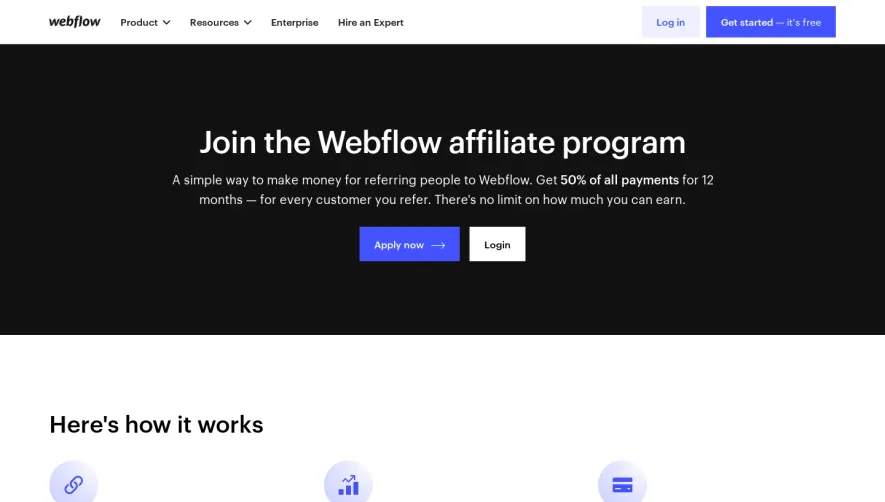
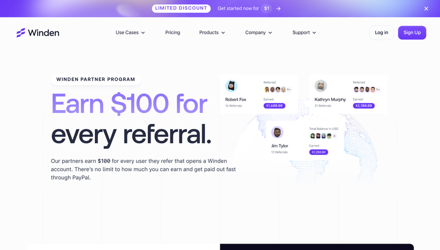
Vidzflow’s affiliate page effortlessly melds a fresh, modern minimalism with a crisp, professional tone. The interface leans into generous white space and clean lines, creating a breathable atmosphere that invites exploration. The overall mood balances trustworthiness with an energetic, future-facing vibe—perfect for SaaS audiences. Layout and Structure
The single-scroll layout is meticulously organized. An above-the-fold hero section introduces the affiliate program with bold, concise copy and a clear primary CTA. This flows directly into an overview of affiliate benefits, followed by a step-by-step “How it Works” sequence utilizing horizontal alignment for easy visual scanning. A social proof area, with testimonials and recognizable brand logos, appears next, followed by an inviting FAQ accordion. A sleek, unobtrusive footer rounds out the journey. Visual Elements
Vidzflow leverages playful yet professional illustrated icons for each step and benefit, adding personality without overwhelming the content. Animations are subtle—think micro-interactions on button hover, or icons with a slight bounce—infusing movement without distraction. No heavy stock photography or background video, keeping load times and attention firmly on content. Color Palette and Typography
Electric blues and vibrant purples dominate the color scheme, complemented by gradients and occasional pops of coral for CTAs. Typography follows a hierarchy with a bold, sans-serif headline font, readable subheads, and body text that maintains contrast and clarity throughout. User Experience Patterns
Navigation stays anchored at the top, with CTAs—such as “Join Now”—prominent and repeated. Forms are short and friendly, adopting a single-column design with in-line validation. Strategic scroll cues and section breakpoints guide users naturally through the page. Unique or Notable Design Choices
Notably, the hero illustration is dynamic and memorable, featuring playful motion tied to the product’s video theme. This, combined with the minimal distraction from unnecessary content, ensures focus, high conversion, and a highly polished SaaS aesthetic.