###
Overall Style and Aesthetic
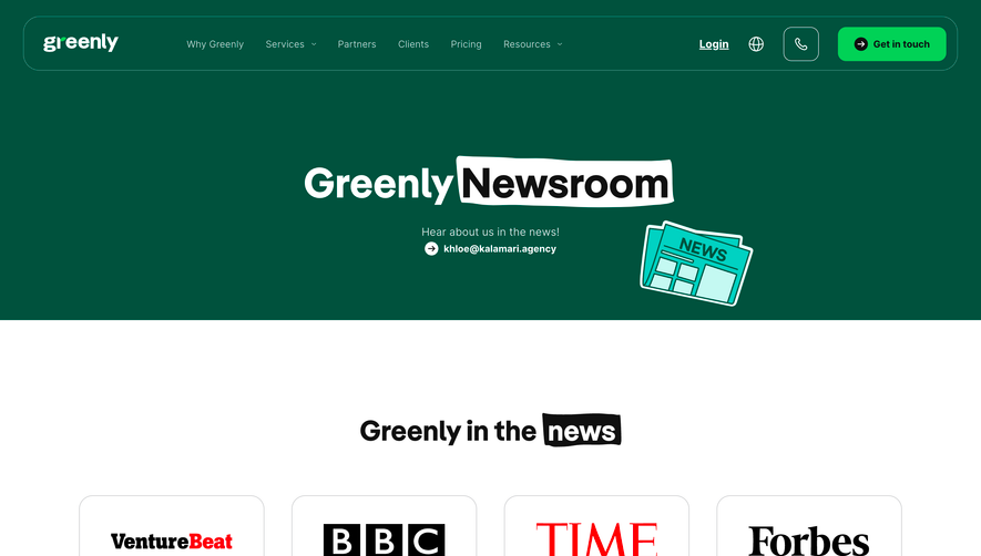
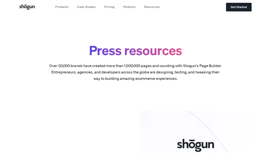
The.com’s Press page delivers a modern, minimalist aesthetic that exudes confidence and clarity. The abundant white space provides a sense of openness, allowing each element to breathe while drawing attention to content. The visual language is trustworthy yet innovative—balancing corporate professionalism with the energetic edge that defines leading SaaS brands. ### Layout and Structure
The layout employs a clean, scroll-friendly column structure. A prominent hero section introduces the page with a compelling headline and subhead, flanked by concise navigation. News article links are arranged in visually appealing cards, each featuring clear separation, preview text, and gentle hover effects to encourage exploration. The page closes with a concise, well-integrated footer, reinforcing brand identity. ### Visual Elements
Visuals are subtle yet impactful. The use of polished press logos, accent icons, and crisp, well-cropped images elevates credibility and professionalism. The visuals avoid clutter, focusing on relevance—using monochrome or muted logos rather than flashy illustrations to maintain aesthetic consistency. ### Color Palette and Typography
The palette centers on high-contrast black and white, punctuated by gentle accent colors (like soft blues or purples) for interactive elements. Modern sans-serif typography is thoughtfully layered: large, bold headings command attention, concise subheadlines and body copy maintain legibility, and calls-to-action stand out in accent shades. ### User Experience Patterns & Unique Choices
Navigation is streamlined, favoring utility over complexity. Hover animations and micro-interactions enhance engagement without distracting. The press content’s card-based layout supports quick scanning—a crucial UX element for credibility pages. Notably, the holistic restraint—using just enough animation, balanced white space, and high-touch brand elements—sets a high bar for SaaS design, projecting assurance and innovation in every pixel.